

Advantages of using charts
There are many reasons to use data driven charts to visualize information in a presentation or on an information screen.
- First of all, charts are easy to read.
- Charts are visually appealing, compared to e.g. a text box or table.
- Easy comparison between 2 or more categories.
- It aggregates large sets of information.
- You immediately spot a discrepancy in the data.
- Immediate overview of coherent categories by using colors.
- Spot patterns and trends easily.
- Fixed size on a slide: new categories or additional months/years later on, will make the size of the bars smaller etc, but the chart itself will keep its original size. This is a design or visual advantage.
- You immediately detect minimum and maximum values.
Data driven charts in your presentations
OK, so the advantages of using charts are clear. You want to use charts in your reporting (as presentations or PDF documents) or you can use charts in real-time on a motivational television screen (e.g. waiting queue at a call center). The ideal solution is to use automated data driven charts.
- Data driven charts for presentations: each time you open your presentation, you will have the latest information. No mistakes or waiting for last month’s sales figures.
- Data driven charts for screens: real-time information on your screen, updated automatically every second. To inform and motivate people.
Both can be accomplished with a tool called DataPoint, which is an add-on for Microsoft PowerPoint. Follow me to create data driven charts in presentations, with automatic updating capabilities. You will never show old information anymore!
Connecting a chart to a database
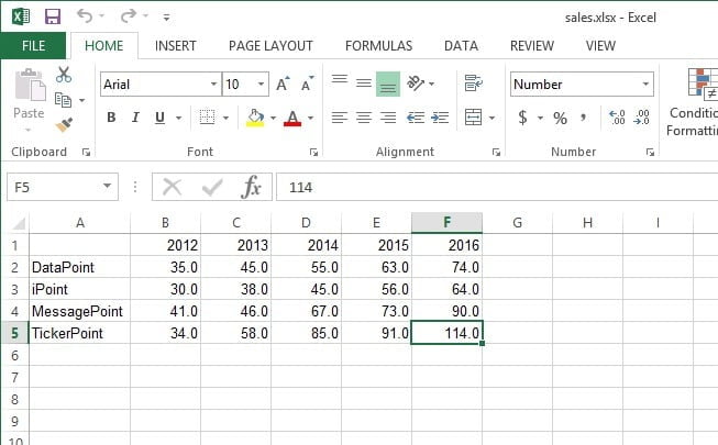
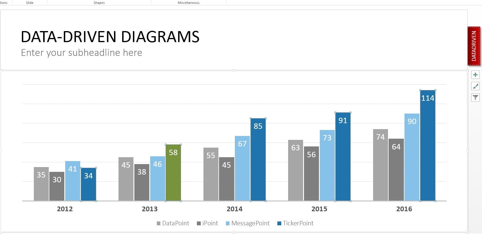
Before we can link a chart to a set of data, we have to establish a connection to a data source. Typically we use a database or Excel document for this. In this example, we will use a Microsoft Excel data sheet. This is the most simple form of a database. We will use this Excel file, with some sales information, split up by product and year.
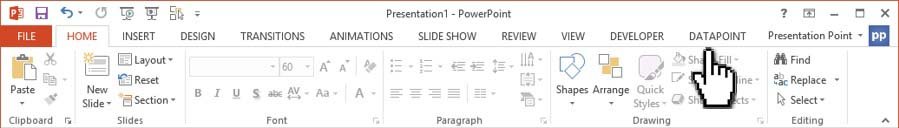
First we open the DataPoint menu in the PowerPoint menu.
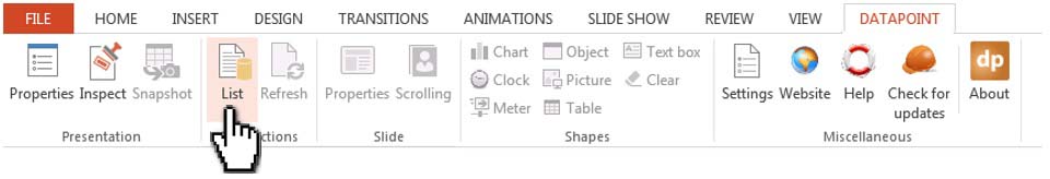
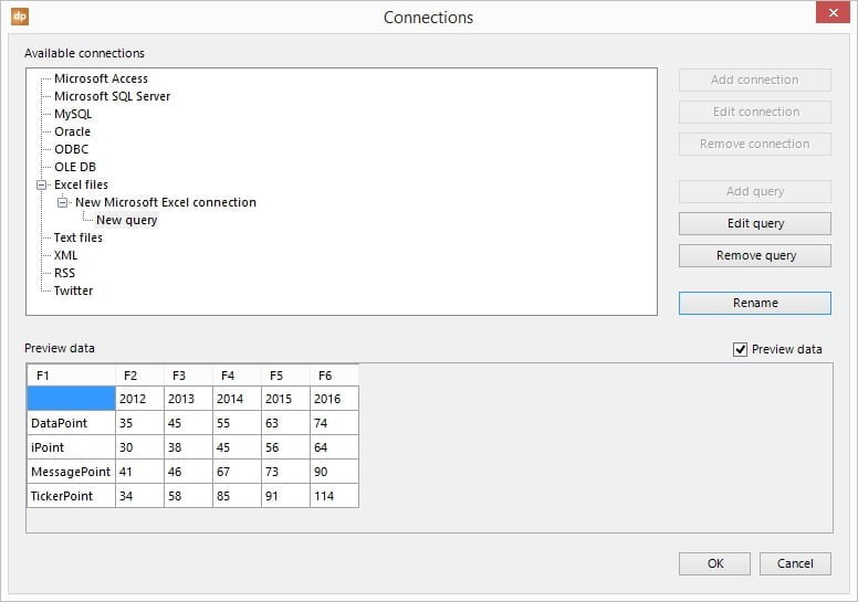
With DataPoint, we click the List button of the Connections group.
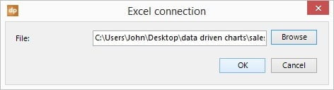
We select the Excel files node and click the Add Connection button.
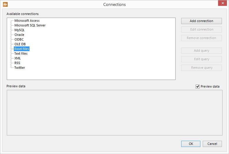
Browse to select the Excel file and click OK to close.
Then click the Add Query button and select Sheet1 as the active sheet, change the range to A1:F5 to embed all our data, and lower the refresh interval to 1 second.
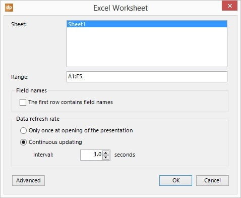
Hit OK to close this form. When you return to the connection list, you will see a preview of the data already. This data we want to show in a chart on a slide.
We now have completed our first step. Linking of a PowerPoint presentation to a data source. Now, let’s move on and link the information to a chart.
Insert a normal chart to your slide
Now comes the easiest part of this article. Just insert a normal chart on your slide. Nothing special here. For those who haven’t inserted a chart before in a PowerPoint presentation; here are the steps to follow.
- Go to the targeted slide or add a new slide to the presentation.
- Then from the PowerPoint menu, click Insert and then the Chart button of the Illustrations group.
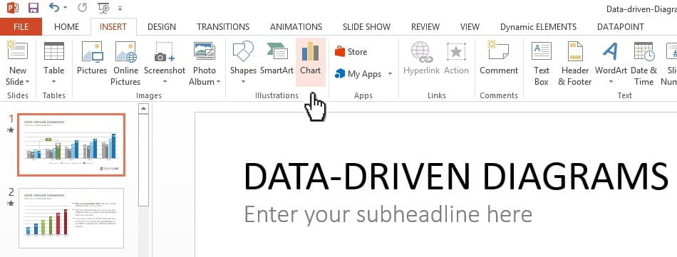
- This pops up this form.
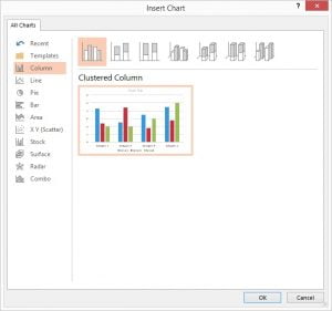
- Select the chart type to be use. Most used chart types are; column, line and pie.
- Click the OK button when you have selected a chart type.
- A new chart object is placed on the slide. Then the user can further customize the chart with title, legend, colors etc.
The inserted chart holds some sample data. A chart comes with 2 objects. The first one is the chart itself. This is easy because this is the visual part of the chart. But the data used in the chart, is stored in the second object, called the datasheet, which is typically not visible at run-time.
To edit the data of the chart, or the data of the datasheet, select the chart and click Design, Edit Data from the PowerPoint menu. This opens the datasheet that looks identical to a Microsoft Excel worksheet, with rows and columns.
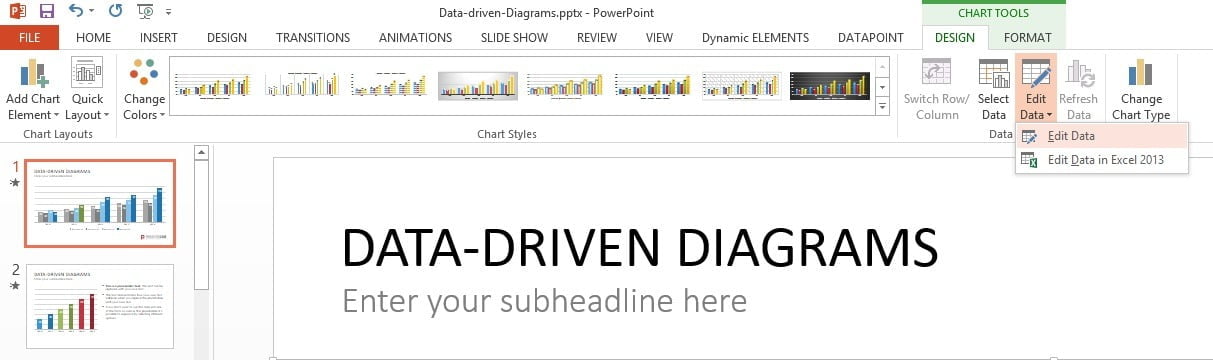
Just add new information or change the values of the existing cells to update the visual chart.
The changing of the data of this chart, can be automated by DataPoint. DataPoint will continuously update the data of this datasheet, based on the data that was found at the connected database.
Link the chart to your data query
Now, the last step for our data driven and real-time charts, is to link the chart to our data query. This is the most important step of course, but it is very easy.
Make sure that the user has selected the chart that we have inserted at the previous step. While the chart is selected, click DataPoint and the Chart from the DataPoint menu. We will get this screen:
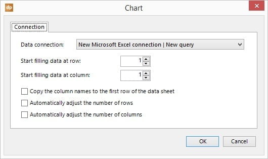
Since we only have one data connection and one query in this presentation, we don’t need to change the default settings. Click OK to link the static chart to the DataPoint connection and then this chart becomes a full data driven chart, always connected to the data source.
Open the Excel file on another computer and change the data in it. Each time that the user wants to change the data and save it, DataPoint will detect this modification and update the chart’s datasheet accordingly.
Conclusion
We have now successfully linked the PowerPoint chart to a dynamic and changing data source. There are 3 options to use your data driven presentations now.
- For personal or business use; when the user opens the presentation, DataPoint actualizes the linked information. So the user will not be looking at old data in a forgotten presentation. Each time that the user opens the presentation, the data is updated with the latest information. As if the user has a presentation view on the data.
- On a real-time notice board or information screen: run the presentation as a slideshow so that each slide is shown for a certain number of seconds, over and over, with no ending. So this is not the typical sales presentation where the user interactively click to the next slide or the next animation. No, this is a presentation that is designed to run forever; automatic advancing of the slides, and animations that are triggered on time, not on clicks. With this information screen here, the user can display the chart’s information in real-time. No need to stop the presentation in order to update the data.
- Generate snapshot presentations for distribution. In DataPoint the user can click the Snapshot button, which will generate a new presentation, based on the latest information. But at the end of the snapshot generation, DataPoint will remove all dynamic links from the presentation. So that people that receive the presentation, have no possibility to connect to the databases and other data sources. All is disconnected and static now, but it holds the latest information.


Hello,
Is there a way to link the chart in one slide to data in another slide so that once data is updated the chart is linked and updated simultaneously?
Guess not. You can have 2 charts on 2 different slides and have it linked to the same data source, and see the latest information on both slides. But one chart linked or the same as the other one (for performance reason I suspect, right?) is not possible.