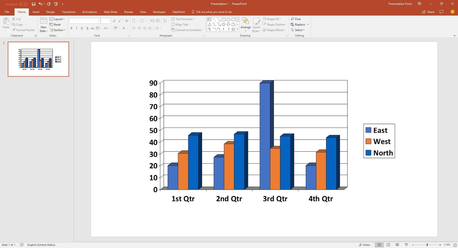
Charts are great to visualize data. Look at a simple bar chart. It visualizes information and immediately plots the information on an X and Y axis. Products compared to countries, teams compared to productivity, and so on. Or a pie chart. See what part of the pie is there because of you.
A historical overview of charts in PowerPoint
Not sure when exactly graphs were introduced in PowerPoint. But when we started with PresentationPoint and we started to build DataPoint, that was officially released in 2003, PowerPoint 1997, 2000 and 2003 were using the Microsoft Graph engine to visualize charts on your slides.
With the new release of PowerPoint or Office 2007, a new charting engine was introduced in PowerPoint. It exactly looked like the better charting engine of Microsoft Excel.
Charts in DataPoint
Charts in DataPoint were working fine from the birth of DataPoint in 2003. Technically spoken, we were using the Microsoft Graph engine. With the introduction of the new charting object in PowerPoint 2007 (based on the Excel charts), it was technically not immediately possible to move from the Microsoft Graphs to the newer charting because of the lack of the technical or programmatic possibility to automate the new charting object.
Thru the years, Microsoft improved the programming capabilities of the newer charting object. And the big advantage of the newer charting objects were the much better looking charts and chart types.
Till today we never had a good replacement of the newer charting object to replace the older Microsoft Graph object, and this because of one reason. When the data on the datasheet of a given chart is updated by our code, you will always see the Excel-like datasheet opening and flashing. For real-time and data driven slideshows, you can imagine that we don’t want to see a datasheet flashing on top of our slideshow or on our screen. We have been working hard to avoid this, but without success and even worse, it caused charts to get corrupted.
Current status
Our DataPoint technology is totally depending on the PowerPoint features that the Microsoft team provides. When we are missing functionality in PowerPoint, then we can develop a tool like our DataPoint product, to extend the standard functionality of PowerPoint, that serves our needs. But we cannot influence the existing features of PowerPoint itself, since we are not in control of the source code.
We are working with Microsoft’s development team on this charting automation failure that we experience and we hope that Microsoft is coming up with a fix or workaround soon. We hate to see that our clients are getting corrupted slides because we try to avoid the opening and flashing of the datasheet.
Therefor we made a very drastic decision. Believe it or not, but we integrated the old Microsoft Graph object back in your DataPoint. The good news is that the older Microsoft Graph object is still present in the current Office 2016 installation and earlier versions, probably because of the backwards compatibility.
Choose between Charts and Graphs
You can still use the new charting object to display real-time charts on your slides. But you will see a datasheet flashing whenever DataPoint is opening the content of the chart’s data. For online presentations, or in other words, when you run a PowerPoint slideshow on a dedicated computer or television screen for your audience, and you want to avoid seeing that worksheet, then you have to use the ‘older’ graphs.
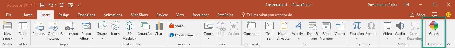
How to insert a Graph on your slide
With the latest version of DataPoint, simply click to open the Insert menu of your PowerPoint ribbon. At the end of the original buttons, you will find a new DataPoint group with a Graph button in it. When you are on a slide, just click that Graph button and it will insert a new default graph object for you. This behaves just like the new Insert > Chart option.
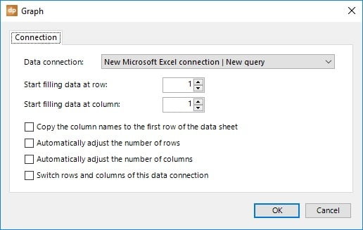
When you have set up a data connection to a data source of your choice, and you have this graph object selected, then click DataPoint and then the Graph button to assign the data of the data connection to this chart/graph.

This graph object can perfectly be used in your slideshow to display real-time information as a bar or pie chart. But, biggest advantage, you will not see a datasheet with your information flashing on your screen.
Question when you edit graph
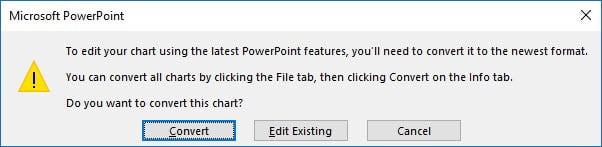
Each time that you click to edit a graph object, PowerPoint will ask you: ‘To edit your chart using the latest PowerPoint features, you’ll need to convert it to the newest format’. Choose Edit Existing here to keep using the Microsoft Graph object.
PowerPoint will ask you this every time. If you find this annoying, and you want to keep on using graphs, then maybe disable this asking. To do so, go to the registry and add a new key (DWORD) named MSGraphEnable to this path below, and set its value to 1.
\HKEY_CURRENT_USER\Software\Microsoft\Office\16.0\Common\Charting
The value 16.0 here stands for PowerPoint version 2016. Use 15.0 for PowerPoint 2013, and 14,0 for PowerPoint 2010.
Conclusion
We are sure that the newer charting shape that was introduced in PowerPoint 2007, and further developed by Microsoft for the newer PowerPoint versions, is much better for all of us, compared to the older Microsoft Graph object. But, as we have learned, the updating of the datasheet without the datasheet flashing, is technically impossible at this moment and causes corruptions.
We are continuing our search, together with the Microsoft PowerPoint development team, to find a way to update the data of a chart, without flashing the datasheet on your television screen. Hope that this will be available soon. We will let you know when when we have more news on this.