Semaphores are visual signals and are a clear and direct impression of the situation. In Excel and the database the user keeps the raw numbers but when the present data to the audience then the user don’t use that raw data at all. When a number like 82 is climbing to 84 in a data driven presentation,the user probably don’t notice it updating. When the user would analyze the critical conditions and use colors for example, then a change from green to red will get the immediate attention. That is why semaphores are great. A semaphore is a direct representation of the data where the user immediately see the status it is in. Let’s work out an example where the user uses traffic lights to represent a condition of our stock of products that we have in our factory or shop. We have an Excel document with our products and its current stock. Next to that we know when our stock becomes critical so that we have to order or fabricate additional items. Our basic spreadsheet with stock information could look like this:
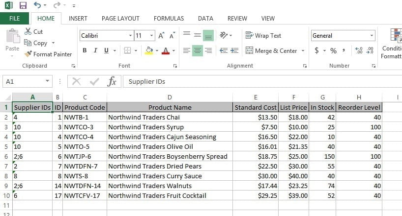
The last two columns are important. The column In Stock represents the number of products that we have physically present in our factory or shop. When our number in stock drops below the Reorder Level then we have to order a new quantity of products from our supplier. With this information we can feed our webshop and sales team for product availability but also alert our manager to buy extra articles.
If we would add semaphores now in a data driven presentation, then we have to calculate the condition here in Excel or in our database. Let’s imagine 3 conditions; green, orange and red. Green is enough quantity in stock. Orange as a warning level to alert an upcoming order and red when we have a stock problem. We add one column to the Excel document and we use the Excel IF function to evaluate 2 numbers. We compare the In Stock value with the Reorder Level value. The IF function allows us to evaluate those 2 values and do something when the condition is true and otherwise to do something else when the condition is not met. In programming terms this is the often called IF THEN ELSE. Here we will use 2 IF functions because we have to check for 3 possible values. So we will check the first condition. When it is not met, then we check for the second condition and in case both conditions are not met, then we assume the 3rd possible value. Each of the 3 comparisons will deliver a condition text. At the new column we use the following formula:
With this formula we compare the value of In Stock with Reorder Level, being in Excel cells G2 and H2 for the first product line, and when we have less stock than the level that we should have, then we display the text red. Otherwise we execute another IF function and compare if both values are equal to display orange and otherwise we display the text green.
Now we copy this formula downwards for all products so that it looks like this:
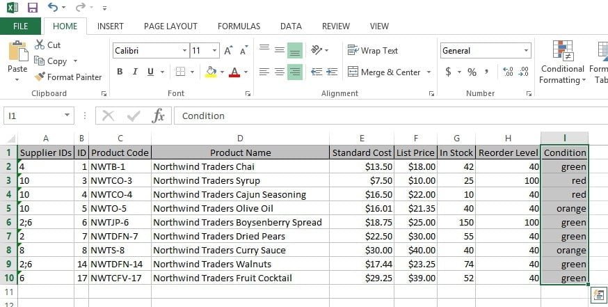
So now we have a calculated field in Excel. Each product now has a red, orange or green status. By the way, we do not need to use words for this condition. We could also use numbers or codes like 1, 2 and 3.
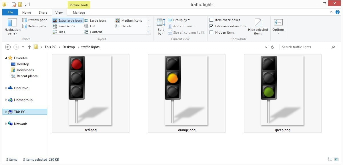
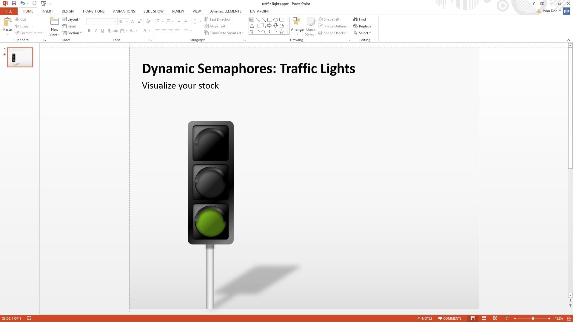
Now we are saving this Excel document and we move over to PowerPoint to create a real-time presentation with data driven semaphores. The semaphores that we are going to use are traffic lights. We have 3 images like these below, one for each condition. So we have an image of a red traffic light for our alert situation, another image of an orange traffic light for our warning level and the third image of a green traffic light for the normal conditions.
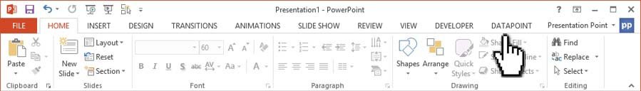
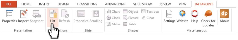
We start with a new presentation and we use DataPoint to make a live connection to the Excel document. Click DataPoint in the PowerPoint menu.
Now click the List button of the Connections group.
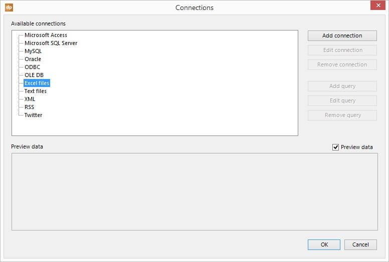
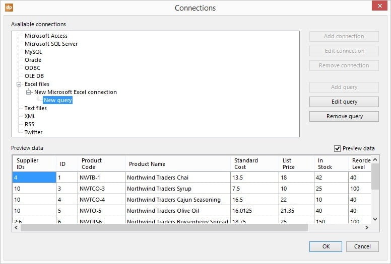
Navigate to the Excel files node and click Add Connection button.
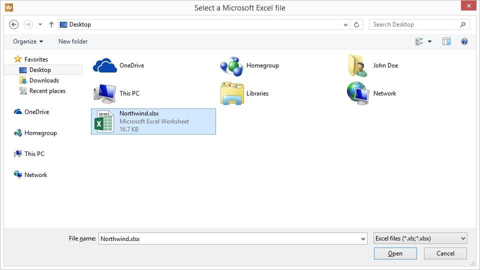
Browse and select the Excel data file and hit Open to use it.
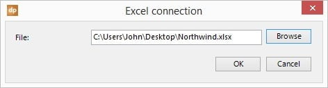
Click OK to close here.
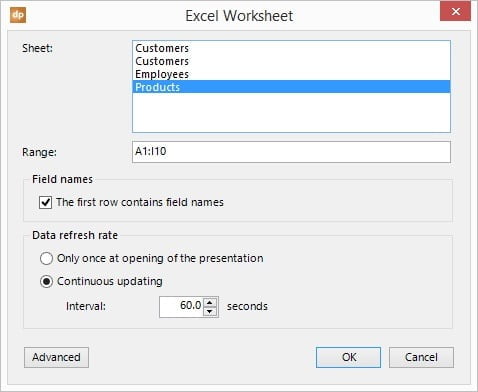
Now this file is available in DataPoint but we have to read out the datasheet before we can use it. Click the Add Query button. Set the Sheet to Products and update the Range to A1:I10 to represent all our data. The user can set a larger range when the user expect more products in the future. Empty rows are ignored for now. Also check the option The first row contains field names.
Hit OK to add the data query to the DataPoint connections list. The user will see a preview of the data here.
Click OK to close. Now insert a normal picture on the slide. Click the Insert tab and click the Pictures icon.
The user can insert the green traffic lights picture that the user have or maybe an image of a traffic light without colored lightbulbs.
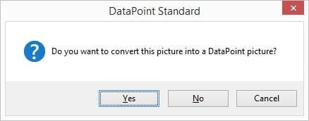
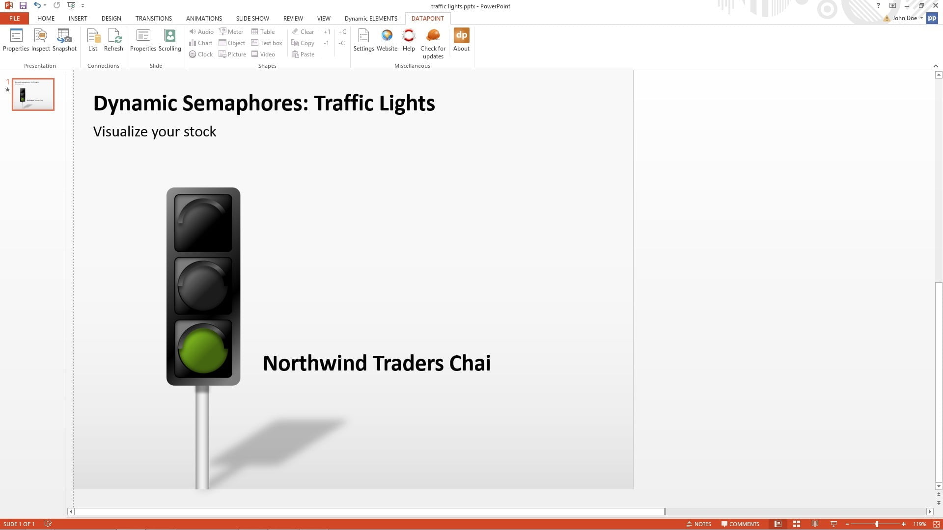
Perfect. Now we can make it dynamic and link it to the Excel data dynamically. Select the newly inserted picture and click DataPoint and choose Picture of the Shapes group.
It will ask the user to convert the image into a DataPoint picture. Choose Yes here.
Then check the Data connection. The default one will be ok since we only have one connection in this presentation. Set the Column to the Condition field. At Options check the Filename only option for the The data of the selected column contains option. Set the Folder to the folder where the user have stored the traffic light images and set the Extension to png because that is the extension of the images we have in this example.
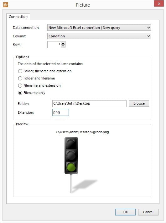
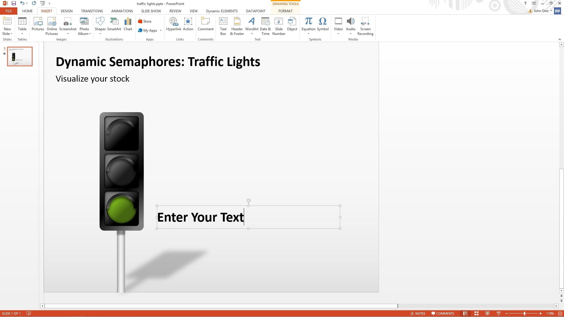
Click OK to close. We have now dynamically linked the condition of the first product to the traffic light. Let’s add a text box next to the image to display the product name.
Click DataPoint and then Text box from the menu. For Column select the field Product Name and hit OK.
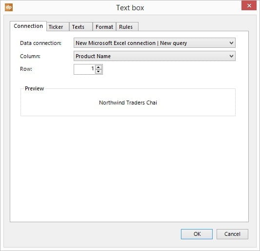
The text box is now displaying the name of the product that we are visualizing.
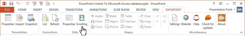
Now we are displaying the information of the first article or product in our Excel, but we have multiple products that we want to show. Go to the DataPoint menu and click the Scrolling button.
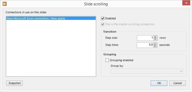
Select the data connection and check the Enabled option. Leave the Step size to 1 and leave the Step time to 5 records. Click OK to close.
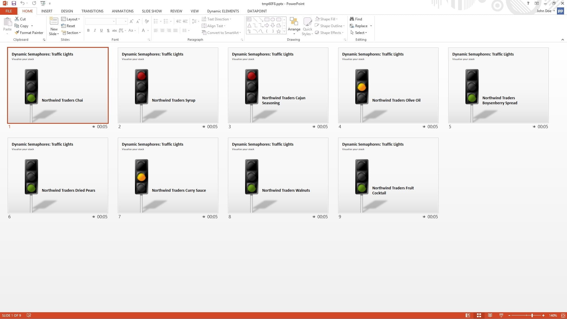
Start the slide show. This will display the corresponding traffic light and the product name of each product 5 seconds long. So it would alternate thru all product records that we have. This option is ideal to show on a real time production display monitor in our factory or office. When the user wants to print or distribute this presentation then generate a snapshot presentation which would create a new presentation with 9 slides; 1 slide per product with its status info. Next to traffic lights there are dozens of other semaphores that the user can use to visualize the data in PowerPoint. All semaphores can come to live with the DataPoint for PowerPoint add-on.
Now, as said before, the user will get a clear indication of the stock level present in the factory and when something changes the user can react accordingly.