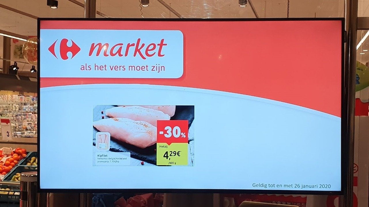
This hurts! It is a digital signage screen in a grocery store that I frequently visit. They are not running our software, and I’m not discussing the choice of software here. I’m talking about the screen and the design that they are using. Let’s make an inventory of this.
Header is Too Large
The red shape and logo at the top are considered to be the header. This header is taking almost 50% of the screen. Why does it need to be that big for people that already what shop they entered? This is not a billboard next to the highway to promote this shop or brand. This is on a screen visible to people that are already in the shop.
Header is Half Empty
And even in this way too large header, we see that more than 50% of the red shape is not used at all. It is sitting there, but that large area on your screen is not being used.
Article or Promotion Too Small
The screen that is used inside the shop, is (AFAIK) meant to promote products and product combinations. So the most important message goes to the article itself. Look at that area. I guess that the promotion that is displayed here, is only 1/6th of the total screen. Their most important message is smaller than their empty header.
And honestly, it looks like it is cut from the weekly brochure that you get in your mailbox. You can probably recognize the product that it shows, and the pricing, but that small text there on the image, is not readable.
Still After Still
The image looks like a picture slider. There is no action or attraction happening on the screen. No flying in. No popping up. No transitions. No animations. Nothing at all. It is just showing a picture, and after a while the next picture is shown.
Bring in animations and transitions. Fly in the product and image. Display price. Display name. Emphasize the discount by using some catching animation effect. Whatever. But bring it to life.
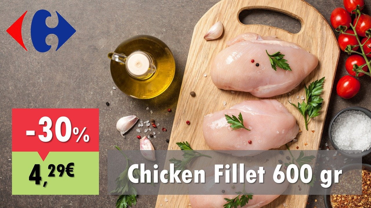
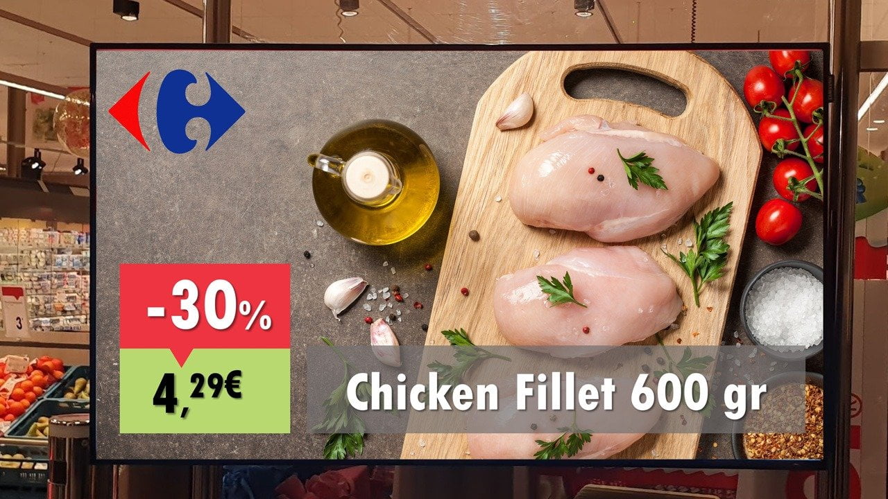
How I Would Design This
Check out the above picture. This is how I would do it. We still show the company logo (not the real one, just a dummy here), but we show the product or promotion as a full screen picture with a perfect high resolution. A picture that is clear; these are chicken filets. And here you are attracted (if you are not a vegetarian) or influenced to buy this product for dinner this evening, or later this week.
I added some animations to the pricing to pop it some more. And of course a transition effect when you go to the next slide. The screen is now coming to life, and every pixel of the screen is now asking you to take this product and put it in your shopping card. This screen is now selling that product.
Let’s take that first real picture again and now replace the screen with my presentation. See how this welcomes you. Don’t you think that this design is much better and appealing more?