Ever wonder what PresentationPoint staff do for vacations? Our founder, Kurt Dupont, donates some of his vacation time to cook for 150+ hungry campers at the nonprofit Chiro Youth Camp.
Being Kurt, he came back and created this nonprofit infographic dashboard in PowerPoint showing data from the experience. The video describes the information and what each point indicates.
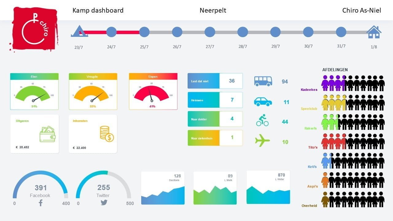
The nonprofit infographic dashboard is in Dutch so I will interpret the dashboard based on the translation given to me by Kurt.
Chiro Youth Camp
The organization Kurt volunteers for is called Chiro. Chiro is a Belgian youth organization with over 100,000 members. Fortunately, Kurt didn’t have to cook for all 100,000 members, just the 150+ campers and counselors at the camp.
Timeline
At the top of the infographic is the timeline. Campers arrived on July 23 and went home on Aug 1.
Groups
At the right side of the image, you see the different subgroups from Chiro and how many attended from each group.
Transportation
Next in from the right is the transportation info.
- 94 came by bus
- 11 came by auto
- 44 came by bicycle
- 10 came by plane
Feedback Meters
In the left-middle of the dashboard are 3 meters showing:
- Liked Food – 91%
- Happiness – 85%
- Sleep – 41%
So the food was a hit (Kurt’s must be a good cook!) and campers had a great time, but sleep appears to have been an issue. Probably common when you have a lot of young people together at an event with high excitement levels.
Other Camper Indicators
In the center are some other indicators from campers:
- 36 campers didn’t like some parts of the food
- 7 were homesick
- 4 children did need to see the doctor
- 1 did go to the hospital – hopefully with nothing serious
Funds Collected and Spent
Below the feedback meters are the funds raised and funds spent.
Social Media Nonprofit Infographic Dashboard
On the lower left, Kurt has created meters showing how many people mentioned the camp on social media:
- 391 on Facebook
- 255 on Twitter
Sound and Fluids
In the lower middle are some graphs showing some additional information:
- Decibels – the sound level when measured was 128 decibels. Apparently, kids camping can make a lot of noise
- 89 Liters of milk – the camp went through 89 liters of milk
- 870 liters of water – and the campers drank 870 liters of water to stay well hydrated
Connect Nonprofit Infographic Dashboard to Live Data
A nonprofit infographic dashboard like this can be connected to live data using our DataPoint software.
Great Fun!
As you can see, Kurt had fun at camp and with creating the dashboard.
So if you need a recipe for pancakes for 150, or any help with creating data dashboards, Kurt’s your guy! 😀