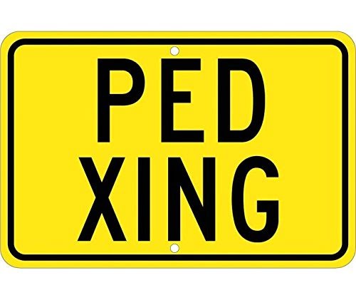
Designers of traffic signs and wayfinding signage in public buildings need to put in a lot of thought into designing wayfinding signage that is easy to process by people who frequent the location. Texts used to be widely used in the past when designing public presentations but using texts only has proven to be counter productive, to say the least. Take the picture above as an example. The “Ped” text in the sign refers to pedestrians while the “Xing” refers to the crossing. This type of signage is very confusing if you are not fluent in Chinese Mandarin texts and Xing is actually the Chinese word for crossing. Unfortunately, most non-Chinese speakers will drive past this type of sign without giving it a second look since it won’t make any sense to them. As for the “Ped” sign, only a few people will be lucky enough to guess that it stands for pedestrians.
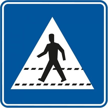
While the sign above is a good example of a very bad wayfinding signage, this one below is easy to understand and conveys a message that can be easily processed by locals and visitors alike who drive through the area where it is stationed. At first glance, you can tell that the sign is simply notifying motorists that pedestrians may be attempting to cross the road hence the need to reduce vehicular speed.
If you are planning to design traffic or public wayfinding signage of significant consequence, it is much better to use visuals to convey your message rather than the use of texts. Here are some of the reasons why visuals are much better for design presentations and why you should use them more often.
It is easy for users to process Visuals faster than text
According to research, humans are able to process visuals ten times faster than when they read a text. With visuals, the intended message is processed, understood and acted upon very quickly and this can be very advantageous when communicating potential traffic hazards to road users.
Visual wayfinding signage increases user interaction
Pictures are a lot more attractive than text because they are easy to process and they come in different color patterns. The human eye and brain are attracted to colors hence their deployment on a larger scale across major routes. Due to their attractive benefits, road users take a keen interest in visuals than they would with text signage.
Communicate potential risks
When communicating potential traffic risks in detail a lot of text needs to be broken down into several sentences that may or may not be understood by road users. In fact, some text signage conveys a lot of information that will require passerby to stop and read them in order to process them better. As we all know, this is not always the case as everyone always seem to be in a hurry when on the road. Not paying attention to traffic signs can be risky but to make sure that your signs are given the attention they deserve, pictograms and symbols can be used to convey messages in seconds that texts may not do in minutes.
Language barrier
This is one of the main reasons why visuals are better than text for conveying short but relevant information. Foreigners visiting a country who may not be able to read words in the local language can be at a disadvantaged position when analyzing traffic signs. Using colorful and informational visuals is indeed an effective way to ensure that they understand what is required of them when driving through public roots or navigating public buildings and premises.
To counter the problem of the language barrier and other signage limitations, you should consider using visuals in place of texts for your presentations. With bold and colorful visuals you can be sure that the message you are aiming to convey will be better understood by pedestrians and motorists alike.