In this video and article, we are going to show you how to add real-time Coronavirus data or any other real-time data to PowerPoint using our software tool, DataPoint.
Finding Coronavirus Data
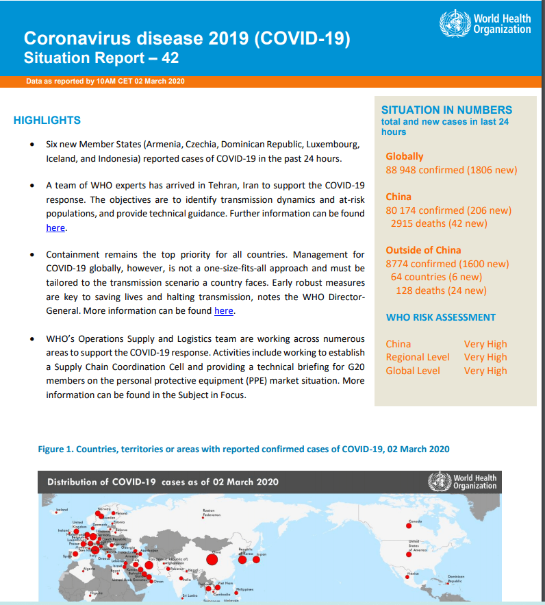
The first step to displaying any real-time data is to find out where to get the data. The most up to data Coronavirus data comes from the World Health Organization (WHO). WHO releases daily updates on the Coronavirus here.
When you open up the daily report, you will find an overview from WHO.
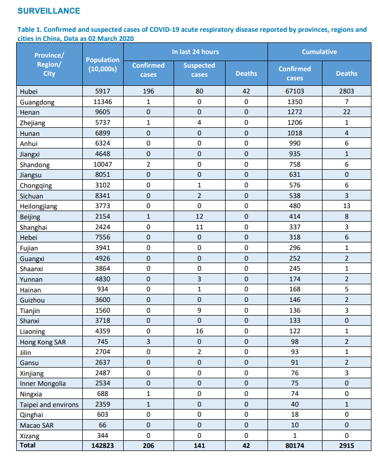
I don’t have access to the raw data tables because I am not a government agency or a health organization, so I copied the data into my own excel spreadsheet to make this video. But it is best to get a real-time connection to the live data whenever possible.
The next step once you have your data source is to open PowerPoint, create a slide and then open the DataPoint tab and click on List.
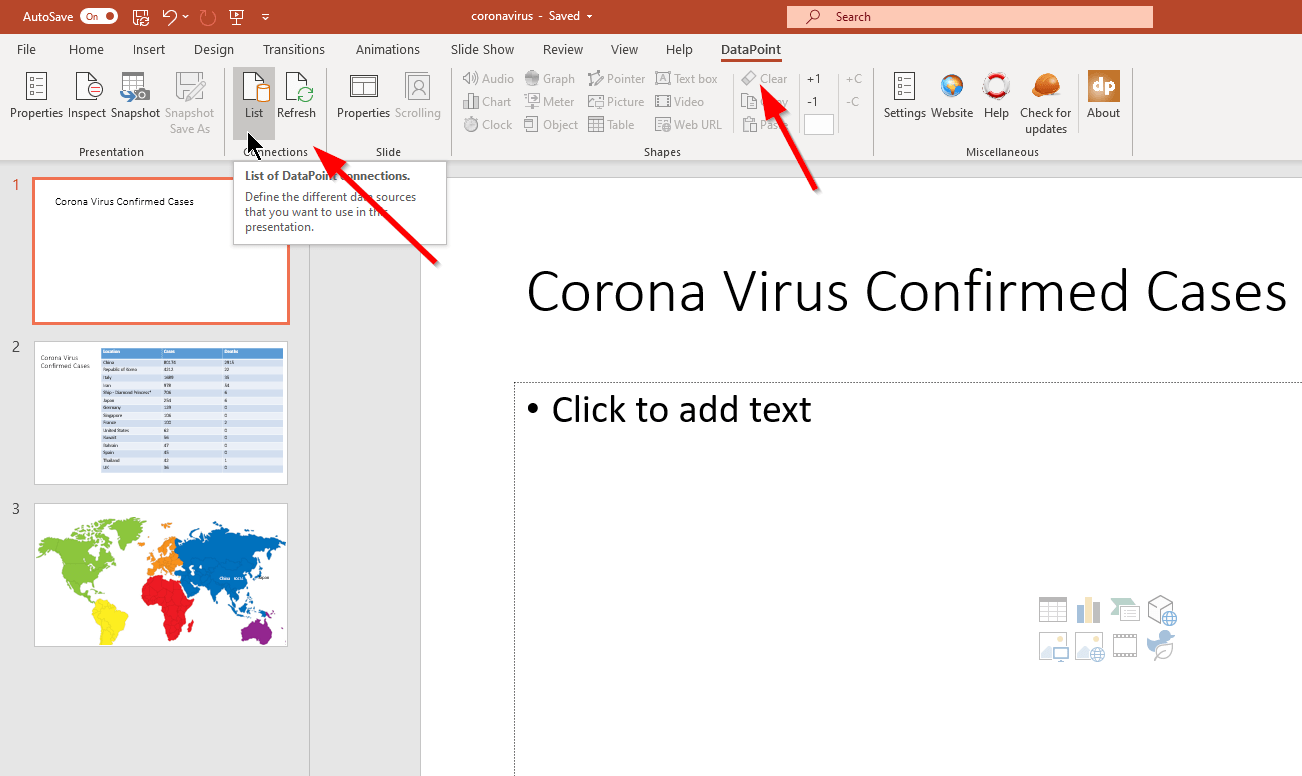
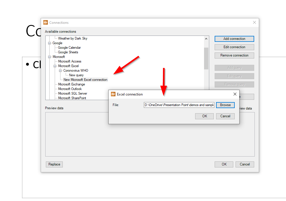
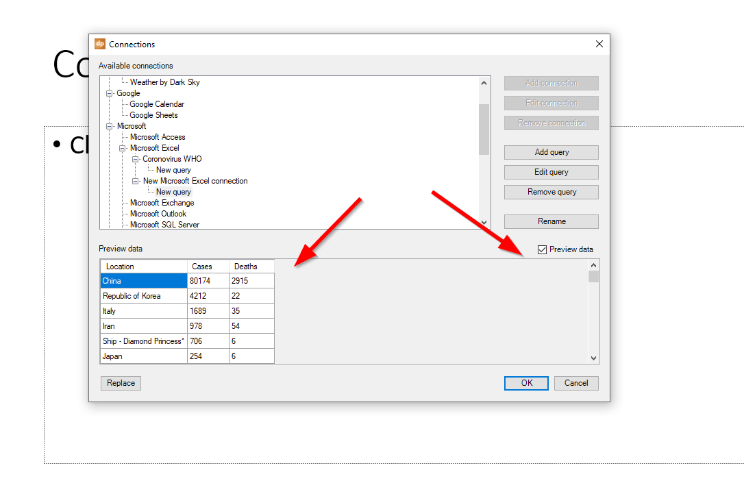
Now we view scroll down the connection list until we find the data type – in this case a Microsoft excel spreadsheet. We click on this option, then click on Add Query.
As a best practices, we suggest you name your connections and queries. If I am only working with a single slide with a single data connection, this may not seem necessary, but as your PowerPoint presentation grows and pulls in data from multiple sources, it will take extra time to look through all the connections if they aren’t named.
If you want, you can also sort the data within DataPoint. This will work no matter what sorting is applied in the original data sort. Just click on the Advanced button on the query then on the Sort tab to apply the sort. In this scenario, I chose to sort by number of cases in a descending order so the highest number of cases would show up top.

If you have ticked the Preview box, the data will show in the lower left. I love this feature because it shows me if I have made the right data connection and if the query is pulling in the right data.
The next step is to add a regular PowerPoint table to your slide. Don’t worry about getting the number of columns and rows correct as DataPoint can handle that automatically.
You can use all the normal PowerPoint table formating, color and font adjustments in this area.
Now click on the table you created, then choose the DataPoint tab, then Table. The DataPoint table screen shows up. You can choose to have the first column copies over as labels and to automatically change the number of rows and columns.
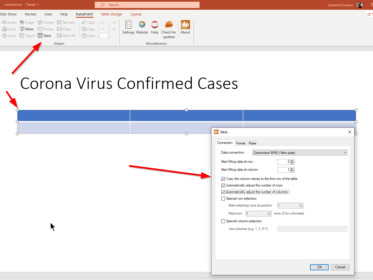
Now the data drops nicely into the table and adjusts the columns and rows. But there is one problem. The table is too big for the slide!
DataPoint has a fix for this. Click on the DataPoint tab, then choose Scrolling. This lets you choose how many lines of the table data to show at a time and how long between steps. Once you have set this and run your slideshow, you will see the table nicely paging through all the data in the increments you choose.
You have likely seen a similar to feature to this in airports where they need to show many different flights and they don’t all fit on the same screen.
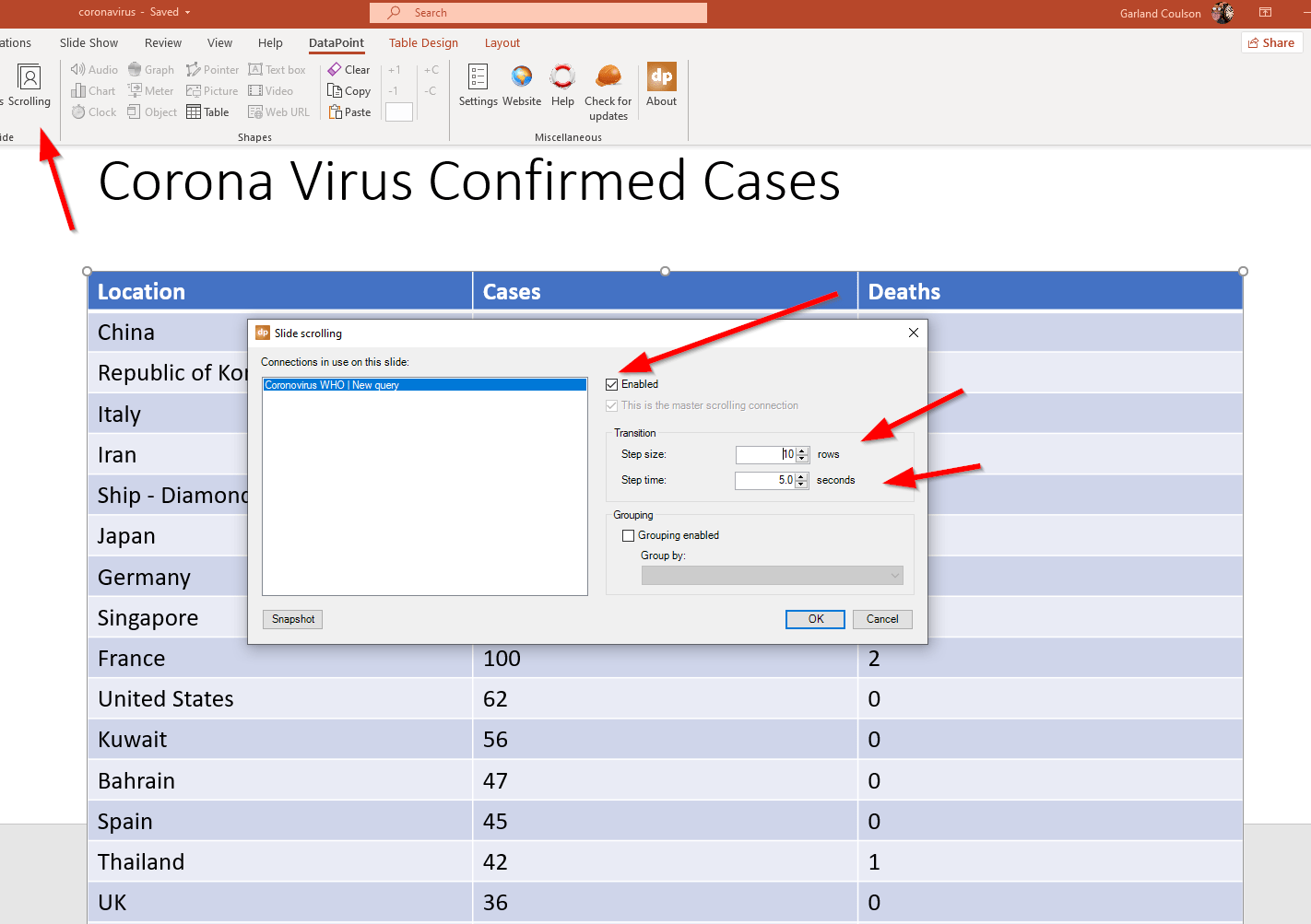
So now we have our real-time data table showing the locations of the coronavirus cases.
But what if we wanted to display the data in another way? What if we wanted to show the data on maps?
Here is a second slide with a world map background. In this case, instead of a table, we are going to add text boxes. I added a couple of text boxes with the names of some countries and then I add another text box and then click on the DataPoint tab, then the Text Box option to connect this text box to data.
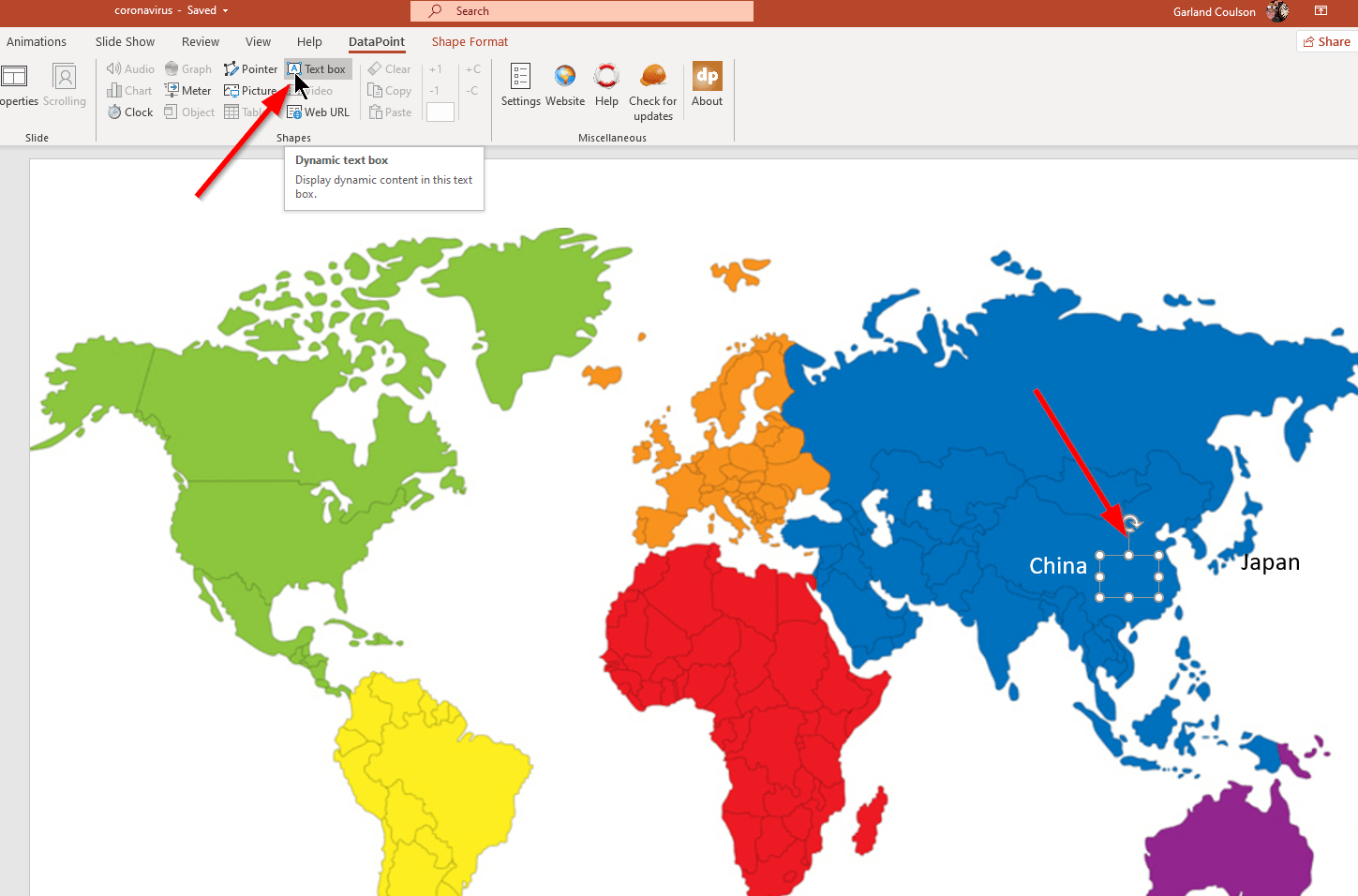
This lets me choose my data connection and which column and row the data for this particular country is in.
When I click on OK, the number automatically drops into the text box. You can then use PowerPoint’s usual features to change font style, size, color, etc.
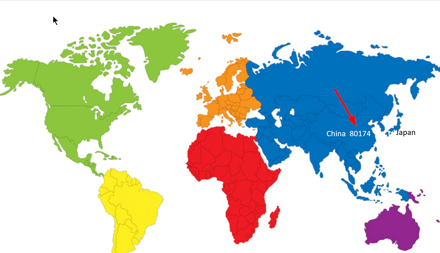
Now, the map and text box version of this will take a while to set up the first time, but remember that once you set up this map, it will automatically update as your data updates.
Any questions about how to use DataPoint to create your own real-time data tables or maps? Please contact us.