Our lives are filled with data. Step counters, sleep monitors, earnings reports, the list goes on. From the second we wake up, to when we go to sleep, we are consuming data.
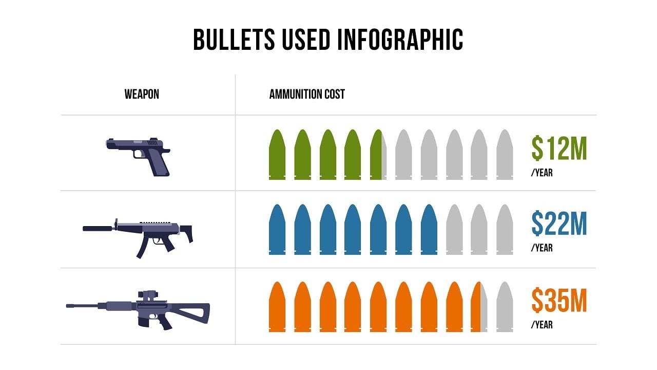
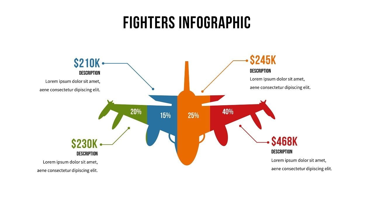
Not all methods of consuming data are created equal, though. This is demonstrated by the cringing that one experiences when they hear the dreaded words “Excel Spreadsheet”. Boring numbers, on a chart, inside tiny cells. While a handy tool for business and all sorts of other things, Excel Spreadsheets are dull. However, you throw that same information on a screen, in digestible, bite-sized chunks, with some cool graphical representation, and you can hold the attention of the viewer for MUCH longer.
This is the power of data visualization. Data is important. It’s how we learn and grow. Data visualization is taking data from a source, and then displaying it. Oftentimes, color, patterns, and charts are added to make the data more attention-grabbing.
Big Data is here to stay. Visualization is paramount to interpret the incredible amounts of new data created everyday. Data visualization takes data, and turns it into a story. It does this by turning data into something that is highly readable, and understandable. It shows trends, and patterns, seamlessly extracting the data it requires, and discarding the rest.
It’s not as easy as putting clipart onto a chart to make it look snappier. Real, useful data visualization is an art that combines form and function. A simple chart can be a snoozefest that no one will pay any attention to. If this is the case, the important information it’s trying to convey can fall of deaf ears, or in this case, blind eyes. What you see, along with the data, must seamlessly work together to tell the epic story it deserves.
All fields of study and work are made simpler and more efficient, with proper data visualization. Not only science and mathematics, but marketing, the service industries, sports, air travel. Frankly, the list could go on and on.
The applications of data visualization are endless. Thankfully, due to increasing demand, there are software companies that are producing incredible data visualization technologies. From tableau, and Power Bi—to DataPoint, by PresentationPoint.
DataPoint is a cool plug-in that seamlessly, and instantly transfers data from Excel, to PowerPoint. That means, once linked, boring Excel data is transferred to an exciting, and visually appealing PowerPoint presentation. DataPoint is linked to 25 different databases so it ensures the information is completely up to date, always.
Here are some of the cool ways DataPoint works:
- Connect your presentation to an external data source like a database, XML file, RSS feed, Facebook info, news, weather, Google Calendar, Google Sheets, JSON, oData, Microsoft SharePoint, OLE DB and ODBC.
- Link your text box, table, chart, tachymeter or gauge to this data source to display real time information.
- DataPoint always displays the latest information in your presentation.
- Use the data scrolling feature when you have more data than fits on one page.
- Enhanced rules and conditions to emphasize your information.
- Create snapshot presentations with disconnected data sources.
With data being produced at a more rapid rate than ever before, it’s time to start thinking about how you’re presenting your data. With so many great tools out there, decide how you want to tell the story of your data.


