

1.Introduction
DataPoint is PresentationPoint’s flagship product to display up-to-date information on your slides. Connect to any data source and start using its data on your PowerPoint shapes like text boxes, tables, pictures, charts and more.
2.System Requirements
Microsoft Office 2010 and up. Does not work with the free Microsoft PowerPoint Viewer application.
.NET Framework 4.7. Read full specifications here.
Supported Client Operating Systems:
- Windows 8
- Windows 8.1
- Windows 10
Supported Server Operating Systems:
- Windows Server 2008 SP2
- Windows Server 2008 R2 SP1
- Windows Server 2012
- Windows Server 2012 R2
- Windows Server 2016
- Windows Server, version 1709
3.Getting started with DataPoint
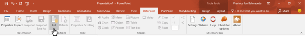
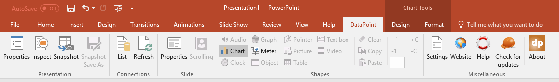
After installation, a new menu option with the name DataPoint is available in your PowerPoint ribbon.
Click DataPoint to open the DataPoint ribbon or menu for more options.
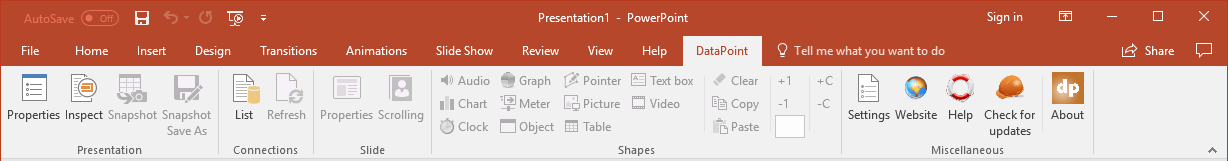
Look closely at the DataPoint ribbon and you will see a few groups of buttons.
Presentation Group
This group represents a few buttons directly related to this presentation. You can change some specific properties of the presentation, such as if you want to enable or disable data caching. Or you can inspect your presentation, or generate new snapshot presentations.
Connections group
This is one of the two most important groups on the DataPoint menu. Typically, you start here when you want to create a dynamic or data-driven presentation. Here, you set up the data connections that you want to use in your presentation. Or you can initiate a manual refresh of the connections.
Slide group
In this group, you will find buttons directly linked or related to the current slide. You can enable data scrolling for this slide, or just hide a slide when there is no data.
Shapes group
This is the most important and most used group of the DataPoint ribbon. First, you set up data connections for your presentation, then you link your PowerPoint shape on your slide to a given data connection. Note that most controls of the shapes group are enabled based on what type of shape you have selected. When you have no data connections set up, you can’t make a text box dynamic. Once you have at least one data connection, then you can do certain things; for instance, insert a table, select that table, and go into DataPoint’s table linking properties.
Miscellaneous group
Every application has a group where you will find all other buttons and functionalities that did not fit in the previous groups. Here, you can check out the version of DataPoint, the status of the trial or license, check for updates, and so on.
4.Connections
Start your Microsoft PowerPoint application and start with a new presentation.
Click to open the DataPoint tab.

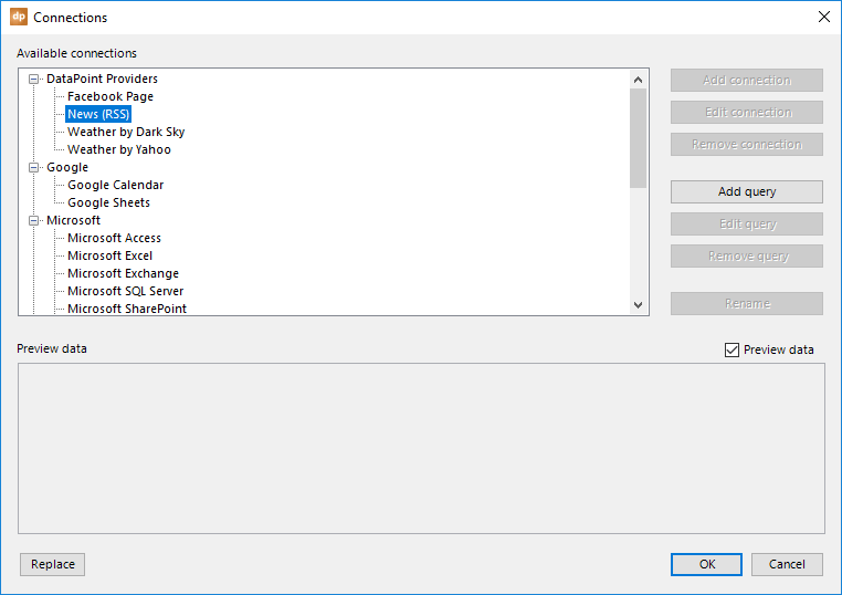
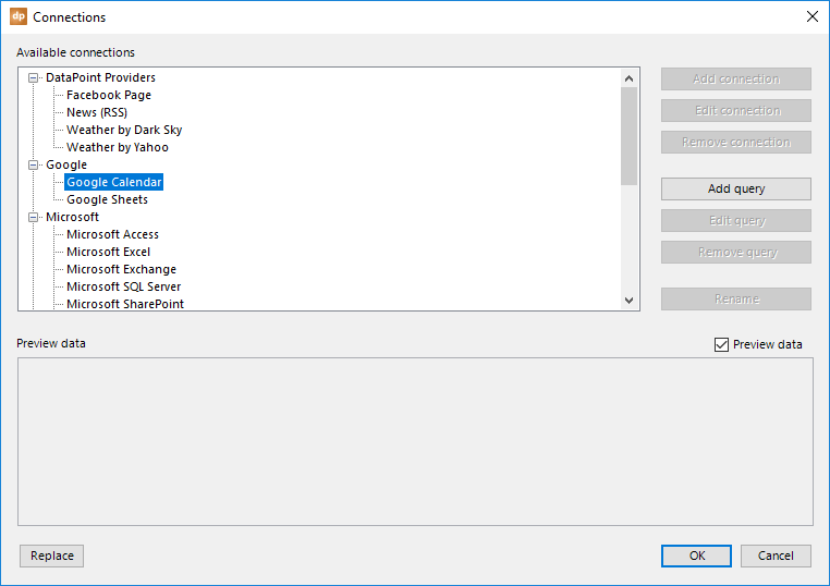
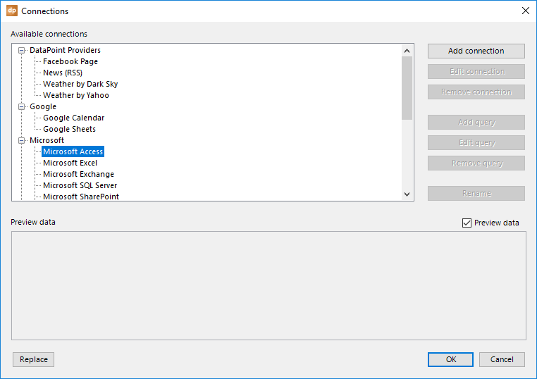
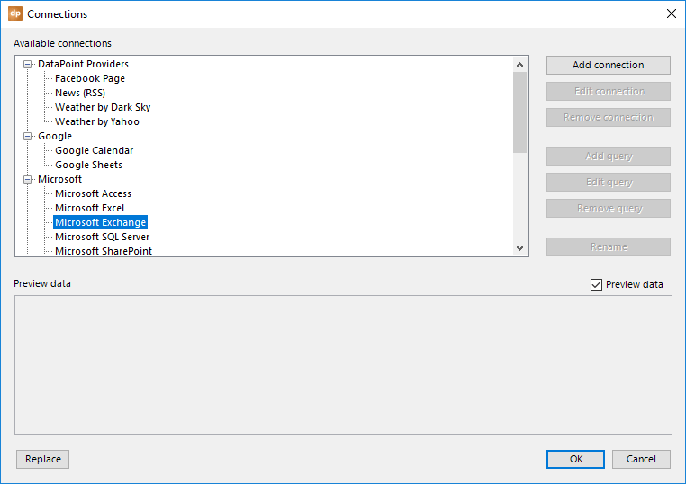
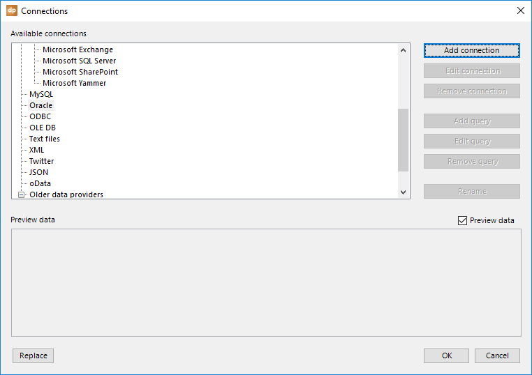
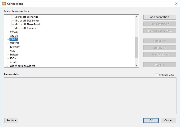
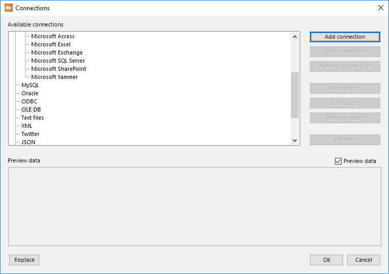
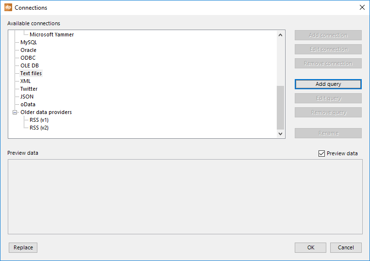
At the connections group, click the List button to open the data connections.
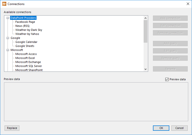
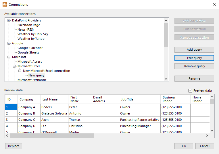
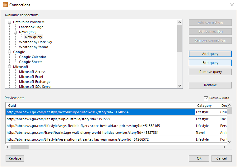
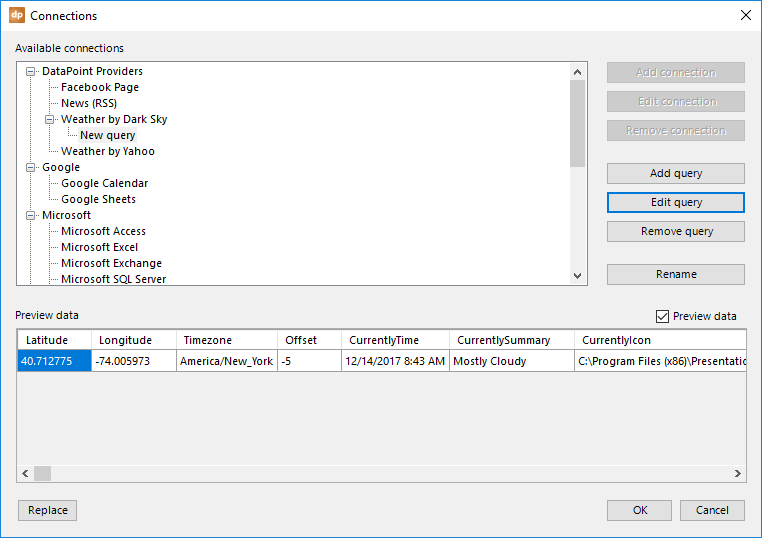
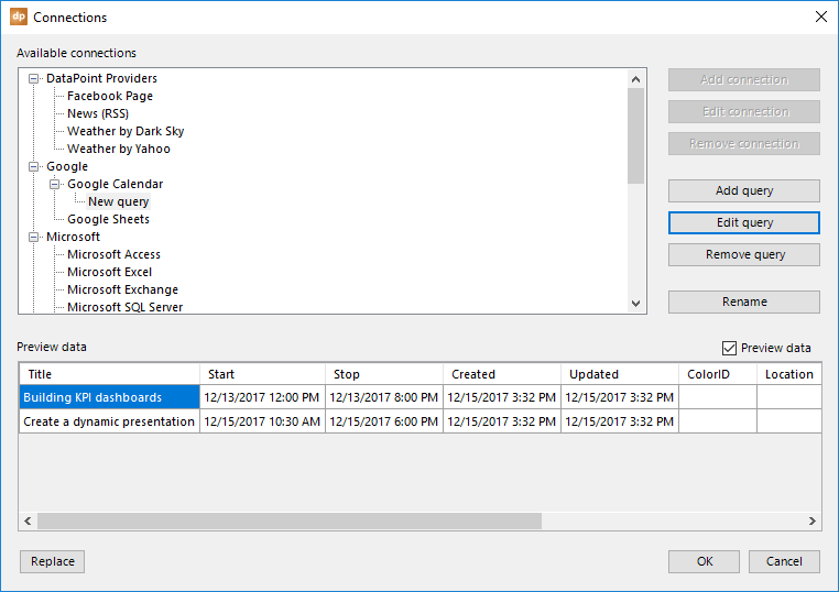
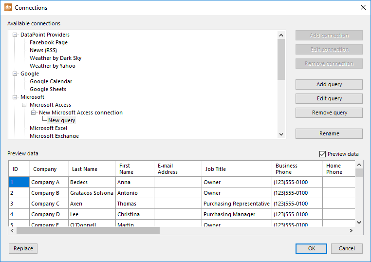
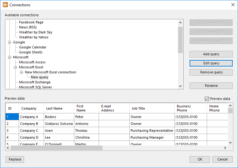
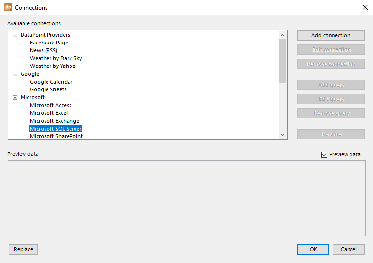
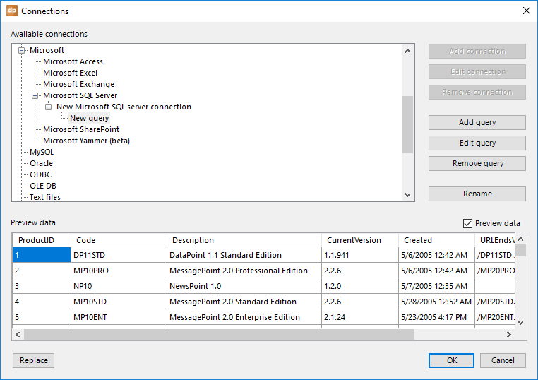
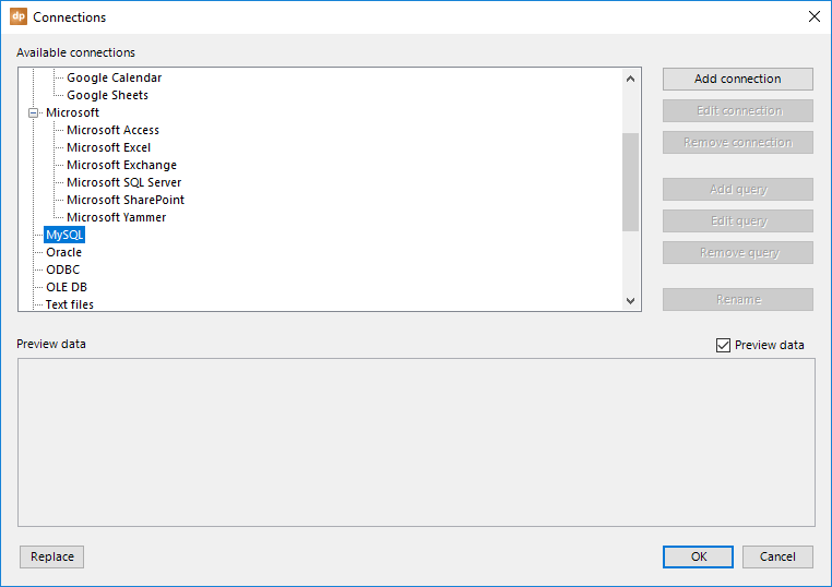
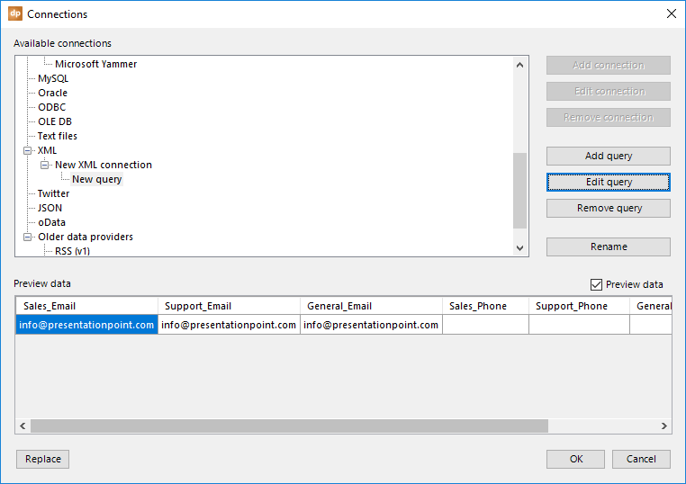
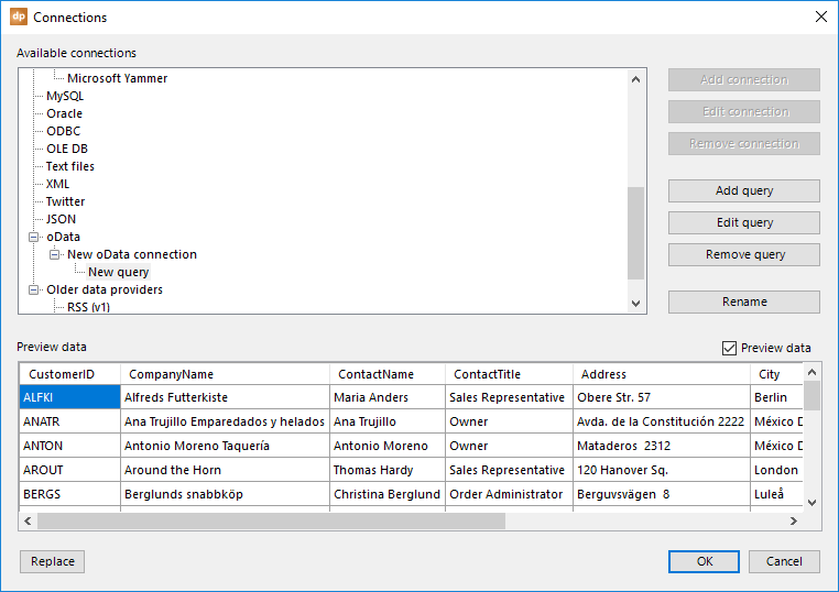
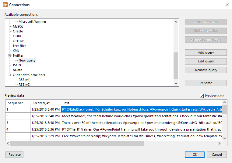
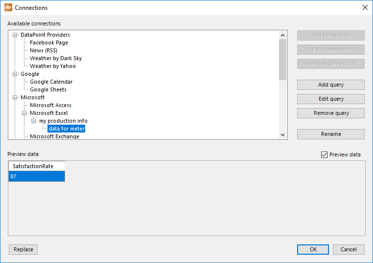
This opens a form where you can manage all of the data connections of this presentation. On the left side, you will see a large list of data providers that you can choose from. Each type of database, or each type of technology, has a specific data provider in DataPoint. If you want to link and show information from a Microsoft Excel file, then you select the Microsoft Excel node from the Microsoft group here.
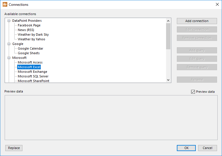
After the selection of a data provider, you will see that some buttons are enabled. After selecting the Microsoft Excel data provider, you can see that you can add a connection. Basically, you have three groups of buttons on the right. The first three buttons are related to connections: add connection, edit connection, and remove connection. Then, you have a second group with buttons related to queries. And finally, a rename button.
Note that most of the data providers will have a connection and then one or more queries. Think of it as a connection to a database with your username and password. And then, underneath the connection, you will have one or more queries pointing to tables, views, or custom SQL statements. Whether a connection and query level, or only a query level, exist depends on the chosen data provider. For instance, with an RSS feed, you only have a query level.
A connection for the Microsoft Excel data provider is basically a link to the physical Excel file that you want to use.
After the selection of the file, you will have a data connection. Then, you will see that you can add a query.
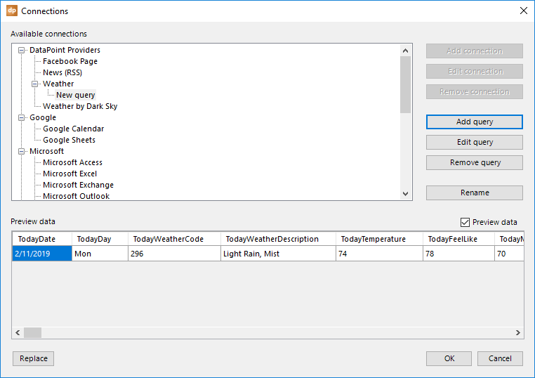
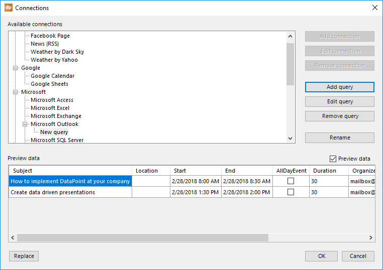
Click the Add query button and this form will be opened.

Within the Excel file, this level will give you some more options on what data should be read. For this Excel data provider specifically, you can choose which data sheet and what data range you want to use.
For every query, you will be able to specify how crucial your data is, which is very important for DataPoint. For hot data, you use a very low data refresh rate, maybe every 0.1 seconds. Or for less critical information, you can refresh the data every 5 minutes, or maybe only once at opening time. It all depends on your data and your display needs.
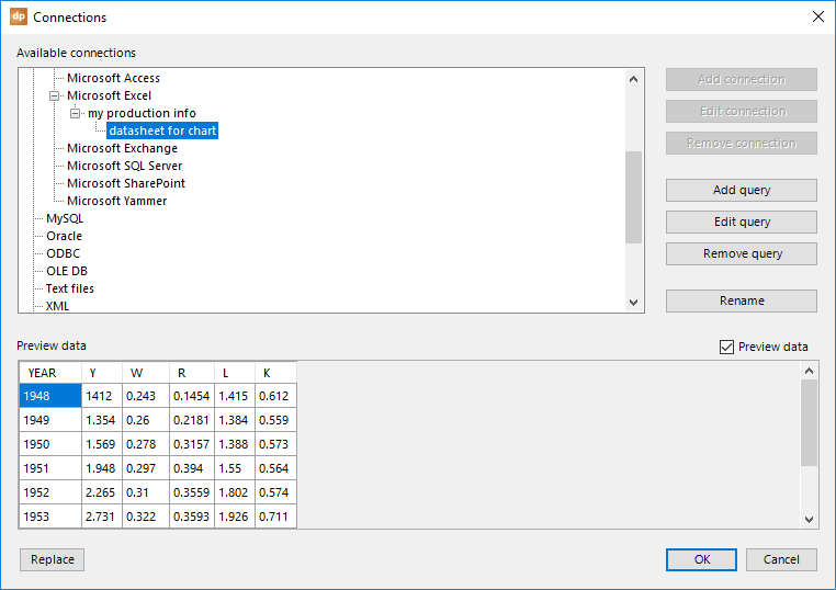
When you are done with setting up the connection and query, you will see a preview of the data in the preview area.
Uncheck the Preview data checkbox in the event that you don’t need the data to show up here. It will work faster.
It would be a good idea to rename every connection and query, and to use a more meaningful name. You will see the benefits later on when you are assigning text boxes to data connections, for example. To rename a given connection or query, simply select the node from the tree and hit the Rename button. Or, just click on the text of the node again to enter the text editing mode.
Finally, you have the replace button. If you want to do a mass find-and-replace on your drive letter, or a folder maybe, then use this button.
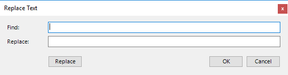
Specify the string to find and set the replacement text for each occurrence. Click the Replace button to execute your text replacements.
Refresh button.
The refresh button in the connection group will requery all of the data connections and refresh all of the shapes linked. This button is only needed in design mode. Note that when you are designing the presentation, automatic requerying of the data connections is disabled. This will give you better performance and no interference when you are designing your presentation. So, if you would like to see an update, or when you are expecting a data update, just click the Refresh button.
When you start the slide show, all internal timers to refresh data connections are active and working. During the slide show, DataPoint will look at the refresh options that you have specified, and refresh or requery the data connection accordingly.
Caching.
Our data caching technology is very powerful. If you have less critical information, like RSS feeds, or maybe information that takes a very long time to get into your database, then you could really benefit by caching the data.
Caching means that the data results of a data connection are written as a local temporary file on your hard disk. If you have set a data connection to refresh every 15 minutes, and you stop a presentation after a few minutes and restart it again a few seconds later, then DataPoint is clever enough to determine that a refresh of the data in the database or data provider is not needed. It can start with the locally stored cache file, which still holds accurate information. When you restart the slide show after a longer wait than your refresh rate, then and only then will a new physical refresh from the data provider be requested.
Now, we will go into specific details about each data provider.
4.1.Facebook connections
Use the Facebook data provider in order to display some general information on a page or company — name of the company, address, telephone number, numbers of likes and checkins, etc.
Select the Facebook Page data provider and click the Add query button.
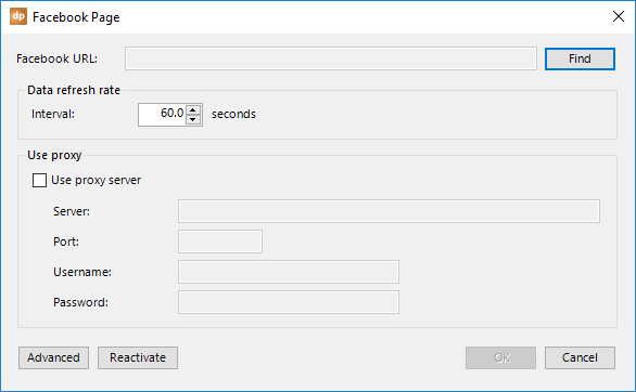
Next, click the Find button to locate a specific Facebook page.
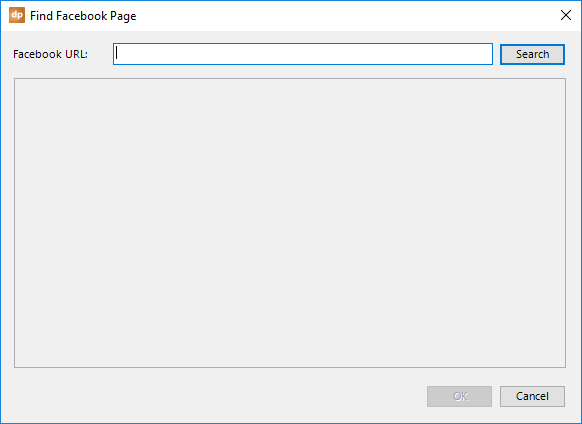
Here, you will enter your search terms to find a given page or company. Enter one or more search terms and click the Search button.
When you execute this for the first time, a browser page will be opened where Facebook asks you if you grant DataPoint access to your Facebook account.

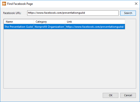
Select the page that you want to monitor and click OK to close this selection.
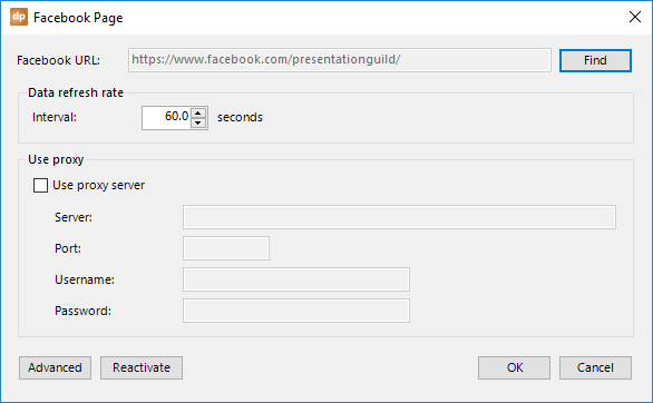
With these default settings, DataPoint will requery the Facebook information every 60 seconds. You can always change this interval based on your requirements.
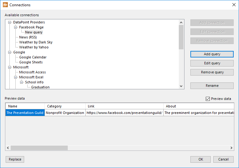
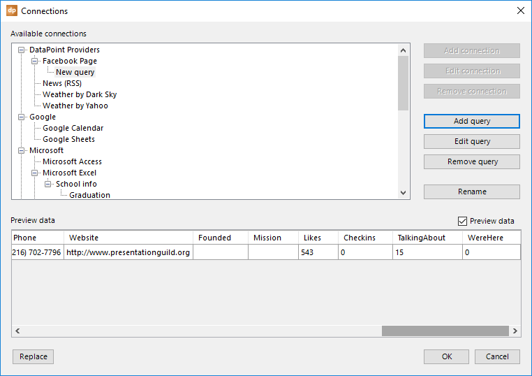
Finally, you will get a preview of the data returned by this page. Typically, people want to show the number of likes, checkins, talking about, and were here figures.
4.2.RSS news connections
To display real-time news on your slide, you need to know the RSS feed URL of the newspaper that you want to use. For example, search the internet for ‘ABC News RSS feed.’
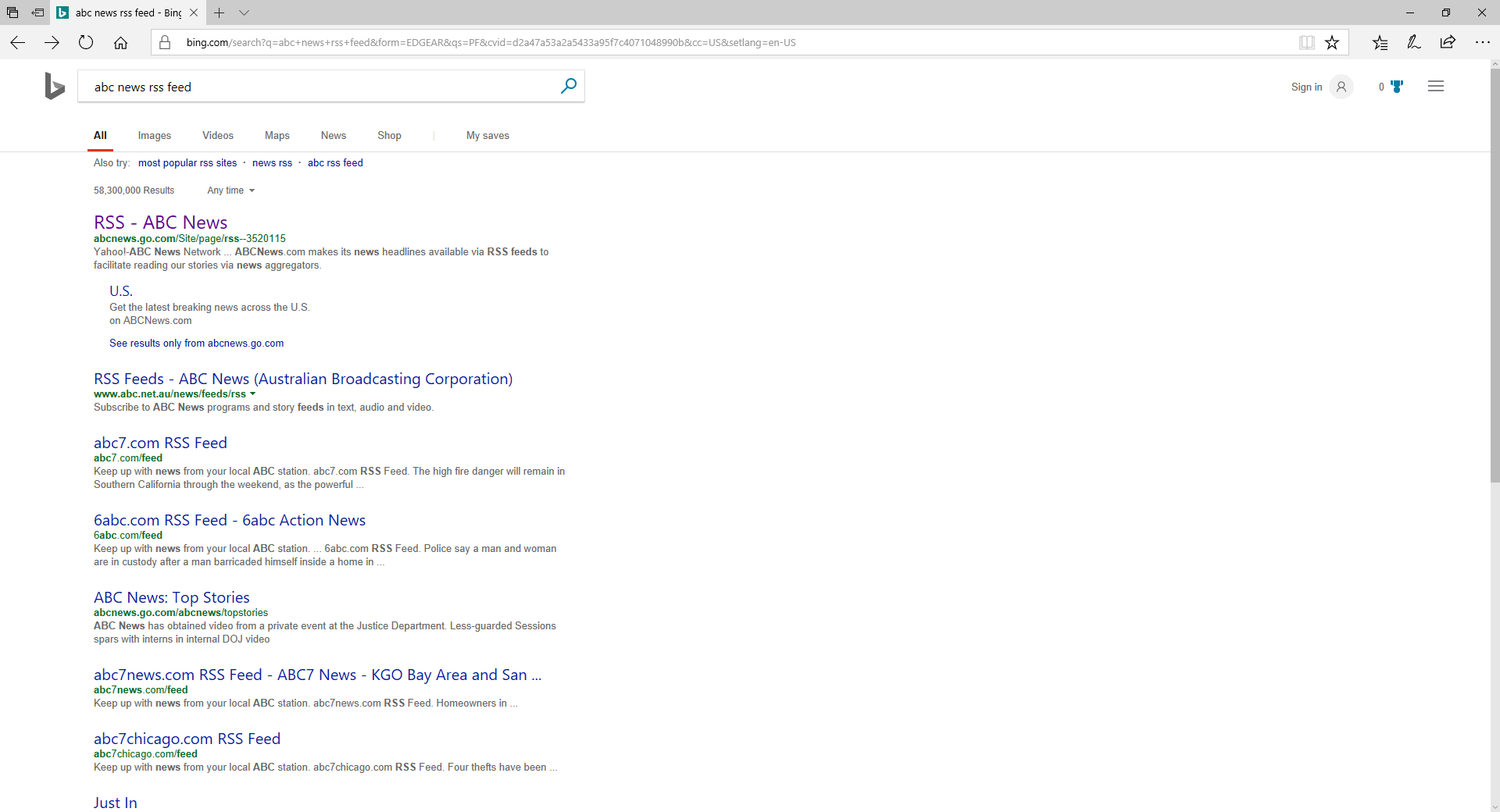
When you open the page found, most often you will find yourself on a page that lists the various feeds that they are providing.
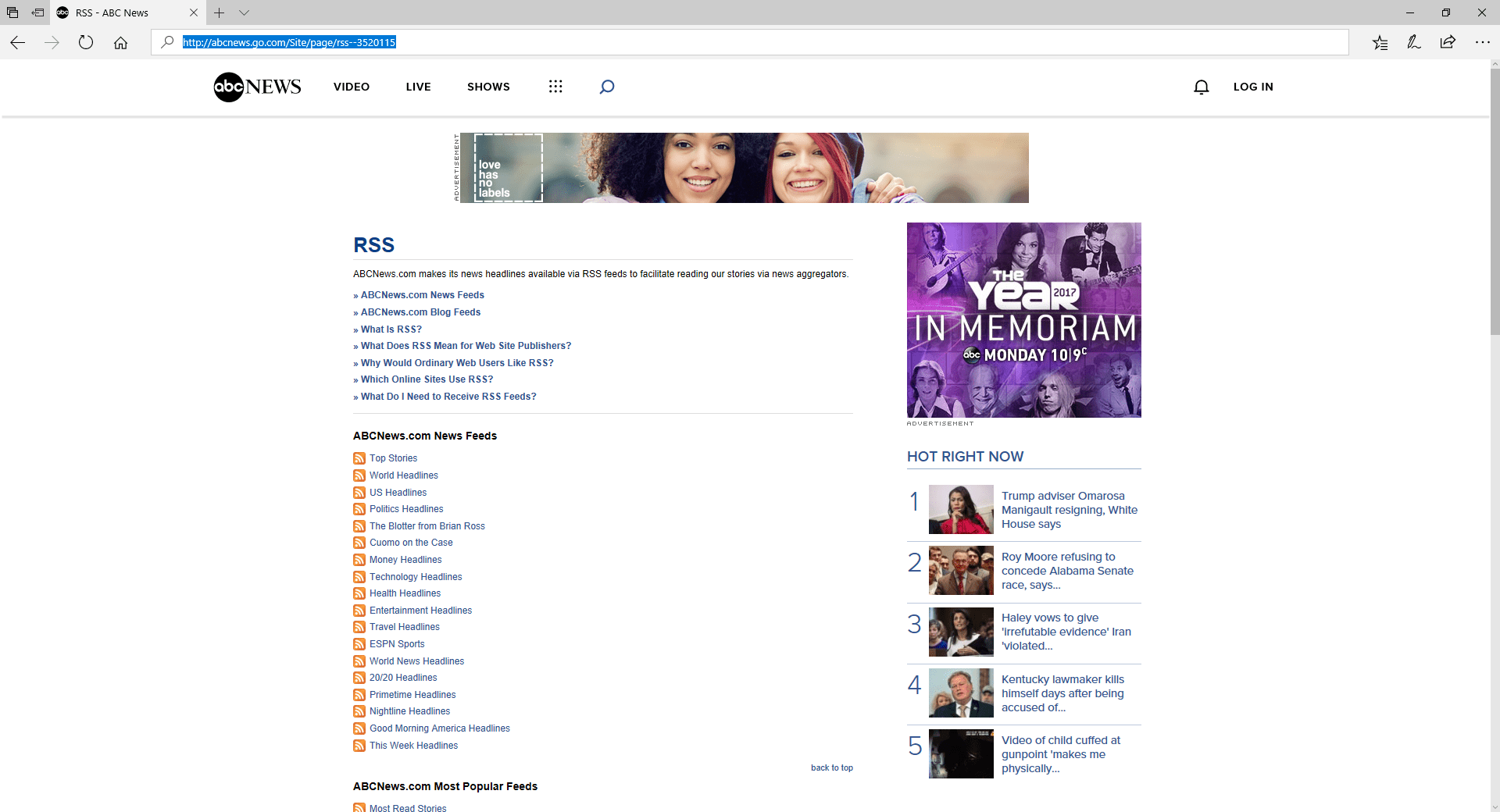
Select whatever category you want to display. We will use the travel headlines for this document. The URL at the time of writing is http://abcnews.go.com/abcnews/travelheadlines. This might change, so always keep that in mind. Open the RSS feed link and it typically looks like this:
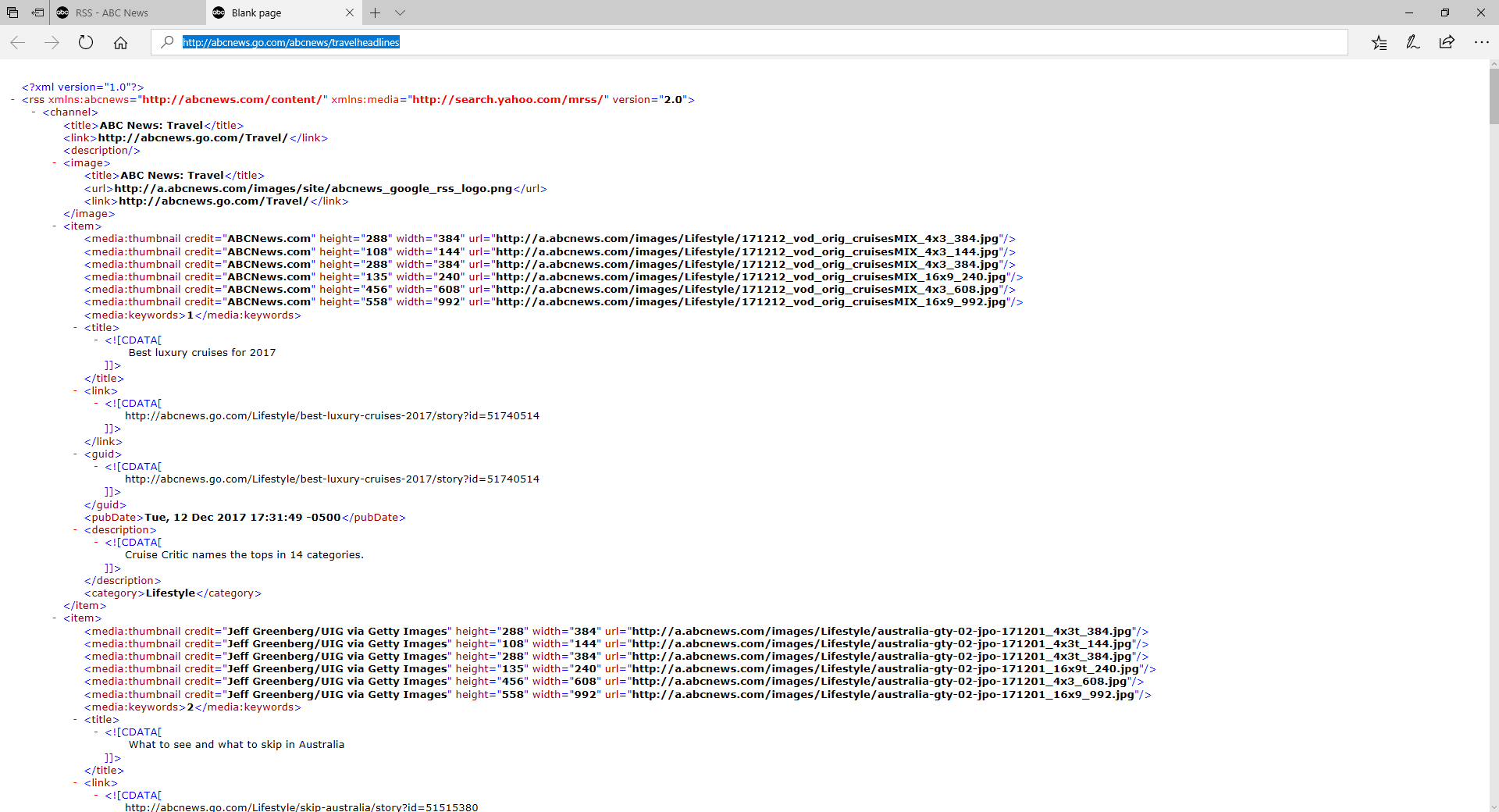
The URL is what we need in DataPoint. Go to the connections and select the News (RSS) data provider.
Click the Add query button.
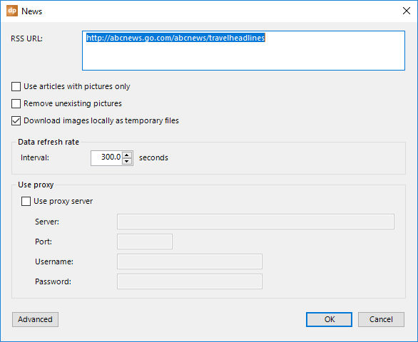
Paste the RSS URL at the top.
Typically, a good news feed comes with a title, a description with more information, and a featured image that is associated with the news article. If you want a very visual slide with images, then you can check the option Use articles with pictures only. Articles without a specified image will be deleted automatically from the news feed.
In some cases, you might see an image URL, but when you use that URL in a browser, it might be missing. This is a typical 404 browser error. To remove feeds with incorrect or broken links, just check the Remove unexisting pictures option.
By default, all images will have a HTTP or HTTPS address. If you want to display that directly, it will work, but also cause internet traffic and be much slower than a local image. Therefore, you can instruct the RSS news provider to pre-download the internet images and store them as local temporary files. The news data provider will also take care of cleaning up the temporary files on your system.
A refresh rate determines how often you want to check the RSS feed for updates. Typically, a 5-minute interval (or 300 seconds) is sufficient.
In addition, when your company network is protected and secured by a firewall, you might have to enter your firewall credentials to access the internet. Check this out with your network administrator.
4.3.Weather
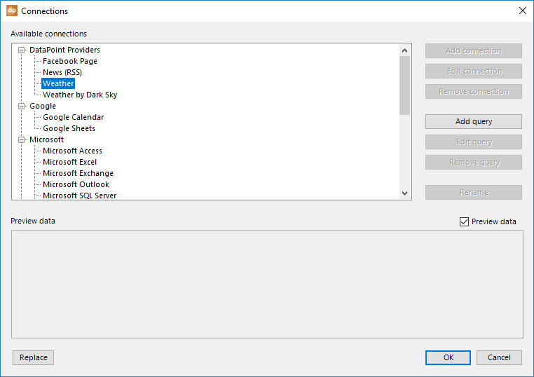
DataPoint can perfectly show real-time weather information. To set up a connection to the weather API, click the List button in the Connections group, select the Weather node, and click the Add query button.
Enter the name of the city, and optionally, the state or country, to make it unique.
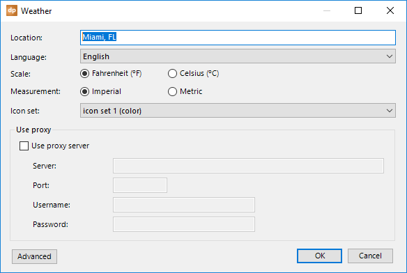
Change the Language option if you want to show the weather descriptions in another language. There are some 40 languages to choose from.
Choose to use Fahrenheit or Celsius as the unit for temperature values.
And choose between Imperial or Metric as measurement unit.
Select the icon set that you want to use. By default, the weather feed in DataPoint comes with four icon sets. Icon set 1 with full-color weather icons, icon set 2 with white icons, icon set 3 with black icons and icon set 4 finally with animated gifs icons.
If needed, you can add an additional icon set to the icon set listing. Maybe you don’t want to use our default weather icons and you want to use your own set of icons in the same color as your company logo. That is possible. Go to the folder C:\Program Files (x86)\PresentationPoint\DataPoint Standard edition\weather icons\3 and duplicate the existing folder named icon set 1. Name the duplicate folder something like “icon set 5” and change the icon files as you would like to see them. Now, when you reopen the data provider, you will see an additional icon set listed there.
DataPoint will typically update the weather information every 30 minutes.
In addition, when your company network is protected and secured by a firewall, you might have to enter your firewall credentials to access the internet. Check this out with your network administrator.
The columns returned from the weather API are:
- TodayDate
- TodayDay
- TodayFullDay
- NowWeatherCode: internal weather code that is used for the weather icon
- NowWeatherDescription
- NowTemperature
- NowFeelsLike
- NowWindSpeed
- NowWindDirDegree
- NowWindDir16Point
- NowPrecipitation
- NowHumidity
- NowVisibility
- NowPressure
- NowUVIndex
- TodayWeatherCode: internal weather code that is used for the weather icon
- TodayWeatherDescription
- TodayTemperature
- TodayFeelsLike
- TodayMinTemp
- TodayMaxTemp
- TodayWindSpeed
- TodayWindDirDegree
- TodayWindDir16Point
- TodayPrecipitation
- TodayHumidity
- TodayVisibility
- TodayPressure
- TodaySunrise
- TodaySunset
- TodayMoonrise
- TodayMoonset
- TodaySunHours
- TodayUVIndex
And then for each day, you will get a block of information. The Dx will vary, using D1 for tomorrow, D2 for the day after tomorrow, etc. They go from D1 to D10, 10 in total.
- DxDate
- DxDay
- DxFullDay
- DxWeatherCode
- DxWeatherDescription
- DxMinTemp
- DxMaxTemp
- DxSunrise
- DxSunset
- DxMoonrise
- DxMoonset
- DxSunHours
- DxUVIndex
4.4.Weather by Dark Sky connections
Weather information is omnipresent on information screens. With DataPoint, you can choose to collect local weather information and forecasts via the Dark Sky API provider.
To add a Dark Sky weather feed, select the Weather by Dark Sky data provider and click the Add query button. 
In order to connect to the Dark Sky weather API, you need to sign up at https://darksky.net/dev. Once completed, you get a secret key that you have to use in all of your communications.
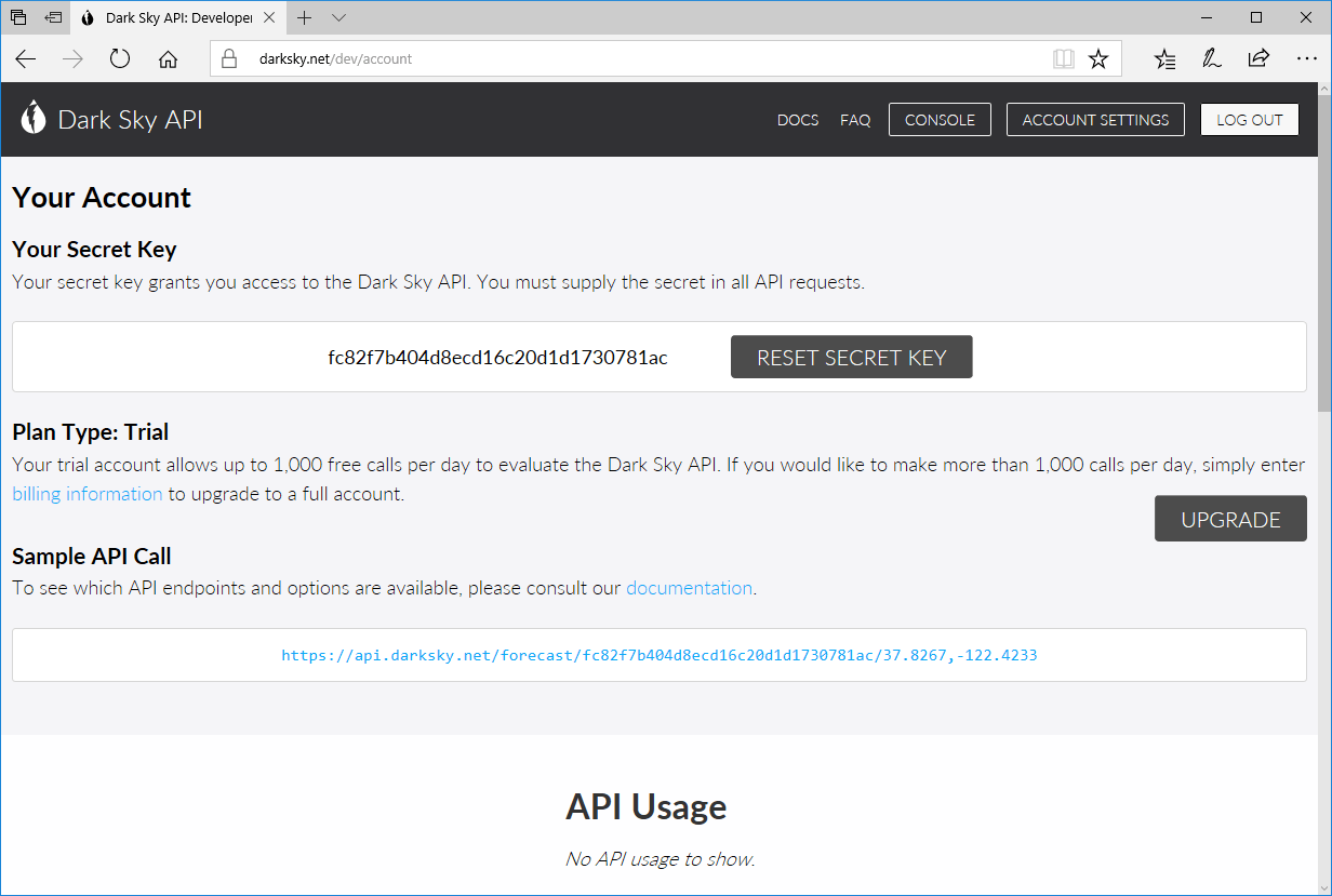
There’s no need to use the key listed here, as it has already been reset. But copy and paste the secret key on the data provider form.
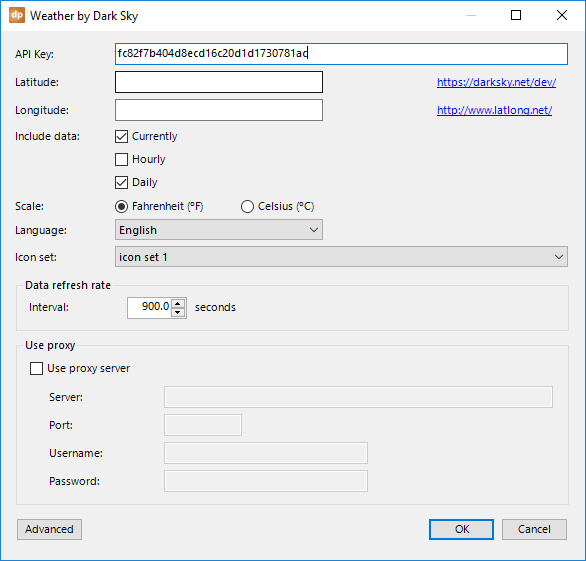
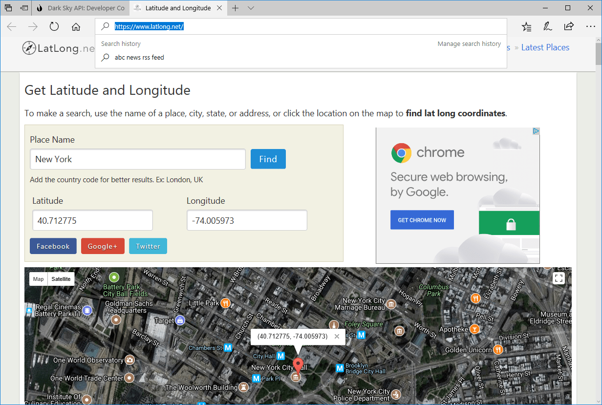
To specify the location, you need to input the latitude and longitude of your location. Visit https://www.latlong.net/ to translate a city into latitude and longitude coordinates.
Enter the name of the city and the state or country, and copy over the latitude and longitude values.
And the form looks like this:
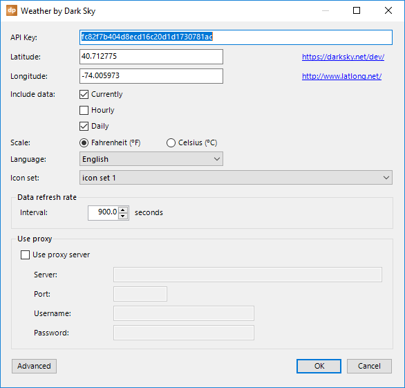
Note that you need to enter the latitude and longitude with a dot (and no comma)!
Check Currently to include the current weather observation data; Hourly for the prognoses every hour; and Daily for the weather forecasts for the coming days. Typically for weather slides, current and daily are selected.
Choose to use Fahrenheit or Celsius as the unit for temperature values.
If needed, you can add an icon set to the icon set listing. Maybe you don’t want to use our default weather icons and you want to use your own set of icons in the same color as your company logo. That is possible. Go to the folder C:\Program Files (x86)\PresentationPoint\DataPoint Standard edition\weather icons\2 and duplicate the existing folder named icon set 1. Name the duplicate folder something like “icon set 2” and change the icon files as you like. Now, when you reopen the data provider, you will see an additional icon set listed there.
A refresh rate determines how often you want to check the weather API for updates. Typically, a 15-minute interval (or 900 seconds) is sufficient.
In addition, when your company network is protected and secured by a firewall, you might have to enter your firewall credentials to access the internet. Check this out with your network administrator.
The columns returned from the weather API are typically:
- Latitude
- Longitude
- Timezone
- Offset
- CurrentlyTime
- CurrentlySummary
- CurrentlyIcon: this is the weather icon that can be used as a dynamic picture
- CurrentlyPrecipIntensity
- CurrentlyPrecipProbability
- CurrentlyTemperature
- CurrentlyApparentTemperature
- CurrentlyDewPoint
- CurrentlyHumidity
- CurrentlyWindSpeed
- CurrentlyWindBearing
- CurrentlyCloudCover
- CurrentlyPressure
- CurrentlyOzone
And then for each day, you will get a block of information. The 0x will vary, using 00 for today, 01 for tomorrow, 02 for the day after tomorrow, etc.
- Daily0xTime
- Daily0xSummary
- Daily0xIcon: this is the weather icon that can be used as a dynamic picture
- Daily0xSunriseTime
- Daily0xSunsetTime
- Daily0xMoonPhase
- Daily0xPrecipIntensity
- Daily0xPrecipIntensityMax
- Daily0xPrecipProbability
- Daily0xTemperatureMin
- Daily0xTemperatureMinTime
- Daily0xTemperatureMax
- Daily0xTemperatureMaxTime
- Daily0xApparentTemperatureMin
- Daily0xApparentTemperatureMinTime
- Daily0xApparentTemperatureMax
- Daily0xApparentTemperatureMaxTime
- Daily0xDewPoint
- Daily0xHumidity
- Daily0xWindSpeed
- Daily0xWindBearing
- Daily0xCloudCover
- Daily0xPressure
- Daily0xOzone
For a full description of all of these field, please consult the Dark Sky API documentation.
4.5.Google Calendar connections
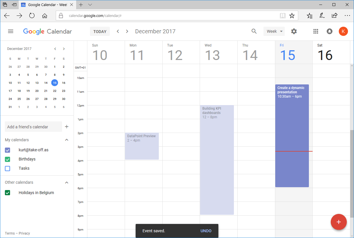
Google Calendar is a great webservice that you can use to maintain your calendars. The advantage of this is that you can use your computer, as well as your smartphone, to consult and edit your appointments when you are on the road.
Why not use Google Calendar as a data feed for the messages or appointments on your information screens?
A typical Google Calendar web interface looks like this.
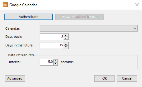
 To start with a Google Calendar feed in your presentation, click the List button in the Connections group and select the Google Calendar node from the list of data providers. Then click the Add query button.
For this first time, click the Authenticate button.
It will open a page in your web browser where you can log on to your Google Calendar account with your email address and password.
After that, Google will ask your permission to share your calendar with DataPoint.
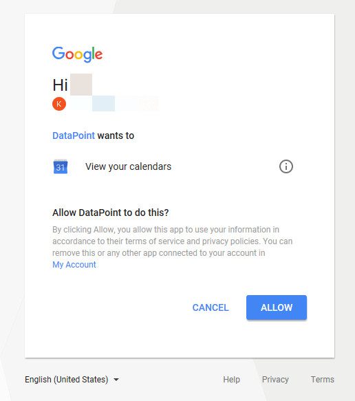
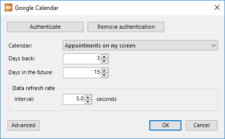
After granting this permission, you can go back to PowerPoint and choose which calendar you want to read out from the calendar list.
As an option, you can change the time period of the meetings that you want to select; for example, you can skip appointments that are older than yesterday and look only 15 days into the future.
A refresh rate determines how often you want to check for calendar updates. Change this number to fit your needs.
You can use the Remove authentication button if you want to disconnect DataPoint’s access to your Google Calendar.
Click OK to close.
The Google Calendar events are now synchronized to your presentation.
4.6.Google Sheets connections
Google Sheets is a web-based spreadsheet that you can use in the cloud. DataPoint can read off the data from your sheets in real-time and you can display this information on your screen with live updates.
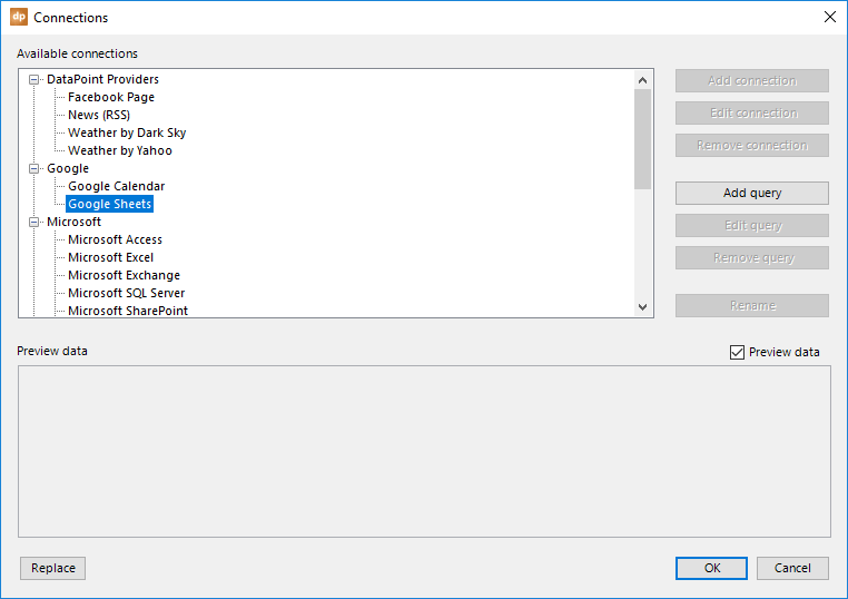
Click the List button of the Connections group, select the Google Sheets data provider, and click the Add query button.
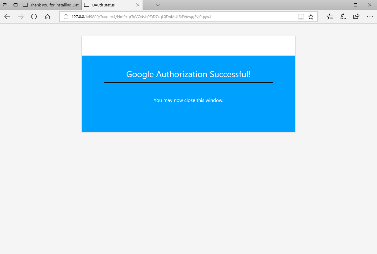
 Click the Authenticate button in order to log on to Google services and files.
Log on with the email address and password of your Google account. 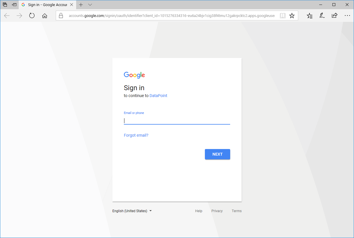
It will ask your permission to allow DataPoint to access your Google Sheets data and files.
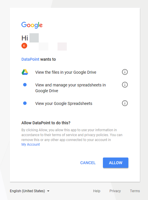
Click Allow.
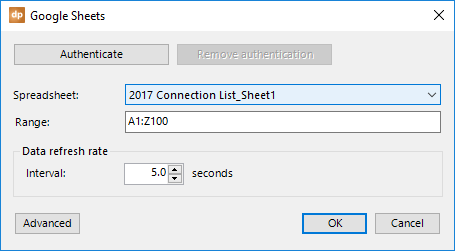
Next, you can select the spreadsheet that you want to use. The name of the spreadsheet is basically a combination of the spreadsheet name itself and the sheet name.
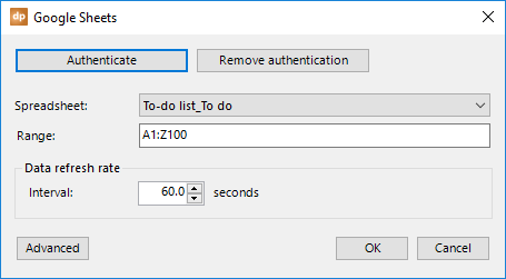
Further options include the maximum import range of the data that you want to read. A1:Z100 reads all cells from row 1 of column A to row 100 of column Z. Set Z100 to e.g. Z600 if you have more than 100 potential data rows. Make your base selection large enough to avoid data lost later on. Empty rows at the end will be removed from the data table.
A refresh rate determines how often you want to check for calendar updates. Change this number to fit your needs.
Click OK to close. 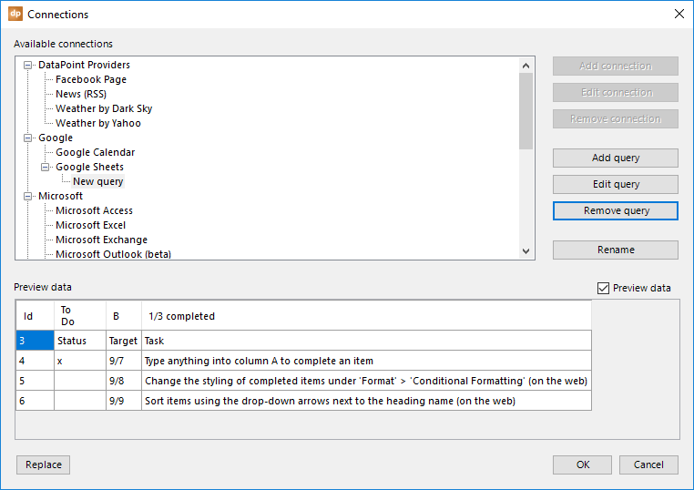
4.7.Microsoft Access connections
A simple Microsoft Access database is so often used by companies and sports clubs. Everyone has it and it is less complex to configure than the larger, relational database systems. Very often, you will see that what starts as a simple database to quickly store some information can grow into a very large database of files with many objects. But, that is not a problem. DataPoint can perfectly handle such a database.
Open the List connections from the DataPoint menu and select the Microsoft Access data provider. First, we need to add a connection to the physical database file. So, click the Add connection button.
Type in or use the Browse button to select the Microsoft Access database file that you want to use. A Microsoft Access database file will have the extension .mdb or .accdb. 
Additionally, you can set the workgroup file and log on information when your database is protected by user access rights.
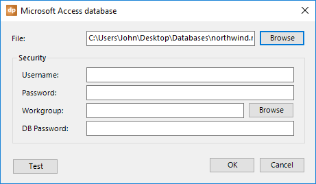
Click OK to close.
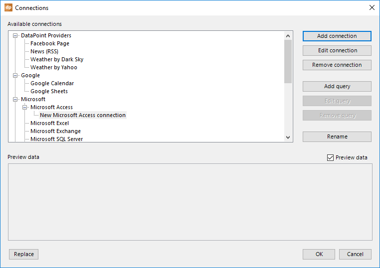
A new data connection under the Microsoft Access data provider is added. As of now, you can add queries to this connection. Click the Add query button.
On the next form, you will choose between two options.
First, you will see a list of available data objects that could be found in the database. Typically for Microsoft Access, these are tables and queries defined in your database.
Second, you can type in your own custom SQL statement. This is usually done when you want to filter the rows or columns of a given existing data object, or when no query is available yet to fit your needs. When you have entered your own SQL statement, you can always validate the correct syntax by clicking on the Test button.
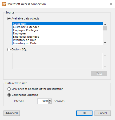
To refresh the data, you have two options here, too.
You can choose to refresh the data only once at the opening of the presentation. This could be done when you are only using the presentation for reporting or statistics, but not really for real-time information screens.
Or, you can choose to activate a timer, e.g. every 60 seconds, to check for new data. This timer starts when you begin the slide show. So, the automatic updating will not happen when you are designing the presentation. For that, you have the Refresh button. Use a small figure for critical or frequently updated data, like for auctions and sports game results. Or, use a larger figure for anniversaries and non-critical messaging.
Click OK to close, and a preview of the data will be displayed.
4.8.Microsoft Excel connections
A Microsoft Excel spreadsheet is used even more than a Microsoft Access database. Theoretical, it is not a database at all, but it comes close. A spreadsheet is very similar to a database since it uses a grid of rows and columns, and looks like a database table. Unlike plain text in a Microsoft Word document, this data is structured.
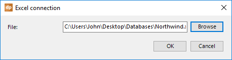
Open the List connections from the DataPoint menu and select the Microsoft Excel data provider. First, we need to add a connection to the physical database file. Click the Add connection button.

It’s very simple now. Use the Browse button and select the Microsoft Excel file that you want to work with.
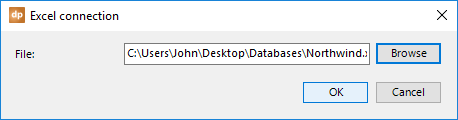
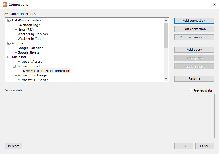
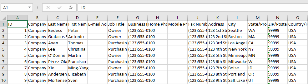
Back at the connections, you can see that the Microsoft Excel file connection is added to the Microsoft Excel data provider. Next, click the Add query button.

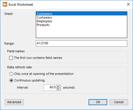
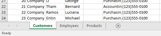
You can now see a list of sheets. These correspond to the names of the sheets that you have in your Excel file. By default, they are named Sheet1, Sheet2, etc., but it is much better to give each of the sheets in your Excel document a decent name.
Select the sheet that you want to use in this presentation.
The range is a typical Microsoft Excel notation. The value A1:Z100 will consider all cells of row 1 and column A until row 100 of column Z. If you have more data, such as more data rows, then extend this import range. If you see 800 data rows, and 5 data columns in your data, then adjust the range to A1:E1000.
Note that empty data rows at the end of your data are ignored as if they were not there.

By default, once they are imported, the columns are named F1, F2, F3, etc. There is an option to indicate that the first row of your range is holding the column names. Check this option if you have unique column names in the first row.
To refresh the data, you have two options.
You can choose to refresh the data only once at the opening of the presentation. This could be done when you are only using the presentation for reporting or statistics, but not really for real-time information screens.
Or, you can choose to activate a timer, e.g. every 60 seconds, to check for new data. This timer begins when you start the slide show. So, the automatic updating will not happen when you are designing the presentation. For that, you have the Refresh button. Use a small figure for critical or frequently updated data, like for auctions and sports game results. Or use a larger figure for anniversaries and non-critical messaging.
Click OK to close, and a preview of the data will be displayed.
Very important notice for Excel connections!
By design, a Microsoft Excel spreadsheet is a great tool to store and organize data. But, there is one big difference with a database: it is not really designed to work with multiple users on the same document at the same time.
Notice that when you are displaying Excel data on an information screen, you have your Excel file open and DataPoint will open the file as well on the display computer; so you already have two users on the same file. This might result in conflicts or warning messages that someone has the file open already.
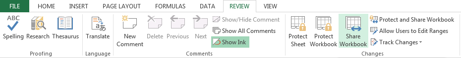
But, there is a solution to this, too. Open your Microsoft Excel file and go to the Review tab, then click the Share Workbook button.
Check the option Allow changes by more than one user at the same time and hit OK to close.
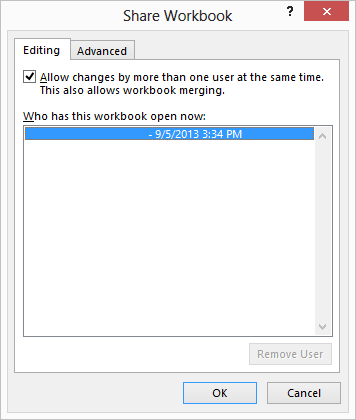
Next, save the file, and as of now, multiple users can access the Excel file at the same time.
4.9.Microsoft Exchange connections
With the addition of the Microsoft Exchange data provider to DataPoint, you can now connect and display information from Microsoft Exchange. The calendars are probably the most often used, but you can do more with mail, contacts, tasks, etc.
Imagine that you can use your smartphone to send an e-mail to, say, screen22@yourcompany.com, and then the subject of that e-mail is displayed on your screen. Sure, that is very possible to do with DataPoint.
Or build a meeting room display system at your office, where you display the meetings of the day.
Click DataPoint from the PowerPoint ribbon and click the List button in the Connections group. Select the Microsoft Exchange data provider, and click the Add connection button.
Log on to your Exchange server by entering the server address, username, and password. Use the machine name if you have Microsoft Exchange server running locally on your network. Or, if you have Hosted Exchange, use the URL https://outlook.office365.com/EWS/Exchange.asmx.
When you are not using Hosted Exchange but a local Exchange installation, then for the server, use the Exchange Web Services URL like www.PresentationPoint.com/EWS/Exchange.asmx
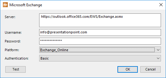
For the platform, choose the version or edition of your Microsoft Exchange server. Choose Exchange Online for Hosted Exchange.
Select the appropriate authentication scheme. You can choose between Basic, Digest, Negotiate and NTLM. Check with your administrator which one to use. Default is the Basic authentication scheme.
Use the Test button to check your connectivity and credentials, and then OK to confirm.
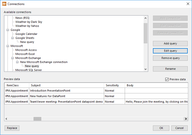
On the connections overview form, you have a new connection selected. Click the Add query button and the form below opens.

Identify where your data is coming from. You can choose between a list of available data objects or you can write your own custom SQL statement.
On the list of available data objects, you will find the typical Exchange folders, like calendar, contacts, inbox, and so on.
You can write your own custom SQL statement when you want to filter out data that is at the server already. A custom SQL statement is really the best option for performance. Instead of including all of the data in your calendar folder and all of the past and future events, you could write a custom SQL statement to only get the appointments for today or this week.
To refresh the data, you have two options.
You can choose to refresh the data only once at the opening of the presentation. This could be done when you are only using the presentation for reporting or statistics, not really for real-time information screens.
Or, you can choose to activate a timer, e.g. every 60 seconds, to check for new data. This timer begins when you start the slide show. So, the automatic updating will not happen when you are designing the presentation. For that, you have the Refresh button. Use a small figure for critical or frequently updated data, like for auctions and sports game results. Or use a larger figure for anniversaries and non-critical messaging.
Extra info.
To access public and other folders, you might have to configure Exchange Impersonation. More info at https://msdn.microsoft.com/en-us/library/office/bb204095%28v=exchg.140%29.aspx?f=255&MSPPError=-2147217396
Also for public folders, you will not see a list of objects (tables) at the list of existing objects. To retrieve information from an unlisted public folder, use a custom SQL statement instead. Use like so:
SELECT * FROM Calendar WHERE SharedMailboxEmail=’shared@example.com’
4.10.Microsoft Outlook connections
Next to the Microsoft Exchange data provider, you can use the Microsoft Outlook data provider for mailboxes that might not be connected to a Microsoft Exchange server.
A mailbox can be used to display the last announcements coming in as a mail message, a task or maybe a note. Or display time related messages via appointments.
Click DataPoint from the PowerPoint ribbon and click the List button in the Connections group. Select the Microsoft Outlook data provider, and click the Add query button.
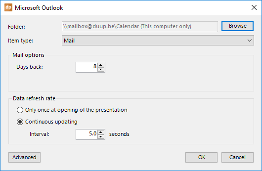
First click the Browse button to select the folder where you are reading out the items. An item in Microsoft Outlook corresponds to a mail type like mail, task, note, appointment etc.
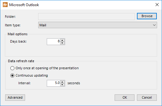
This will open a dialogue where you select the folder that you want to use. On some occasions you have to go back to your Microsoft Outlook application when this dialog form is not visible after pressing the Browse button. Or use Alt-Tab go get to it.
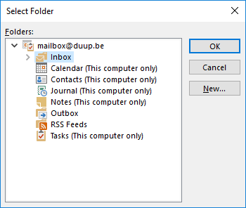
Select the folder of your choice and click the OK button.
Change the item type to Calendar because we are dealing with an appointment or calendar folder.
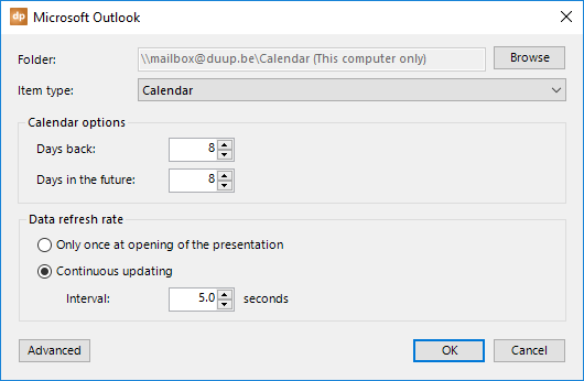
In the calendar options, you can set how many days to go in the past and how many days to look ahead in your calendar. This option will lower your result set or data set.
To refresh the data, you have two options.
You can choose to refresh the data only once at the opening of the presentation. This could be done when you are only using the presentation for reporting or statistics and for the real-time information screens.
Or, you can choose to activate a timer, e.g. every 60 seconds, to check for new data. This timer begins when you start the slide show. So, the automatic updating will not happen when you are designing the presentation. For that, you have the Refresh button. Use a small figure for critical or frequently updated data, like for auctions and sports game results. Or use a larger figure for anniversaries and non-critical messaging.
4.11.Microsoft SQL Server connections
The Microsoft SQL Server is probably the most used professional database system around. With the DataPoint data provider for the Microsoft SQL Server, you can connect to the server and then add one or more queries to this connection.
Click DataPoint from the PowerPoint ribbon and click the List button in the Connections group. Select the Microsoft SQL Server data provider, and click the Add connection button.
On the connection form, enter the server name or IP address. To log on to the server, you have the typical two options to use Windows NT integrated security or a specific username and password.
Finally, set the name of the database that you want to use, unless you want to use the default database assigned to the user.
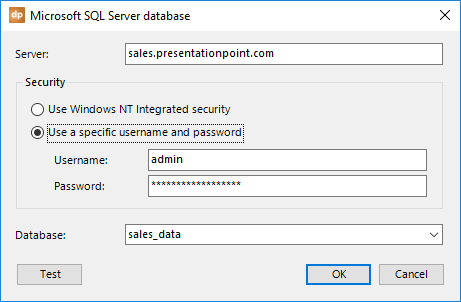
Hit OK to close. Now, back on the connection form, you still have the connection node selected. Next, click the Add query button.
Just like with the other databases, you have two options for where the information is coming from. First of all, there is a list with all data objects that are available at the server. Typically, this is a combination of tables and views of your SQL server.
Second, you can write your own custom SQL statement if you are familiar with them. Custom SQL is always better, as you can limit the number of columns and rows to a minimum while still meeting your needs.
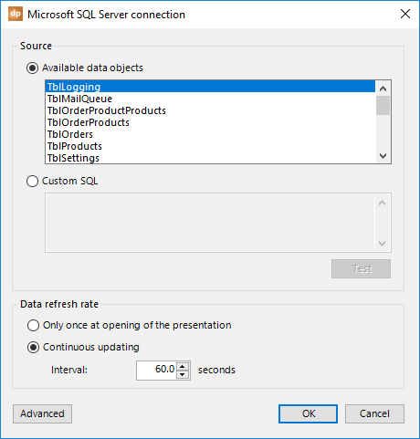
To refresh the data, you have two options.
You can choose to refresh the data only once at the opening of the presentation. This could be done when you are only using the presentation for reporting or statistics, not really for real-time information screens.
Or, you can choose to activate a timer, e.g. every 60 seconds, to check for new data. This timer starts when you begin the slide show. So, the automatic updating will not happen when you are designing the presentation. For that, you have the Refresh button. Use a small figure for critical or frequently updated data, like for auctions and sports game results. Or use a larger figure for anniversaries and non-critical messaging.
4.12.Microsoft SharePoint connections
Use DataPoint to connect to your Microsoft SharePoint site and start displaying live data from SharePoint lists.
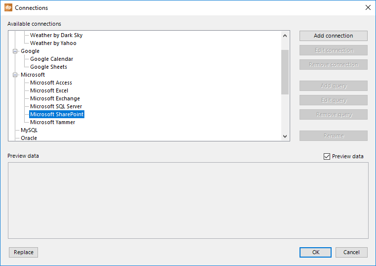
Open the List connections from the DataPoint menu and select the Microsoft SharePoint data provider. First, we need to add a connection to the SharePoint server and then identify what lists to use.
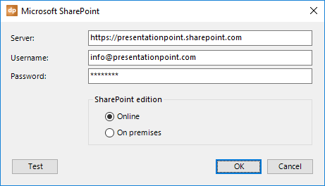
Enter the server name, your username, and password to access your Microsoft SharePoint website. You may want to consider not using a personal account for general display purposes on various public displays. In that case, it might be better to create a specific user for this purpose, so as to avoid using personal access.
With the SharePoint edition option, you can indicate whether the SharePoint server is online (as Hosted SharePoint) or running on a local server in your company network.
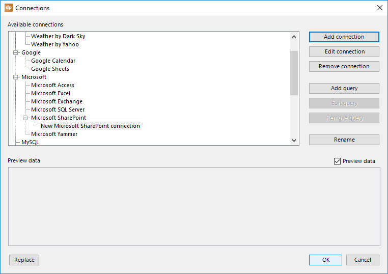
On the connections again, you can see that the Microsoft SharePoint connection is added to the Microsoft SharePoint data provider. Next, click the Add query button.
After that, you get a Microsoft SharePoint property form where you can choose which SharePoint list you want to use in this presentation.
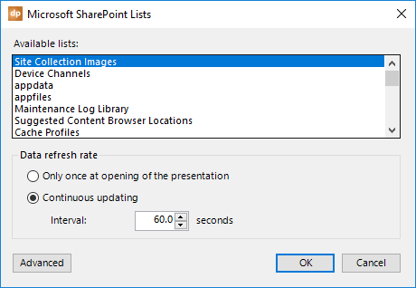
To refresh the data, you have two options here, too.
You can choose to refresh the data only once at the opening of the presentation. This could be done when you are only using the presentation for reporting or statistics, not really for real-time information screens.
Or, you can choose to activate a timer, e.g. every 60 seconds, to check for new data. This timer starts when you begin the slide show. So, the automatic updating will not happen when you are designing the presentation. For that, you have the Refresh button. Use a small figure for critical or frequently updated data, like for auctions and sports game results. Or use a larger figure for anniversaries and non-critical messaging.
HTML formatting
SharePoint posts or lists are typically formatted with HTML tags, similar to a website. PowerPoint cannot display HTML tags. So, in order to avoid texts like <b>New Employee</b>, we will have to strip HTML tags from the texts.
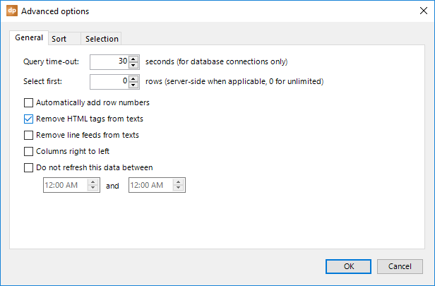
Click the Advanced button and check the option Remove HTML tags from texts.
Click OK to close the Advanced form. Then, click OK again to close the query information, and a preview of the data will be displayed.
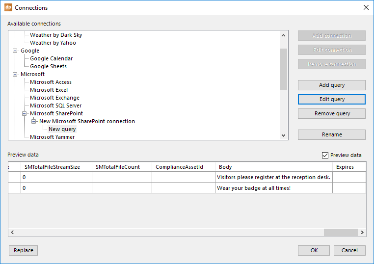
There are a lot of columns with information for a SharePoint row. Typically, you will use the Body columns for displaying.
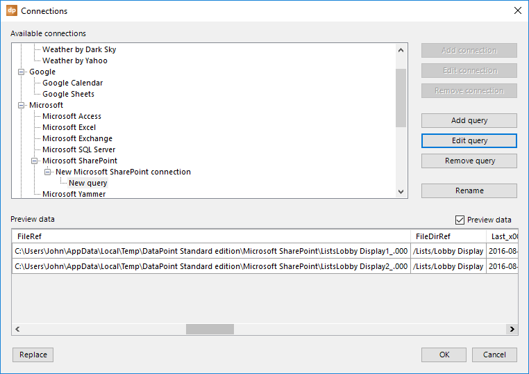
Image references used in the lists (http://…) are downloaded as temporary files for easier usage. Look at this FileRef column.
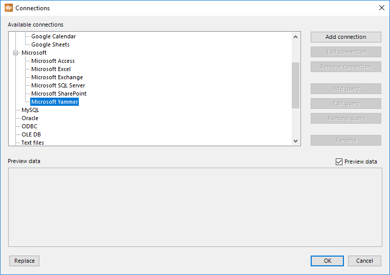
4.13.Microsoft Yammer connections
You can let DataPoint connect to your Microsoft Yammer network and display Yammer messages and discussions in real-time.
Open the List connections from the DataPoint menu and select the Microsoft Yammer data provider. First, we need to add a connection to the Yammer network and then identify what to use.
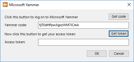
To establish our data connection to the Microsoft Yammer network, click the Get code button.
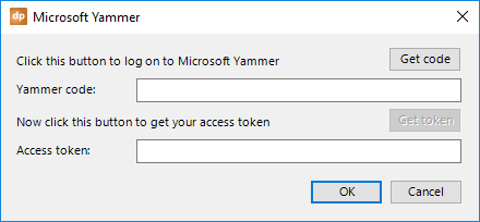
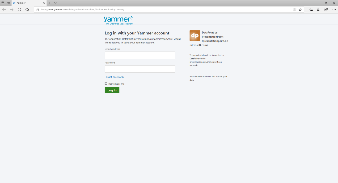
This will open a browser that will ask you to log on to your Microsoft Yammer account.
After logging in, you will be redirected to a page at www.PresentationPoint.com — like what you see below.
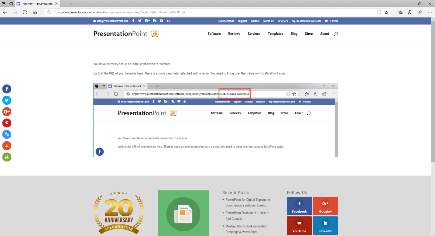
Look at the page’s URL: https://presentationpoint.com/software/integrations/yammer/?code=YjT0dHPywJIgxzWM7lCmA
You need to select the value of the code variable, like YjT0dHPywJIgxzWM7lCmA from the screenshot. Copy that list of characters to your clipboard and go back to DataPoint in PowerPoint.
In the Yammer code text box, paste this code and click the Get token button.
That generates your access token to access your Yammer messages.
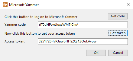
Click OK to save.
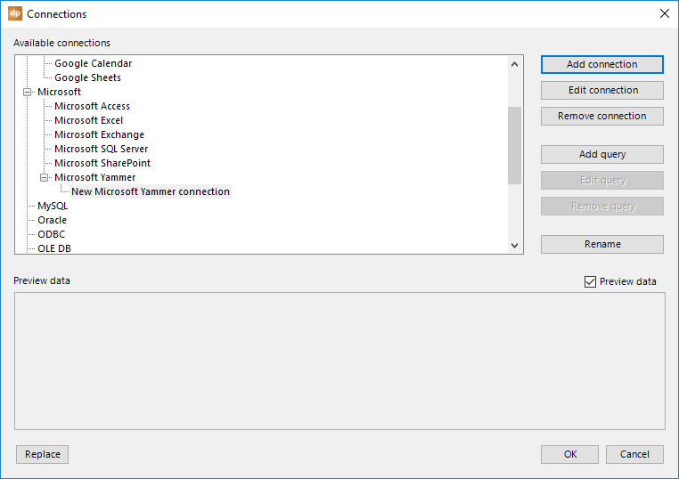
Back on the connections overview form, we have established a connection to the Yammer network. Next, click the Add query button.
This will open a new form where you can choose from which group to retrieve the messages.
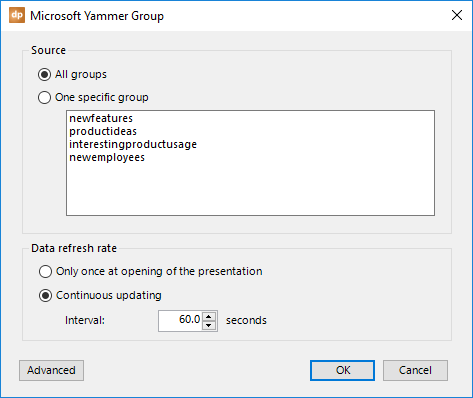
Choose to read out all of the messages from all groups or choose one specific group.
To refresh the data, you have two options here, too.
You can choose to refresh the data only once at the opening of the presentation. This could be done when you are only using the presentation for reporting or statistics, not really for real-time information screens.
Or, you can choose to activate a timer, e.g. every 60 seconds, to check for new data. This timer starts when you begin the slide show. So, the automatic updating will not happen when you are designing the presentation. For that, you have the Refresh button. Use a small figure for critical or frequently updated data, like for auctions and sports game results. Or use a larger figure for anniversaries and non-critical messaging.
Click OK to close and start using the Yammer data on your slides. Note that pictures used in your Yammer messages are made available as local temporary images.
4.14.MySQL connections
MySQL is, next to Microsoft SQL Server, a great database system, and it is free, too. You can connect your presentation to a MySQL database and display live information through the DataPoint MySQL data provider.
Open the List connections from the DataPoint menu and select the MySQL data provider. First, we need to add a connection to the database. Click the Add connection button.
Establish a connection with the MySQL server by specifying your server, username, password, and database. As an option, you can change the port number. Click OK to add the connection to the presentation.
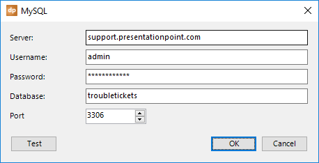
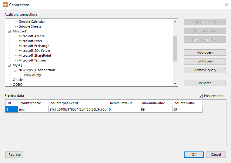
Back at the connections, you will find this connection for the MySQL data provider. Next, click the Add query button.
Typically for DataPoint’s data connections, you get a list of available data objects that you can choose from, or you can write your own custom SQL statement.
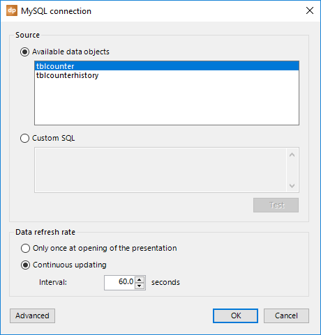
To refresh the data, you have two options.
You can choose to refresh the data only once at the opening of the presentation. This could be done when you are only using the presentation for reporting or statistics, not really for real-time information screens.
Or, you can choose to activate a timer, e.g. every 60 seconds, to check for new data. This timer starts when you begin the slide show. So, the automatic updating will not happen when you are designing the presentation. For that, you have the Refresh button. Use a small figure for critical or frequently updated data, like for auctions and sports game results. Or use a larger figure for anniversaries and non-critical messaging.
Click OK to close, and a preview of the data will be displayed.
4.15.ORACLE connections
Click the List button in the Connections group.
Click on the Oracle node and choose Add connection from the popup menu.
Enter the name of the server and your log on credentials.
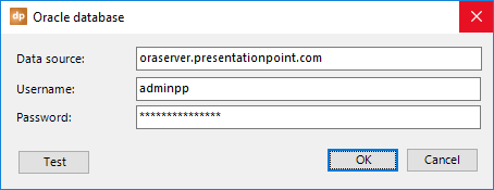
Click OK to apply the changes and your new Oracle connection is now visible at the Oracle node.
Next, click the Add query button. You will be presented with a list of tables and views that were found in the database, as well as an option to write your own SQL statement.
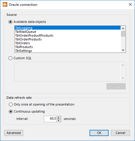
To refresh the data, you have two options here, too.
You can choose to refresh the data only once at the opening of the presentation. This could be done when you are only using the presentation for reporting or statistics, not really for real-time information screens.
Or, you can choose to activate a timer, e.g. every 60 seconds, to check for new data. This timer begins when you start the slide show. So, the automatic updating will not happen when you are designing the presentation. For that, you have the Refresh button. Use a small figure for critical or frequently updated data, like for auctions and sports game results. Or use a larger figure for anniversaries and non-critical messaging.
Click OK to close, and a preview of the data will be displayed.
4.16.ODBC connections
Though it may seem less attractive or old-fashioned compared to XML and databases, there is also the ODBC data provider. ODBC stands for Open Database Connectivity and is a standard application programming interface (API) for communicating with databases.
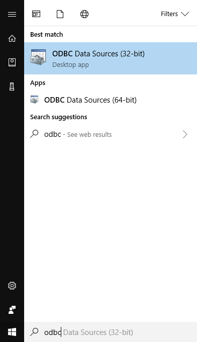
It starts with an ODBC data source, which is using a specific driver and is defined on your system. To set up ODBC data sources, search and open the ODBC Data Sources, 32 or 64 bits.
This is how it looks:
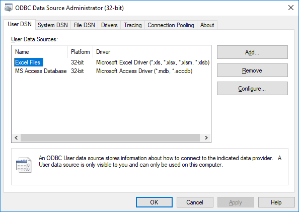
To add a new ODBC data source for yourself, click the Add… button.
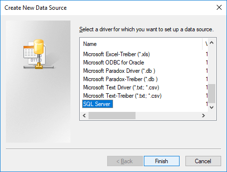
Select the driver that you want to use (consult your database documentation) and click Finish. This will open a new form, which is where you first set the name, a description, and the server address.

Click Next and you will get some more options.
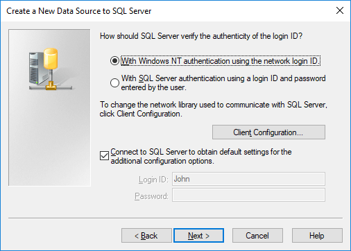
The data that is asked in the wizard completely depends on the ODBC driver that you are using. What you see here and in previous screenshots does not reflect what other drivers might ask. This is all driver-dependent.
Finally, a new ODBC data source is added to your computer and can be used by DataPoint.
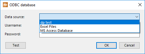
Open the List connections from the DataPoint menu and select the ODBC data provider. First, we need to add a connection to the ODBC data source. Click the Add connection button.
On the form, select the data source from the list and enter the username and password in order to connect. Click OK to close.
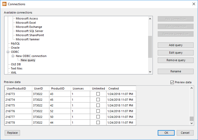
Back at the connections, you will find this connection at the ODBC data provider. Next, click the Add query button.
Typically for DataPoint’s data connections, you get a list of available data objects that you can choose from, or you can write your own custom SQL statement.
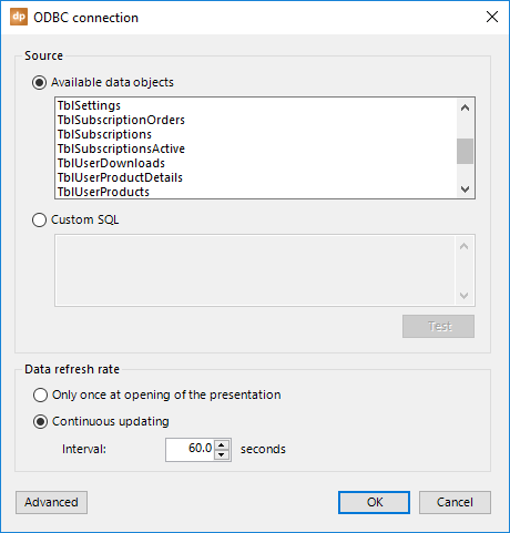
To refresh the data, you have two options.
You can choose to refresh the data only once at the opening of the presentation. This could be done when you are only using the presentation for reporting or statistics, not really for real-time information screens.
Or, you can choose to activate a timer, e.g. every 60 seconds, to check for new data. This timer begins when you start the slide show. So, the automatic updating will not happen when you are designing the presentation. For that, you have the Refresh button. Use a small figure for critical or frequently updated data, like for auctions and sports game results. Or use a larger figure for anniversaries and non-critical messaging.
Click OK to close, and a preview of the data will be displayed.
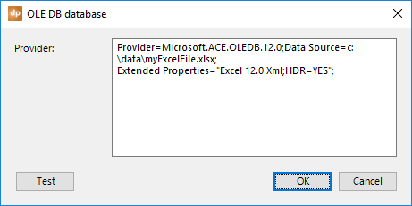
4.17.OLE DB connections
Next to ODBC, we have a data provider for OLE DB. OLE DB stands for Object Linking and Embedding, Database. It is an API designed by Microsoft to access a variety of data sources in a standardized manner.
Open the List connections from the DataPoint menu and select the OLE DB data provider. First, we need to add a connection to the OLE DB data source. Click the Add connection button.
Next, type in or paste the OLE DB specific connection string. The content and parameters of the OLE DB data source that you are going to access are very specific to the source that you access. Check out the OLE DB connection string specifications for more info.
Here, at this screenshot, we will be connecting to a Microsoft Excel file.
Back at the connections, you will find this connection at the OLE DB data provider. Next, click the Add query button.
Typically for DataPoint’s data connections, you get a list of available data objects that you can choose from, or you can write your own custom SQL statement.
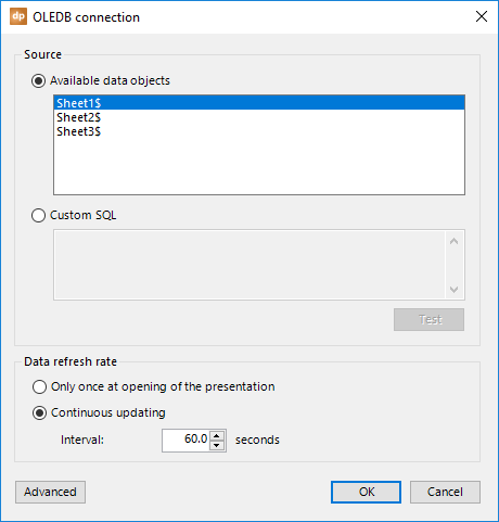
To refresh the data, you have two options here, too.
You can choose to refresh the data only once at the opening of the presentation. This could be done when you are only using the presentation for reporting or statistics, not really for real-time information screens.
Or, you can choose to activate a timer, e.g. every 60 seconds, to check for new data. This timer begins when you start the slide show. So, the automatic updating will not happen when you are designing the presentation. For that, you have the Refresh button. Use a small figure for critical or frequently updated data, like for auctions and sports game results. Or use a larger figure for anniversaries and non-critical messaging.
Click OK to close, and a preview of the data will be displayed.
4.18.Text FIle connections
Text files are the most simplistic databases possible —a document with data, no indexes, no validations, and no querying. The big advantage of using text files is that every database, system, and application can export information to text files. And no additional software, like a database engine, is needed. It will work everywhere, across every platform.
Open the List connections from the DataPoint menu and select the Text files data provider. We start by adding a link to the data file. Click the Add query button.
Click the Browse button. Navigate to your file and select it.
Sometimes, you will find column names in the first row of the file. If so, check the The first row contains field names option, as this will be much easier to read later on. When checked, the column of your data table will take over the column names of your file. When this option is not checked, default column names like F1, F2, F3, etc. will be used.
When using a data file with multiple data columns, there is a column separator or character used to separate the different columns. For text files, this is typically tab or comma characters. A text file where the columns are separated by commas is also frequently called a comma separated value file, or CSV file. Check the Tab or Comma separated option, or select the Custom separator and set its value.
With some text files, string values are enclosed by double quotes, like this: “DataPoint is a great product.” In that case, check the option Columns are enclosed within double quotes.
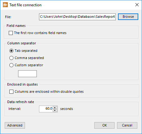
To refresh the data, you have two options here.
You can choose to refresh the data only once at the opening of the presentation. This could be done when you are only using the presentation for reporting or statistics, not really for real-time information screens.
Or, you can choose to activate a timer, e.g. every 60 seconds, to check for new data. This timer begins when you start the slide show. So, the automatic updating will not happen when you are designing the presentation. For that, you have the Refresh button. Use a small figure for critical or frequently updated data, like for auctions and sports game results. Or use a larger figure for anniversaries and non-critical messaging.
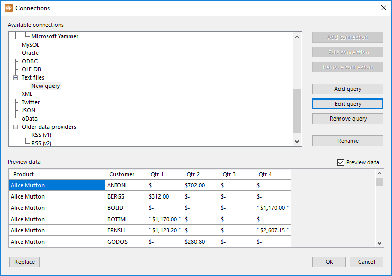
Click OK to close, and a preview of the data will be displayed.
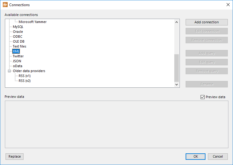
4.19.XML connections
XML files are more like text files, but with some structural information included. XML is great for cross-database communication via flat files.
Open the List connections from the DataPoint menu and select the Text files data provider. We start by adding a link to the data file. Click the Add connection button.
Click the Browse button. Navigate to your file and select it. For XML files from a webserver or website, enter the HTTP or HTTPS address here. As an option, you can enable the use of a proxy server and set the proxy information. Check the correct values with your network administrator. Click OK to close.
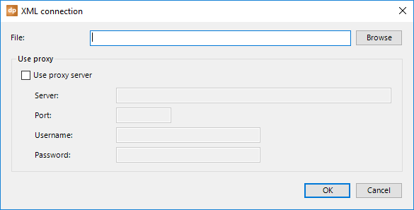
This connection to the XML file will be saved at the XML node. With this connection selected, click the Add query button to open more information about the XML file.
You get to see a list of available tables of the XML file, depending on what file you are using. Select the tables that you want to use to get your information for DataPoint.
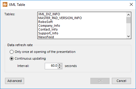
To refresh the data, you have two options.
You can choose to refresh the data only once at the opening of the presentation. This could be done when you are only using the presentation for reporting or statistics, not really for real-time information screens.
Or, you can choose to activate a timer, e.g. every 60 seconds, to check for new data. This timer begins when you start the slide show. So, the automatic updating will not happen when you are designing the presentation. For that, you have the Refresh button. Use a small figure for critical or frequently updated data, like for auctions and sports game results. Or use a larger figure for anniversaries and non-critical messaging.
Click OK to close, and a preview of the data will be displayed.
4.20.TWITTER connections
Twitter is a social media network that allows you to send out short messages with keywords, known as hashtags, and images. A message on Twitter is called a Tweet. You can subscribe to certain persons or companies and receive all related tweets in your newsfeed.
With DataPoint, you can show given tweets in real-time.
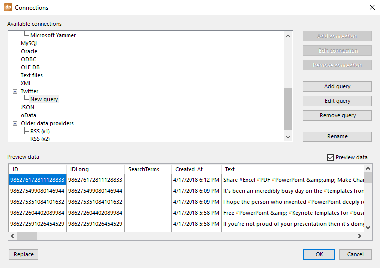
Open the List connections from the DataPoint menu and select the Twitter data provider. Click the Add query button.
At the Selection pane, you can choose which Tweets to display. First, you can show all Tweets from your Twitter news feed as if you were using your Twitter app. Secondly, you can choose to display all Tweets of a given username, e.g. @Microsoft. And finally, you can enter a search term or keyword like #powerpoint or just powerpoint.
Sometimes a single Tweet is retweeted multiple times by different users. By default, we exclude retweets. If you still want to show retweets, then uncheck the option Exclude retweets.
You can also show the profile image of the person that Twittered. When the option Download user profile images is checked, then DataPoint will download the user profile image as a local temporary image file. You will find a column named UserProfileImage at the data table for this purpose.
Another great option is the Download featured images option. When checked, the featured image of the Tweet or the primary or featured image of the article mentioned in the Tweet, is made locally available for you to show on your slides. You will find that image at the column FeaturedImage.
You will find the content of the Tweet at the column named Text. This might contain a URL that points to the article that you use in your Tweet. If you want to show the Tweet’s content without that URL, then use the column TextWithoutURLs.
By default, only the first 25 Tweets are returned. You can change that parameter via the Advanced button.
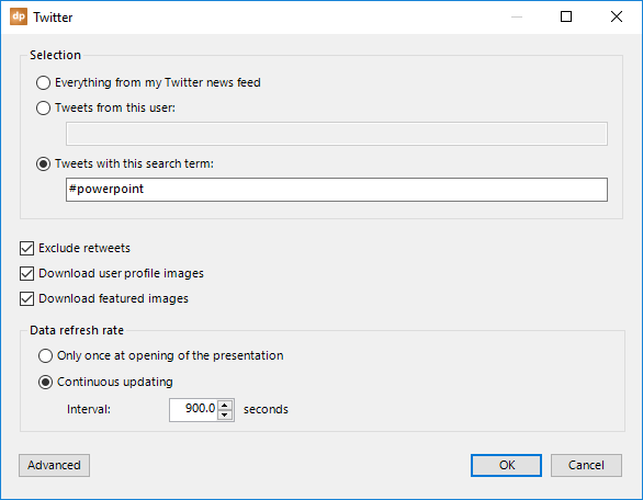
Set the Data refresh rate to fit your needs. When you want to display a continuous number of Tweets for a life event, lower the interval, for instance, to every 1 or 5 seconds. When it is less critical, then set it to, say, 300 for every 5-minute refresh.
Click OK to close, and a preview of the data will be displayed.
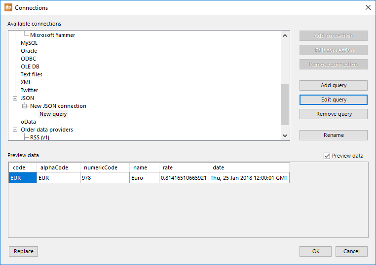
4.21.JSON connections
JSON is a more modern object notation protocol, like XML, and stands for JavaScript Object Notation. It is an open standard for storing and exchanging data between systems.
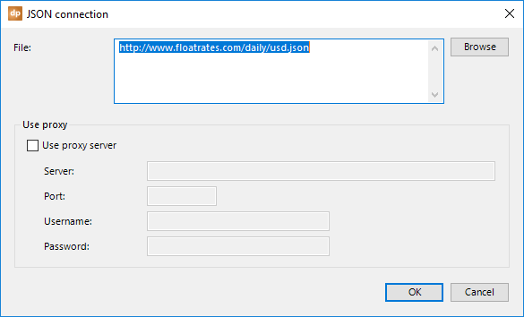
Open the List connections from the DataPoint menu and select the JSON data provider. Click the Add connection button.
Click the Browse button. Navigate and select the JSON file that you want to use. Mostly, the JSON will come from a webserver or website. In that case, just enter the HTTP or HTTPS URL that identifies this file on a website.
In addition, you can enable the use of a proxy server and set the proxy information. Check the correct values with your network administrator. Click OK to close.
This connection is added to the JSON node on the connections form. With this connection selected, click the Add query button.
Select a table from the list of tables that you want to use on your DataPoint presentations.
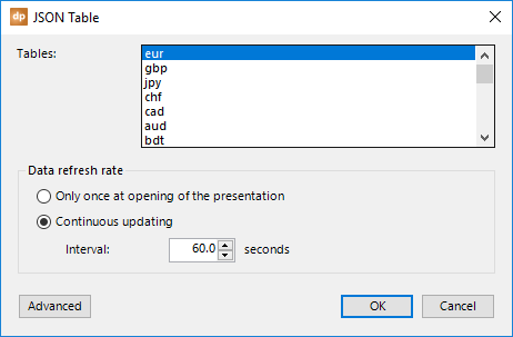
To refresh the data, you have two options here, too.
You can choose to refresh the data only once at the opening of the presentation. This could be done when you are only using the presentation for reporting or statistics, not really for real-time information screens.
Or, you can choose to activate a timer, e.g. every 60 seconds, to check for new data. This timer begins when you start the slide show. So, the automatic updating will not happen when you are designing the presentation. For that, you have the Refresh button. Use a small figure for critical or frequently updated data, like for auctions and sports game results. Or use a larger figure for anniversaries and non-critical messaging.
Click OK to close, and a preview of the data will be displayed.
4.22.oData connections
The OData (Open Data Protocol) data provider allows you to connect to RESTful APIs in a simple and standard way. Typically, you will find an oData service with one or more resources with data.
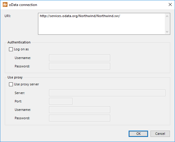
Open the List connections from the DataPoint menu and select the oData data provider. Click the Add connection button.
First of all, you start by setting the URI, or the Uniform Resource Identifier. This is the server or machine address that you are connecting to.
In addition, you can check the option Log on as and set its username and password for a protected service.
And finally, you can enable the use of a proxy server and set the proxy information. Check the correct values with your network administrator. Click OK to close.
The oData connection is added to the oData node. Click the Add query button next.
Select an item from the resources list.
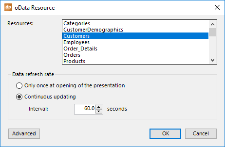
To refresh the data, you have two options here, too.
You can choose to refresh the data only once at the opening of the presentation. This could be done when you are only using the presentation for reporting or statistics, not really for real-time information screens.
Or, you can choose to activate a timer, e.g. every 60 seconds, to check for new data. This timer begins when you start the slide show. So, the automatic updating will not happen when you are designing the presentation. For that, you have the Refresh button. Use a small figure for critical or frequently updated data, like for auctions and sports game results. Or use a larger figure for anniversaries and non-critical messaging.
Click OK to close, and a preview of the data will be displayed.
4.23.Advanced properties
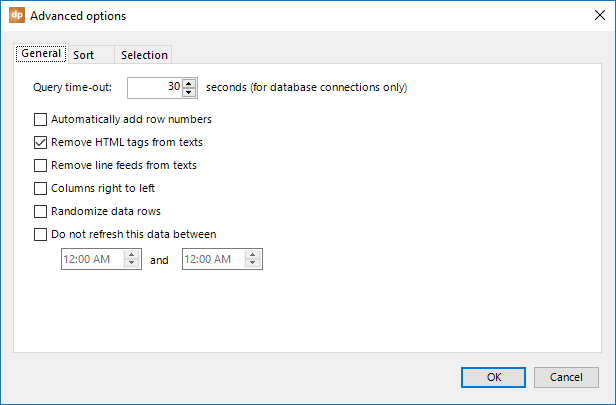
On the General tab, there are a few options that you can set for every type of query.
In some events, communication with a data server is either not working or too slow. To avoid long-running transactions, you can set a maximum time for running a query. A timeout, as this is technically called. Timeouts of 30 or 60 seconds are very common. When a query is launched, it will be seen as unresponsive after this number of seconds, and it will abort the data request. Sometimes, when you know that you are using a long-running query, it might be helpful to increase the query time-out time.
You can add row numbers automatically to the data. For example, when you want to display the five top-selling products, you can list the products’ names and sales info, and you can use the row numbers to better rank your data. You will have a clear view of which product ranks 5th and which product ranks 1st.
In the event that you are working with HTML content, then you can remove the HTML content automatically by checking the option Remove HTML tags from texts. Examples of HTML tags are <p>Your text</p> and <strong>my text</strong> and are typically found in RSS feeds.
To remove the line feeds from the text, check the option Remove Line Feeds from texts. Line feeds are used to start a new line of text within the same field or column, like an address.
To put the column from right to left, check the option Columns right to left. This is typically used for some Arabic or Hebrew languages.
Sometimes you have a set of data and you really want to display the data in an random order. Think about quotes and jokes. Check the option Randomize data rows for the feature. Certain slides can have text boxes linked to such a random data set. Every time that such a slide is shown, the randomization is happening so that every time that you land on this slide, new information is shown.
To lower data communications and to minimize network resources, you can disable the refreshing of data between certain hours, such as the closing hours of your shop. Check the option Do not refresh this data between and set your desired start and end date.
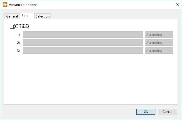
Sort data by checking the option Sort Data. This will enable the sort data option. The combobox will allow you to select an ascending or descending sort order — A-Z or Z-A.
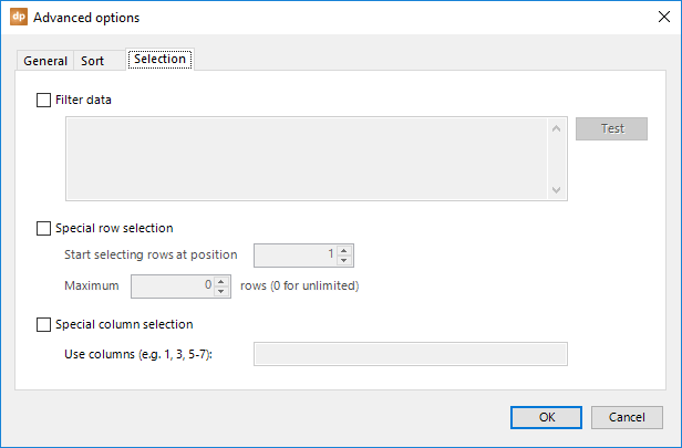
Check the Filter data checkbox and set a .Net filter syntax to filter some of the data that matches the criteria. This is a bit technical, and more information can be found here.
There are a few variables that you can use in the filter like:
- Now() returns the current date and time
- Today() returns the current date only
- UTCNow() returns the current date and time in Universal Time Coordinated value
- UTCToday() returns the current date in Universal Time Coordinated format
- DateAdd(“n“,-15,Now()) can be used to add or subtract minutes from the current time
- DateAdd(“d“,-31,Now()) can be used to add or subtract days from the current time
- DateAdd(“n“,-15, Today()) can be used to add or subtract minutes from today
- DateAdd(“d“,-31, Today()) can be used to add or subtract days from today
- TodayDayNo() returns the current day number (1-31)
- TodayMonthNo() returns the current month number (1-12)
- TodayYearNo() returns the current year (e.g. 2021)
- TodayWeekNo() returns the current week number (1-52)
Note that the functions are case sensitive!
A working filter is this: [Start] <= Now() and Now() <= [Stop]
Enable Special row selection when you need to read out rows 6 to 10 only. Set the starting position to 6 and set the maximum rows to 5.
Use the Special column selection to filter out columns automatically. Typically for a table of data, you have many columns that are not relevant showing on your screen. Therefore, you can use this feature to specify the column number that you want to keep. This works like a print command for pages. The notation 1, 3, 5-7 will include columns 1, 3, 5, 6, and 7.
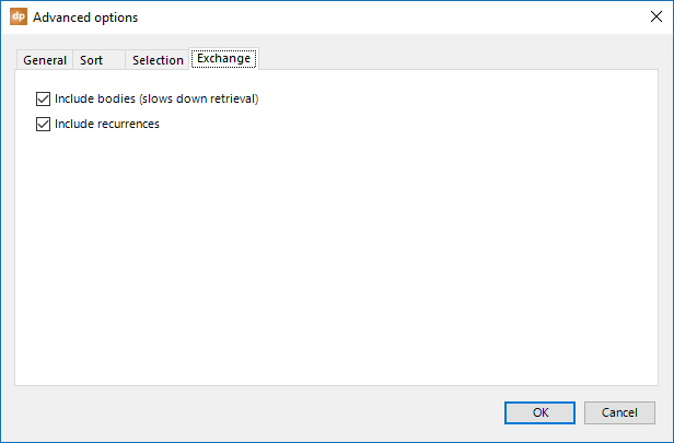
There are some more advanced options for Exchange data connections. Click the Advanced button and click to select the Exchange tab.
Here you can choose to uncheck the option Include bodies (slows down retrieval). By default, the bodies of appointment are retrieved for more information about events and appointments. When you don’t need the body content, then uncheck this option and your data retrieval will be much faster.
Check the option Include recurrences when you want to include the daily/weekly/monthly recurrence of a recurring event.
5.Using shapes
After setting up all your data connections, it is now time to start using that data for PowerPoint shapes.
There is only one DataPoint shape that does not need a connection associated, and that is the clock. The clock is reading out the normal date or time values from your local computer. Besides the DataPoint clock shape, all other shapes need to have a data connection because they are associated with data connections.
That is also the reason why you might experience numerous shapes being disabled in the DataPoint’s shapes group. You need to have data before you can assign that data to shapes.
Let’s explore all of the dynamic DataPoint shapes.
The first time that you open the DataPoint properties of a shape, you will get to see a tip that will tell you in short what the purpose of the shape is and what can be done with it.
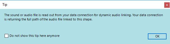
You can click OK to close the message. It will not be shown anymore during this run of PowerPoint. The next time that you start PowerPoint and click the same button, this message will pop up again.
Check the option Do not show this tip here anymore to prevent future openings completely.
5.1.Shapes on slides and slide master
You can use different shapes on the slides of your presentation. Think about text boxes, pictures, tables, and charts. But even more exotic shapes — like audio and video, meters and pointers — can be used.
A slideshow is typically a sequential collection of slides, but sometimes it can be handy to be able to place some shapes on the slide’s master design of a presentation, so that these shapes are immediately available on all slides. Think about the current time, or the running sum of your fund-raising event.
With DataPoint, you can use the clock, text boxes, and picture shapes on your slide master, and have it update automatically.
5.2.Dynamic audio shapes
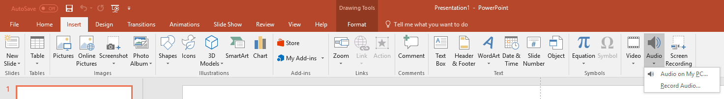
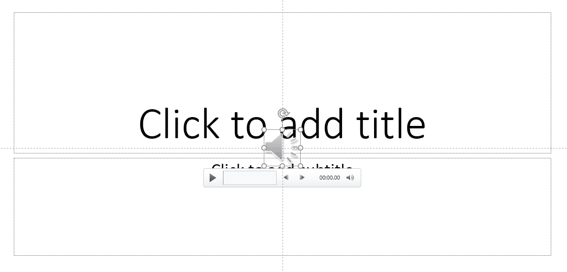
With an audio shape on your slide, you can play a selected sound file. Click to open the Insert menu of your PowerPoint ribbon, and click the Audio icon or button. Next, choose Audio on My PC… and navigate and select a sound file.
You can use a variety of extensions and audio formats. The most common formats are MP3 and WAV files.
See the sound file and click the Insert button. The audio shape is inserted on your slide.
You might not see this very often, but you may want to change the audio file itself on certain occasions. Think about a ping sound when give the right answer on a quiz, and a big dong sound for an incorrect one. Something like that. Or maybe your audio file is a spoken text, or maybe some form of spoken advertising. Whatever…
Now, we assume that we have a data source, like a Microsoft Access database, Microsoft Excel spreadsheet, or maybe just a text file within which is the full path to the audio file, that you link dynamically to this audio file.
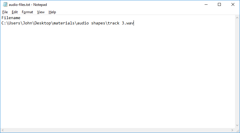
So with DataPoint, we have a dynamic data connection via the text file data provider, like this.
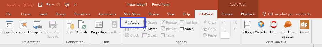
To turn that previously static audio shape into a dynamic shape that is listening to our value of the data provider, we first have to select the audio shape. Then, click to open the DataPoint menu and you will see that the Audio button of the Shapes group is enabled.
Click the Audio button. The audio linking form looks like this.
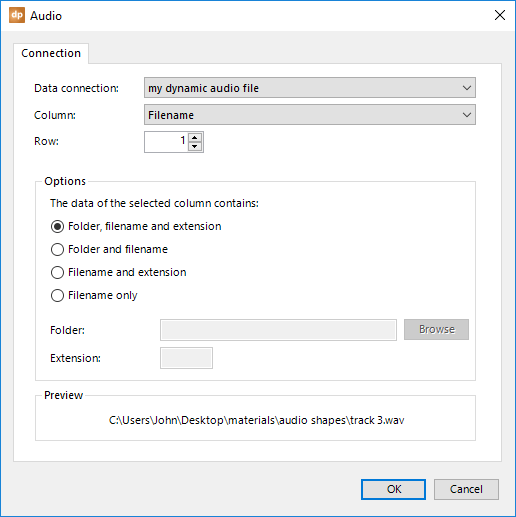
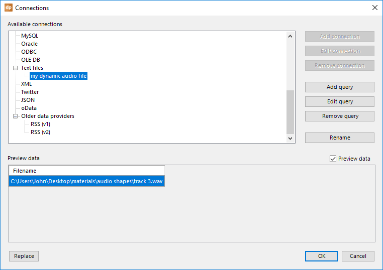
The first combobox, named Data connection, allows you to choose the data connection from which you want to read the information. You might have other data connections to news, weather, and other databases. So here, make sure to select the data connection that is holding your audio file for playback.
Based on the data connection you have selected, all of its columns will be displayed in the second combobox, named Column. Open this and select the corresponding column that you want to use. In this example, we only have one column, which is the filename of the audio file. But in more complex situations or data files, we might see a lot more columns here.
Leave the Row number as 1, as we are interested in the first data line of the data connection here. You are free to change the row number to any other value that corresponds to a line number or row number of your data file. If you want to play the 9th entry of the data file, then simply set this row value to 9.
In the Preview area, you can always see what value is currently taken from the data connection. Here, we see a filename of ‘track 3.wav,’ accompanied by the file’s full path.
A full path, filename, and extension are what we need to find the audio file. This value seems to be fine and, whenever the file can be found, it will be used in the PowerPoint slideshow when it’s running.
In the Options group, there is a setting named The data of the selected column contains. By default, this is set to Folder, filename and extension. This is perfectly fine for our current value.
Sometimes, you may only find the filename, or filename and extension, in the data source. In that case, you have to change the option here. When you set it to Filename only, you can set the folder and extension options to complete the full path to the file.
When you’re ready, press the OK button.
The value of the first row is now dynamically linked to this audio shape. The next time you open the presentation, the potentially updated value of the data connection will be re-applied to this audio shape. And when this presentation is running as a slideshow, you can update the content of the data connection, and the sound file linked to this audio shape is updated accordingly, without having to stop the slideshow.
5.3.Dynamic chart and graph shapes
There are charts and graphs in PowerPoint. Basically, graphs are its older charts. Since PowerPoint 2007, Microsoft has moved away from graphs (produced by the Microsoft Graph) to the newer charting (based on the Excel charting engine). Microsoft is promoting the newer charts and discouraging the use of the graphs.
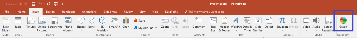
Let us show you first a graph and then a chart, and you will probably recognize the difference. Click to open the Insert menu and then click the Graph button in the DataPoint group.
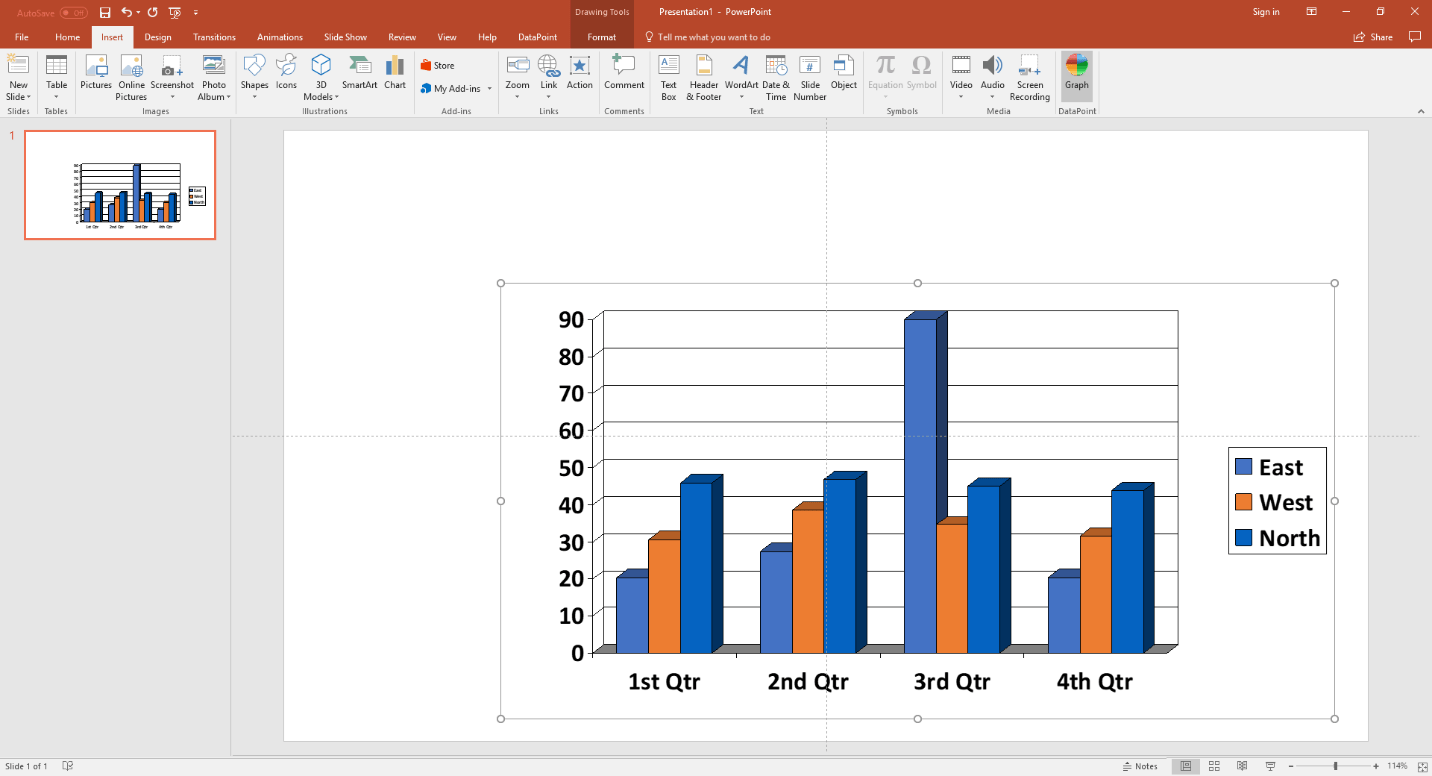
This action inserts a default graph on your slide.
To insert a newer chart, open the Insert menu again, but this time, click the Chart button.

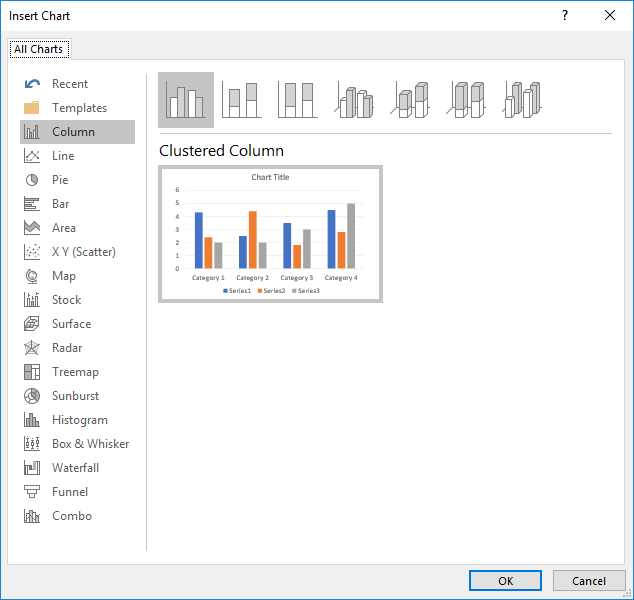
You are first asked to choose your type of chart. You can choose between bar charts, pie charts, and many more.
Finally, the inserted chart shape looks like this now.
What’s the difference, you might ask. On this last chart shape, the green Excel worksheet opened up automatically to edit the figures of the datasheet. That worksheet opening is the difference between a graph and a chart.
Microsoft PowerPoint does not allow 3rd party tools to update the data on the datasheet of a chart without opening and seeing the worksheet. This is ‘by design.’
The older graphing shape allowed us to update data during the slideshow, without the datasheet popping up. So here is our advice: if you don’t mind seeing that worksheet flashing when updating, then use a chart. If you do mind, use a graph.
So, basically, our rule is as follows: for designing and generating snapshot presentations, etc., use a chart. If you want to display real-time updates on your chart on a running information screen, then use a graph.
The look of a chart is different from a graph, but its DataPoint processing and linking capabilities are identical.
For this here, we have a data file set up like this.

Typically for charts and graphs, you have numerical information like this.
Now, when you select the inserted chart or graph, the following DataPoint linking options remain the same.
For chart processing, select the chart and click the Chart button on the DataPoint menu. For graph processing, select the graph and click the Graph button on the DataPoint menu.
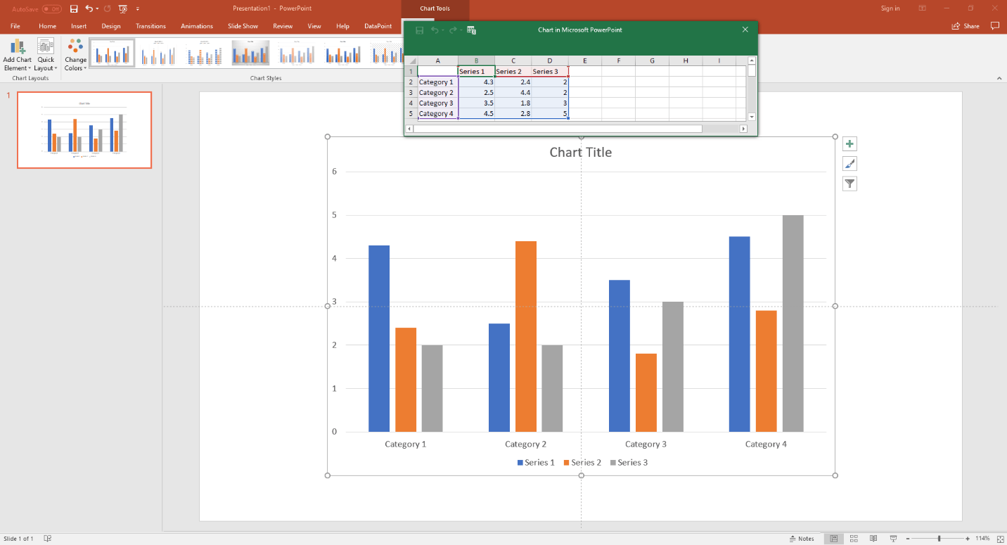
The DataPoint linking properties look like this. We will use the chart for this documentation. The graph options are completely identical.
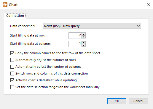
The first combobox, named Data connection, is used to select the data source or data connection for your chart. Open the combobox and you will see all the data connections that are set up for you in this presentation. Select the data source to feed your chart.
With Start filling data at row and Start filling data at column, you can control which cell of the chart’s datasheet you start filling in with data. Typically, you start at row 1 and column 1. A good reason to start at row 2 is when you want to set your own column headers or names.
The option Copy the column names to the first row of the data sheet allows you to automatically use the data connection’s column names as the column names of the chart. It will place the column names in row number 1 and start filling in the data in row number 2, and further.
You create the chart and the datasheet, and you can control the selection of the data. Note that you can have more data on your datasheet than you display on the chart. This is controlled by the selection. So normally, DataPoint is just copying over the data from the data connection to the datasheet of the chart. If you want to grow or shrink the selection dynamically, then you can check the options Automatically adjust the number of rows and/or Automatically adjust the number of columns.
You can switch the rows and columns of your data connection before they are fed into the chart’s datasheet. Just check this option and your datatable will be rotated 90°, so to say.
To avoid seeing the chart’s worksheet flashing on your screen, uncheck the option Activate chart’s datasheet while updating. Microsoft encourages using the activation because without it, it can cause corruptions, but in some situations you have to take the risk when you can’t afford to show that datasheet flashing on your screen while it is updated. Make backups of your presentation so that you can easily recover your charts after a potential corruption.
Normally DataPoint is setting the data selection of a chart based on its number of rows and columns. But there are situations where you just want to display a subset of the datasheet’s data. In that case, check the option Set the data selection ranges on the worksheet manually and you have control of the selection.
Click OK to close the form.
5.4.Dynamic clock shapes
A clock shape is the only shape in DataPoint that is not linked to data connections. It is just displaying the current date and/or time. Start with a new text box on your slide. Click Clock from the Shapes group while you have the text box selected.
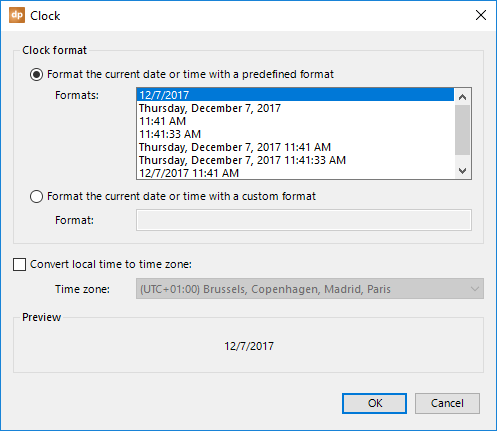
Now, you can select a preformatted date or time, or you can enter your own customized date and time format. A complete list of custom date and time formats can be found at http://msdn.microsoft.com/en-us/library/8kb3ddd4.aspx.
Optionally, you can select a time zone to convert the current local time into the date or time of another time zone. The Preview frame is showing you how the presentation will look. Click OK to apply.
5.5.Dynamic meter shapes
Meters are great. They are easy controls for rotating or resizing a shape based on a dynamic value from a database. Think about dashboards, where you can, for example, rotate needles or gauges. Resizing controls can be used for the dynamic bars of a bar chart, but without the chart. You can visualize your dynamic values by resizing the shape. It is much quicker than updating a chart.
Typically for a meter, it can control the rotation and the width or height of a shape, dynamically and based on one specific value. Imagine this data.
Controlling the Width and Height of a shape
We just inserted a rectangle shape and we want to control the length or width of the shape dynamically. It’s important that you draw the rectangle at its maximum size.
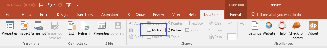
Select the rectangle shape and click to open the DataPoint menu. Click the Meter button next.
The meter property form will open.
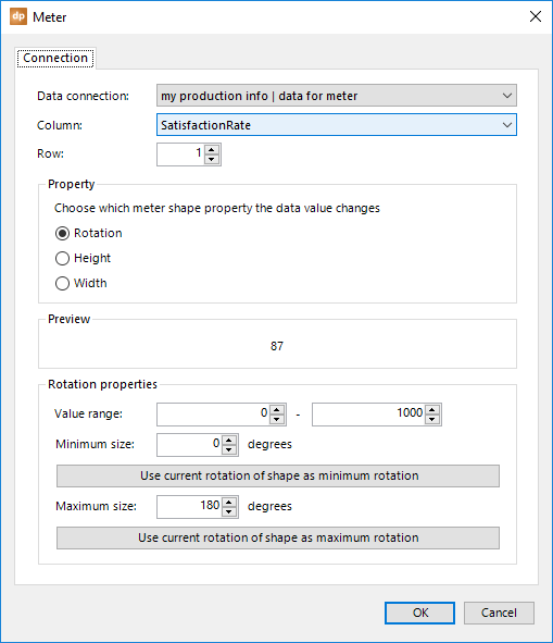
First, select the proper data connection from the list. Then, make sure that the data column that is holding your dynamic value is selected in the Column combobox, as well as for the Row number.
You can always verify your connection settings by looking at the Preview panel.
With this shape, we want to control the width dynamically. In the Property group, switch to use the Width option.
The properties on the form will change slightly.
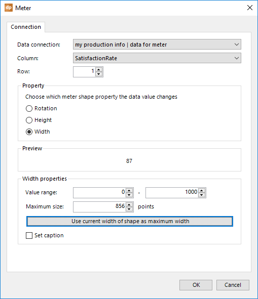
In the Width properties group, you can set a range for the expected database value. The minimum value of the range corresponds to a width or size of 0 pixels. The maximum value of the range corresponds to the maximum database value that results in the maximum width that you want to draw on this slide. So, if we are dealing with percentages, then set the range to 0 and 100 as the maximum. When we are talking about salaries, set it to 0 and 6000, for example.
Important: Before we went into this form, we should have drawn the rectangle at the maximum size possible. When this is done, we just click the Use current width of shape as maximum width and the current width will be set as the value in the Maximum size textbox. Of course, if you need more excitement, you can set the maximum size with your own numeric value.
You can read the current values on the form like this: a database value of 1000 maximum will adjust the width of the shape selected to 856 points, which is a unit in PowerPoint for measuring shapes and lines. A database value of 500, which is exactly 50% of the maximum value possible, would resize the dynamic width of 856 pixels to 50% of 856, which is 428 pixels.
As an option, check the Set caption option to set the database value as the caption of the shape.
Hit OK to close and you will see that the width recalculation takes place immediately.
In design mode, a database value change would update the width by just resizing the shape at once. In slideshow mode, however, a new value will cause it to grow or shrink gradually to the new size.
What we did for the width here is the same for dynamically controlling the height of the shape. It all depends on how you want to use your slides and your design.
Rotating a shape
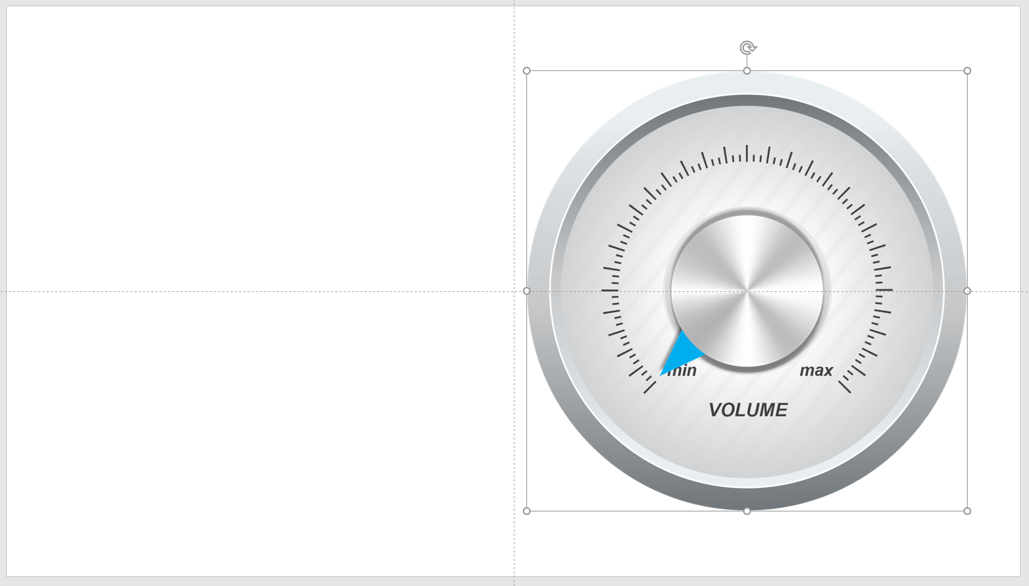
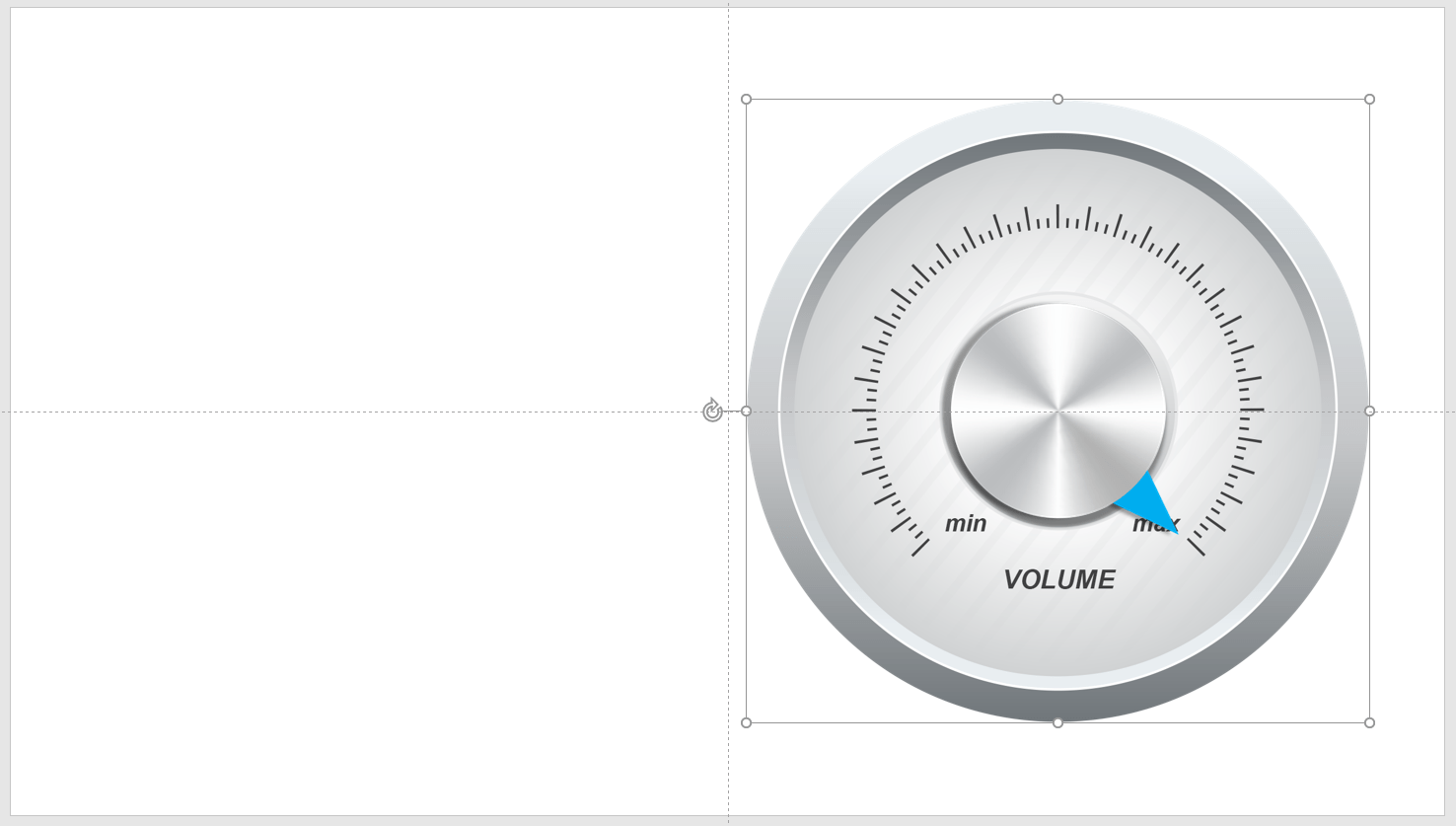
More visually spectacular is controlling the rotation of a shape. Most likely, you will use a gauge or needle to represent a database value. Look at the slide below. We have two physical drawings. One is the background image that represents the scale, and the other one is the needle that we can rotate.

We place the needle on top of the background image, and we still have the needle image selected before we go into the meter options.
Make sure that the needle is turned to the minimum position on the scale. Select and open the DataPoint menu and select the Meter button.
Just like when changing the width dynamically, make sure that the data connection, column, and row are correctly chosen from the lists.
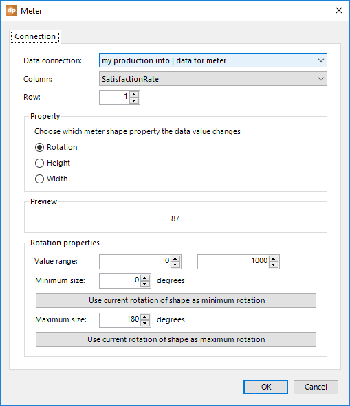
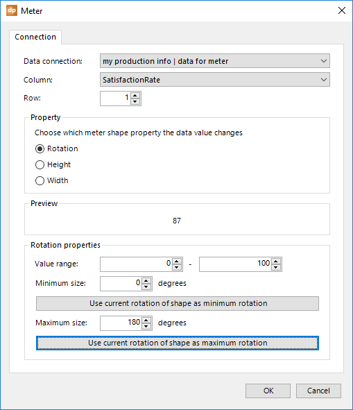
While we have the Property set to Rotation, we first set the minimum and maximum values of the value range. With this sample, we have a percentage value of 0 to 100 as our data source. So, we set the minimum to 0 and the maximum to 100.
Since we set the needle to the minimum position, just click the Use current rotation of shape as minimum rotation and the current rotation value will be set in the Minimum size textbox.
Click OK to close. The needle is repositioned.

Now, turn the needle to its maximum position.
Click the Meter button again from the DataPoint menu.
Click the Use current rotation of shape as maximum rotation button.
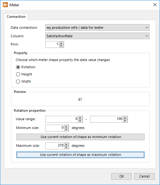
The maximum size will now update to 270°, which completely reflects our rotation change between the minimum and maximum of the scale.
Click OK to close.
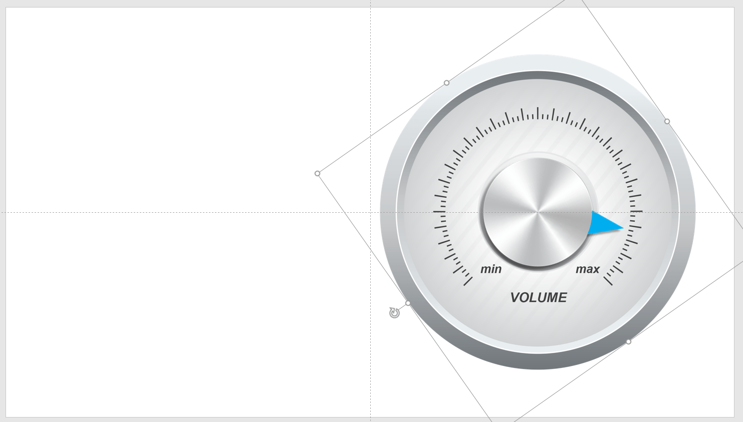
The needle is now correctly positioned according to its value.
In design mode, a database value change would rotate the shape to the new position immediately. In slideshow mode, however, a new value will cause it to gradually rotate to the new position.
5.6.Dynamic object shapes
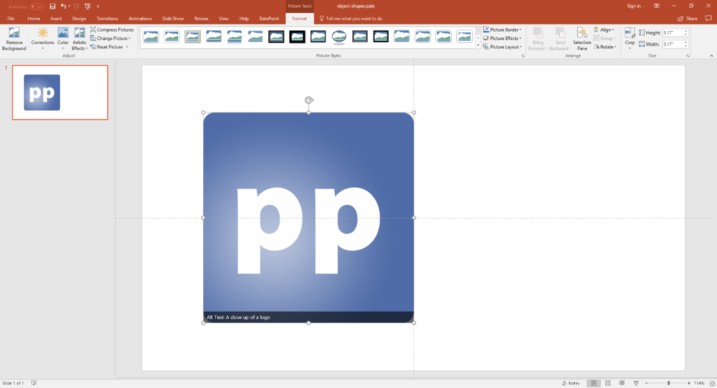
An object in PowerPoint is a generic shape that can host linked OLE objects and linked pictures. For example, when you need a picture, you go to Insert, Picture, and you choose your image. The image is inserted (not linked) on your slide. If the content of the file changes, the image will not change on your slide. That is where you would need a linked object.
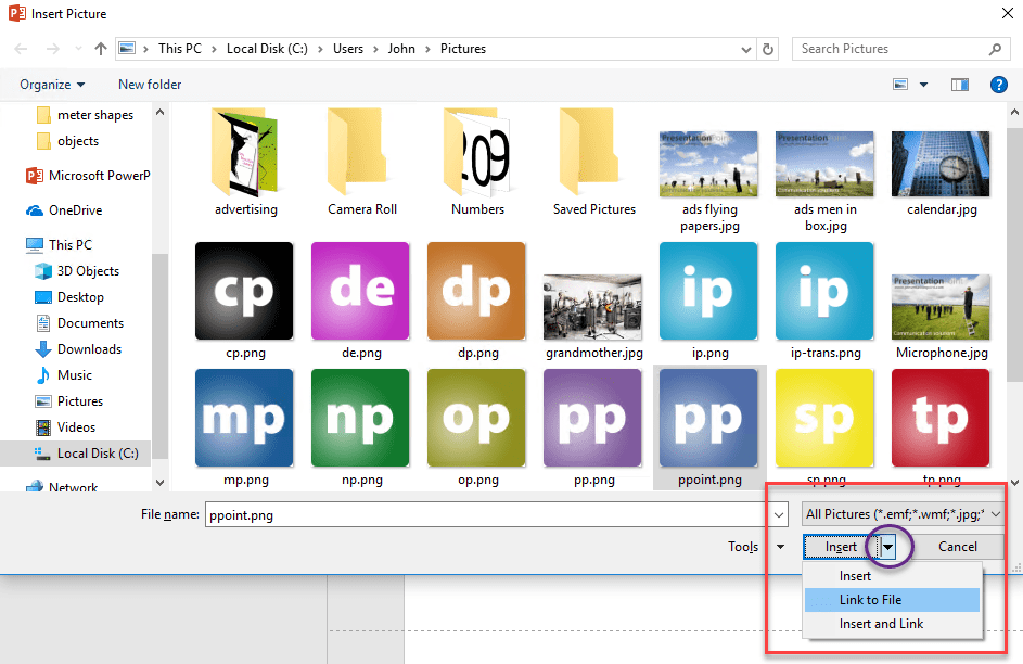
To insert a linked object or linked image, go back to the Insert menu and click the Pictures button.
Now, browse until you see the image that you want to use, but do not click the Insert button as before. Open more options under the Insert button by clicking on the arrow of the button. Then, choose Link to File.
The result might look the same, but with this, the picture is dynamically linked to the source file and can be controlled by the content of your data connection.
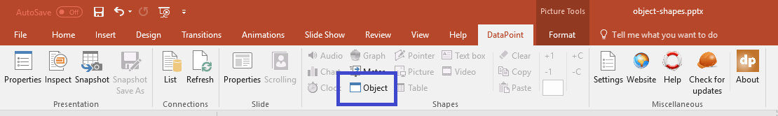
With this inserted image selected, go to the DataPoint menu and click the Object button.
In the object linking properties, you can choose a data connection from the first combobox with a list of data connections that are set up for this presentation.
Then, pick the column of the data connection that you want to apply here.
Finally, change the row number to another value, when needed.
A preview of the value that is retrieved from your data source is visible in the preview area.

From the value in the preview, we can see a full path, filename and extension. So the default value in the Options group of The data of the selected column contains being set to folder, filename and extension is fine.
If ever a path is not supplied at the data source, then you can switch this option to Filename and extension and browse for the folder manually, to complete this information.
Hit OK and the image of the data connection is now dynamically linked to the source image or object.
5.7.Dynamic pointer shapes
Time for something more exotic: dynamic pointers in PowerPoint. What is that, you might ask. Do you know what a Graphical Information System, or GIS, is? Right, that is a kind of presentation where you see objects moving on a map. Think about flight tracking software, or software where you can track trucks in real-time. With DataPoint, you can build your own graphical information system in PowerPoint.
Basically, what we call pointers in DataPoint, are just one shape to start with. We bind that to a data connection and multiply the shape or pointer by the number of data rows that you have.
So, if you have information about 12 trucks driving out there with their corresponding position or X-Y coordinates, then you only need to add a map to your slide and add one shape to it. This shape, which could appropriately be an image or picture of a truck, will be positioned correctly on the map. Each truck will get its own pointer on the map.
So, after this introduction, you know that a pointer in DataPoint is an occurrence of a person or piece of equipment that is moving around and plotted in real-time on a map.
First, we start by adding a map as a background image. This can be a map of a country, state, city, or even a floorplan of a factory or plant.
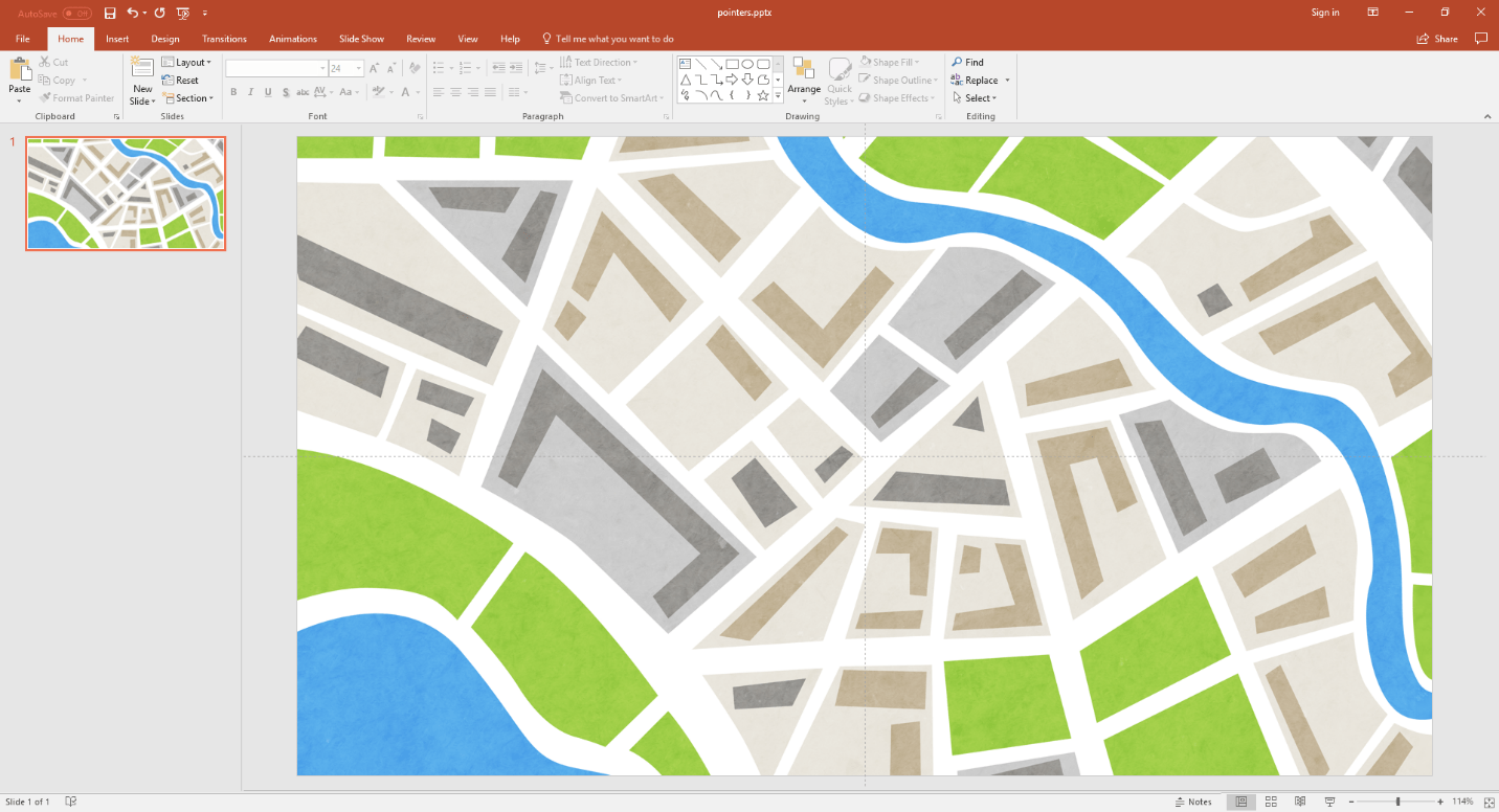
Second, we start by adding one shape that will be used to represent an object or resource. We add an icon to this slide here.
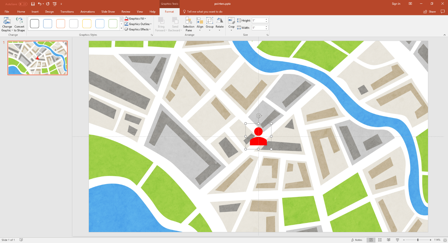
Third, we connect to a data source that will deliver some resources and positioning information.
<xxxx>
With this first shape selected, click and open the DataPoint menu and then click the Pointer button.
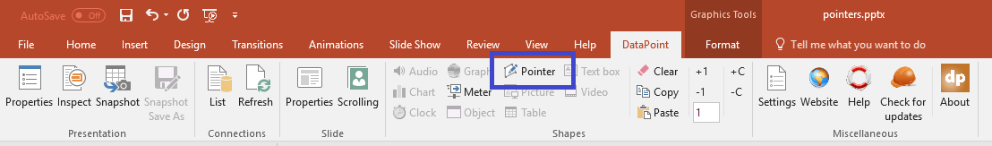
This will bring up the pointer properties form.
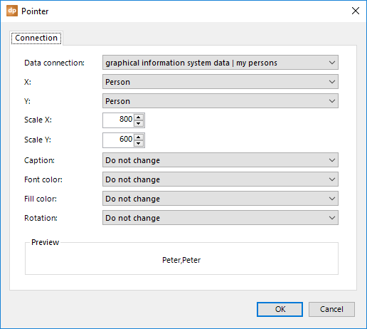
The first combobox, named Data connection, should be obvious by now. Here is where all of your positioning data is coming from.
Then, there are two comboboxes named X and Y. For both comboboxes, select the columns holding the X and Y positions, respectively, of the resource that we are going to show on the slide.
Next, the two fields are called Scale X and Scale Y. These values represent the maximum possible size of the map or slide. Resources that are visible on this map area should have X-Y values within this range.
Set the Caption to a field that identifies a resource. Flight number for flights, license plates for trucks, names for persons, etc. Note that some shapes have a text placeholder, but others don’t. For example, an image has no text placeholder, while a rectangle or freeform shape has a text placeholder.
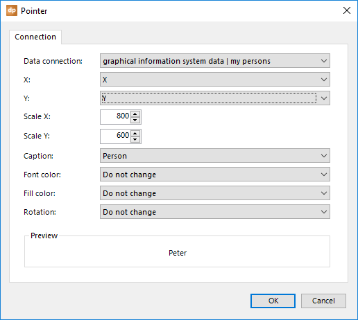
With these values, we have a maximum map area of 800 points in width and 600 points in height. A plotted resource with X-Y values 400-300 would go directly in the middle of the map or slide.

Another resource at 400-600 will be positioned in the middle of the bottom of the map.

Resources with a position of -180,500 are completely outside the scope of this map and these are not drawn on the map.
So when you design this map, you only place one resource linked to the first data row. Whenever you have multiple resources at your data source, DataPoint will automatically create duplicates of this shape to position each resource on the map.
Even during slide shows, new row additions will result in a new shape that is added at runtime to this map. A row deletion, or a resource that is completely outside the scope of the current map, is deleted automatically.

Tip: If you want to see the resources move in real-time on the map, make sure you use a high refresh rate (small value) in the connection or query settings.
There are a few properties left over to explain.
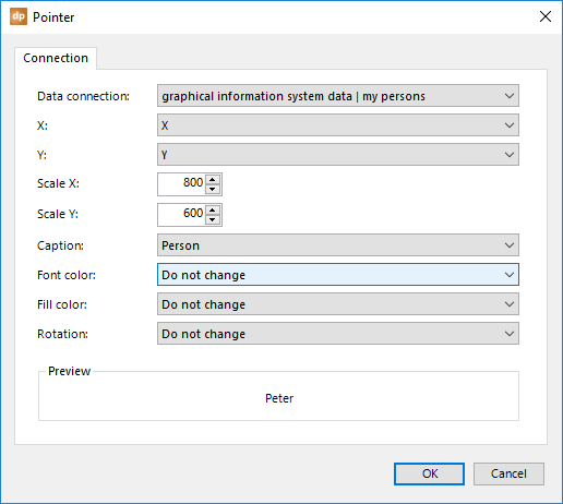
If you are controlling the color of the caption dynamically from our data source, then you can set the Font color combobox to the database column that holds its value. The color value is expressed as a RGB value, like 255.255.255, or a HEX value with 6 numeric values, starting with a # sign, for example #FFFF00.
The same goes for the fill color of the shape. Set the Fill color combobox to the color that holds the fill color.
Finally, you can choose a column that will return the Rotation of the shape. This is a value between 0 and 360. Think about trucks and aircrafts that travel in a given direction.
5.8.Dynamic picture shapes
Pictures are great shapes in PowerPoint. You can use a picture as a background image, but you can also use one to clarify or visualize data. A numeric value of 87 might say something to you, but a red light shows more information. 87 might be in the danger zone for certain indicators, but that is knowledge or interpretation. When you define that a value lower than 80 is green, and higher is red, then you alert people better in alarming situations. There is nothing wrong with giving that figure of 87 as well, but the picture says it all, in the blink of an eye.
We have this information coming from a data source.
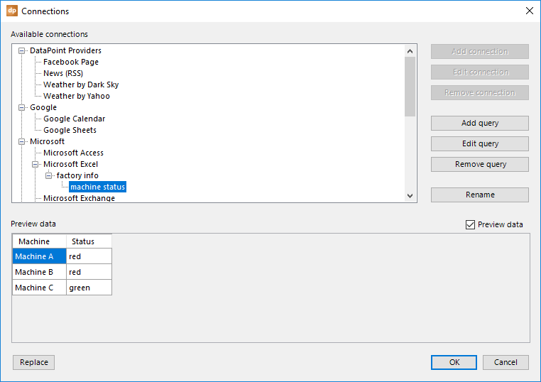
Let’s try to visualize this information with dynamic pictures. First of all, add a normal picture to your slide. Click to open the Insert menu and click the Pictures button.
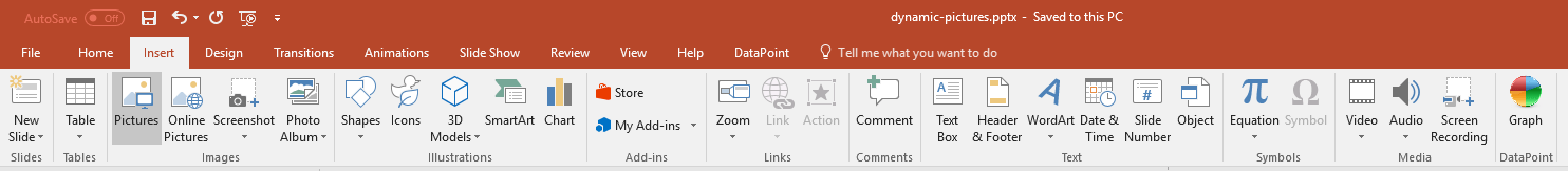
Browse and select any picture to get started.
With this picture selected, click to open the DataPoint menu and click the Picture button.
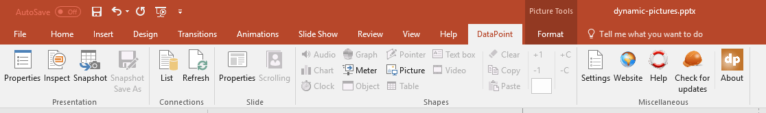
This will ask you to convert this static picture into a dynamic picture. Of course, we confirm by clicking Yes.
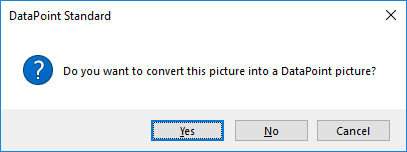
This will open the picture properties form.
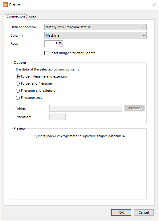
First of all, we select the desired data connection from the list and set the column to the column that is holding the information for our dynamic picture. Also, make sure that the row number is correct.
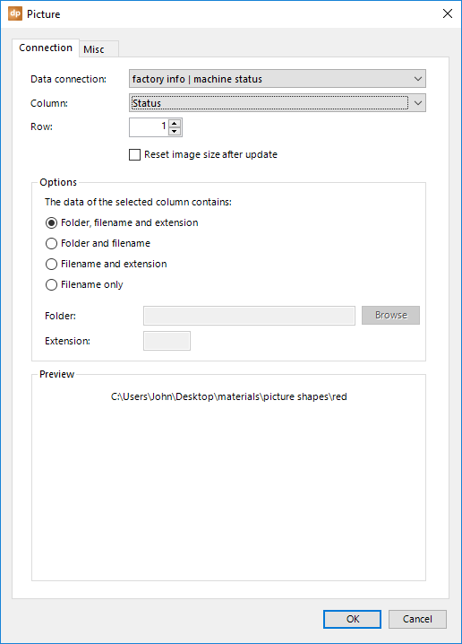
You can see the preview value. In this sample, the data connection is only returning the possible values green, orange, and red. We see some kind of default path, and then the value red in our preview.
When we look at the folder and the images that we have, we see three JPG files named green.jpg, orange.jpg, and red.jpg.

Back on the picture properties form, change the option The data of the selected column contains to Filename only. This gives us the option to specify a folder and an extension.
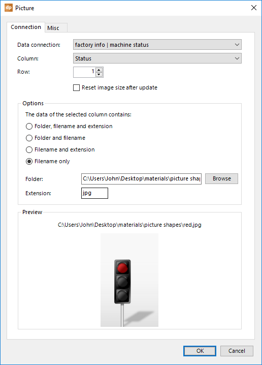
After setting the folder that holds our possible pictures and the correct extension (jpg is this sample), we can now confirm that the picture’s path is correctly set, since we see the picture preview.
Click OK to close and this picture is now listening and reacting to changes at the data connection.
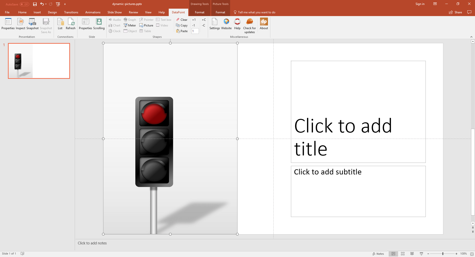
5.9.Dynamic table shapes
Nothing is easier to use than tables. The advantage of a table on your slide is that it is only one shape that can store multiple cells. Basically, it is a collection of text boxes in rows and columns. Probably very similar to the rows and columns of your data connection already.
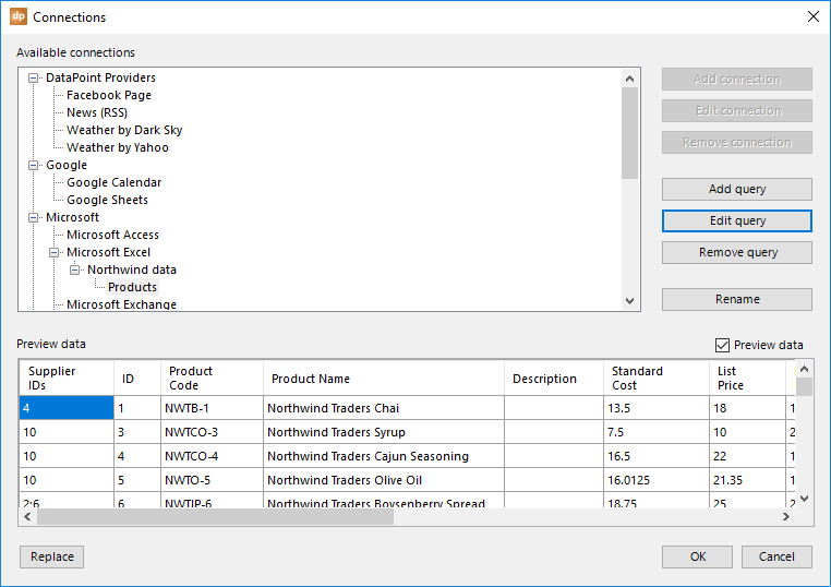
To insert a table on your slide, click to open the Insert menu and then click the Table button.
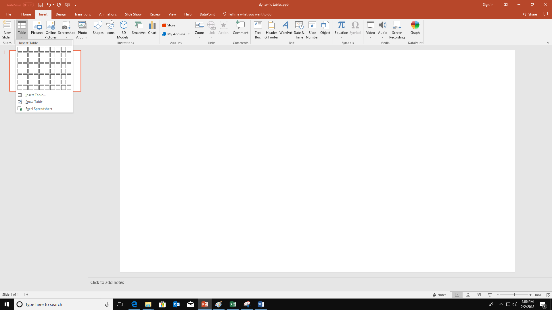
On the popup menu, indicate how many rows and columns you want to have in your table and click it. The new table is inserted on your slide.
Now, click the DataPoint menu option to open it and click the Table button.
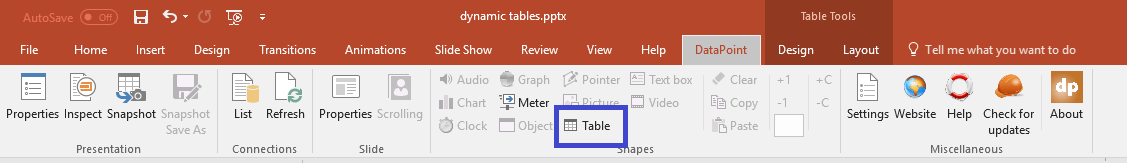
This clicking opens the table linking form.
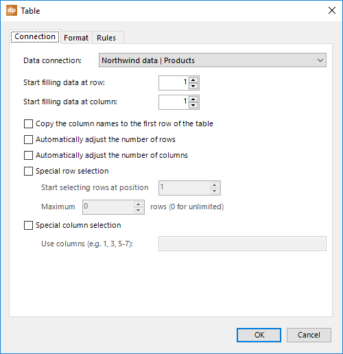
First of all, the data connection. Nothing new, always the same in DataPoint. Make sure to select the data connection that you want to use on this table.
When you click OK here with all of these defaults, your table is populated with data from the chosen data connection.
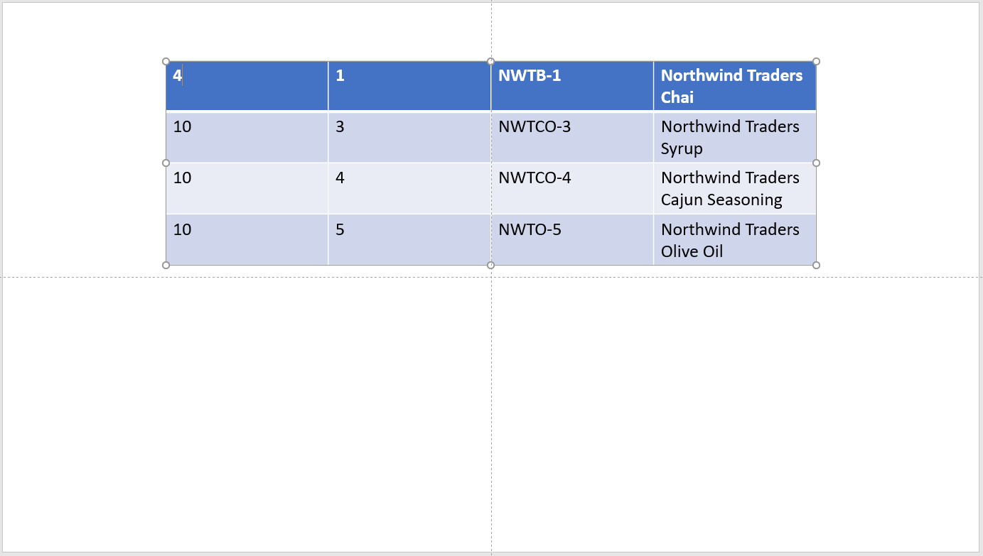
But, there are more options for tables.
To start with, you can control where to start filling in the data. You can change the Start filling data at row and the Start filling data at column options. The default is 1 and 1 to start filling the first upper left cell and so on. You can set the row to 2 if you want to set some header information manually in the first row.
The next option is that you can have the column names filled in on the first row of the table. Check the Copy the column names to the first row of the table option. Note that when you check this, this sets the Start filling data at row to 2.
By default, DataPoint is filling in all the cells of the table. If the table is larger than the data itself, then you will see empty rows and/or columns. DataPoint will only process the cells that are present.
But, sometimes you need more flexibility. Maybe next year, you will have a new column. Or your company is selling another product and you need an extra line. To handle this, you can allow DataPoint to automatically adjust the number of rows and columns by using the Automatically adjust the number of rows and the Automatically adjust the number of columns options.
Maybe you don’t want to just show the first 10 rows of your data connection. Maybe you want to skip some rows or use some specific rows in the middle of your data table. Let’s assume that you need to display rows 10 to 17, so 8 rows in total. First, check the option Special row selection. Then, set the Start selecting rows at position to 10, and increase the Maximum 0 rows to 8.
With these settings, DataPoint will not start copying data from row 1, but it will start from the 10th row and take the next 8 rows.
When you leave the maximum at 0 rows, then all of the rows after the starting row are selected until the end of the data.
The same functionality is there to easily skip a number of columns. Maybe you don’t want to show the first two columns because they just contain some meaningless numbers. The option named Special column selection works exactly like a print job command, where you can specify what pages to print. If you only want to show columns 3, 4, 5, 6, and 11 from your data connection, then set this Use Columns option to 3, 4, 5, 6, 11, or even 3-6, 11.
The tabs Format and Rules will be covered later on in this documentation because they behave the same for text boxes, too.
5.10.Dynamic text box shapes
Textboxes in PowerPoint offer the best functionality of all dynamic shapes. First of all, a textbox is easy to characterize and format. And second, DataPoint has a lot of possible features for textboxes.

Insert a textbox in your slide by opening the Insert button and then clicking the Textbox button.
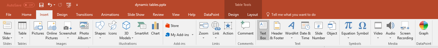
Then, draw the textbox on your slide.

With the textbox selected, click DataPoint and then the Textbox button.
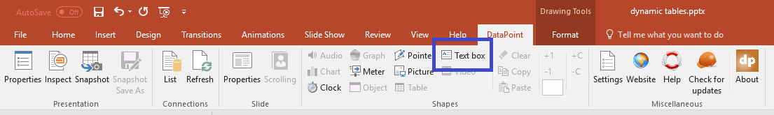
This opens the DataPoint textbox linking properties.
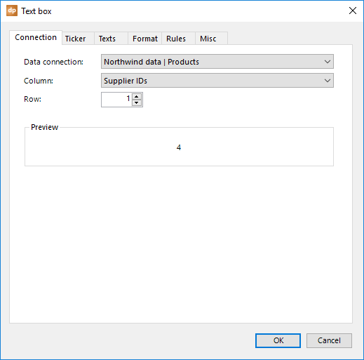
As with everything in DataPoint, you can choose where the data is coming from. First, choose a connection from the Data connection combobox. Then, choose a column name from the Column combobox. And finally, choose the row number.
The preview area shows what value is taken and will be assigned to the textbox.
Ticker tab
Click to open the ticker tab.
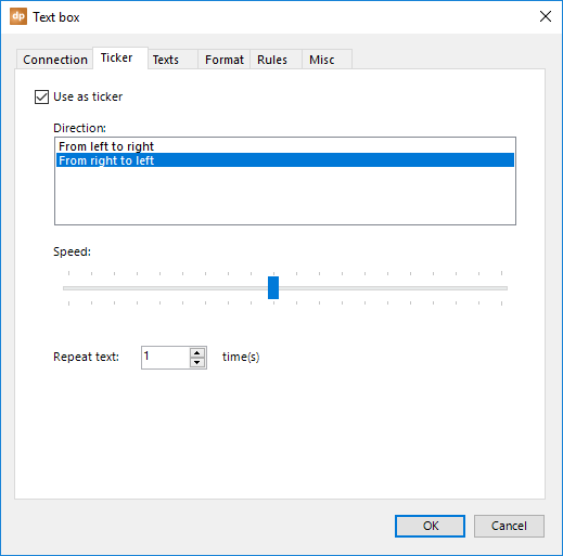
By default, a textbox just shows the dynamic value. But, you can check the option Use as ticker and that will add some animation to the textbox, to fly in from left to right or from right to left.
A text ticker is often seen as a news text message or other info at the bottom of your television screen on a news channel.
With the Speed trackbar, you can make a text scroll faster or slower. Move the tracker to the left for faster animation, or to the right for slower animation or to prolong the duration of the animation.
As an option, you can repeat the text a couple of times, as the text is typically too short for the duration of the slide.
Texts tab
The texts tab adds great value to a textbox.
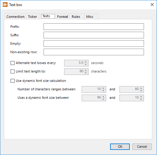
By default, just the database value is placed dynamically in your textbox.
When you enter a given text in the Prefix textbox, this text is placed in front of the database value. When showing temperatures on your slide, you can use a prefix text, like ‘Current temperature is .’ Notice the space after the “is.”
So the textbox will show a value like this:

The same goes for the Suffix textbox. Here, this text is always added after the database value. Use, for example, a text like ‘°C’ to end up with this new text:
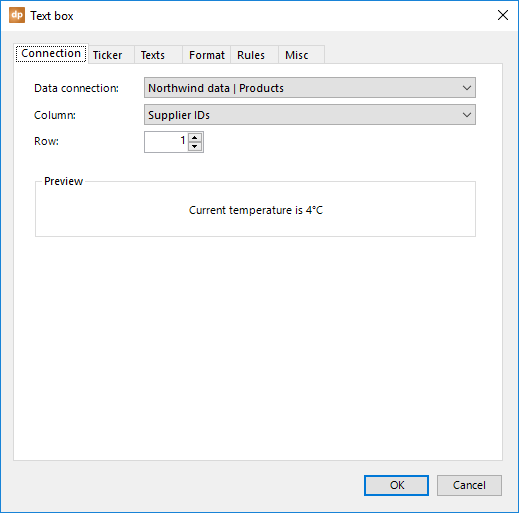
The Empty text replacement can be used whenever the column is returning nothing or a database NULL value. Instead of displaying nothing (the database has a nothing value), you could display the word None, for example.
The last text replacement option is the Non-existing row. Imagine that your textbox is linked to row number 5. Today, your data connection is returning more than five rows, so you will see a value. But maybe next week, there is no row at all at position 5. In that case, you can specify the text replacement here, like ‘No malfunction reported.’
Check the option Alternate textboxes every x seconds when you have multi-line texts in your database. This could be a multi-line text to show the status of a gate at an airport.
Gate open
Porte ouverte
In one single cell, there is not just one line of information, but multiple lines. Each line is separated by a typical line feed (LF). When this option is enabled, it will not show all of the lines at once in the textbox, but it will start displaying the first line for three seconds, then the second line for three seconds, and so on. It will continuously alternate the textboxes, line by line. This is an interesting option to gain more attention for your texts, but also interesting because it needs less space on your screen.
And there is an option to cut off long texts. Text can ruin your design when the text is too long, or longer than you expected to fit in your slide design. In order to prevent having textboxes that go over the expected size, you can check the option Limit text length to and set the number of maximal characters.
When the database value exceeds the specified number of characters, then DataPoint cuts off the text before the last word that exceeds the length. It will add “…” to the text to indicate the cut-off.
Finally, there is an option to adjust the font size based on the text length. The shorter the text, the larger the font size. Long texts require a smaller font size. Check the option Use dynamic font size calculation. Then specify the range (minimum and maximum) of the text length. And finally set the range of the smallest font size and the largest font size possible. The actual font size of your text will be calculated in function of the number of characters, reflected on the font size range. An actual text length of 30 characters, in a possible range of minimum 10 and maximum 50 characters, is calculated as 50%. Right in the middle. That percentage is also applied on the font size range. So a font size range of 20 and 100 as maximum, will use a dynamic font size of 60.
Misc tab
The miscellaneous tab hosts some unique features.
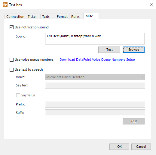
First of all, it is possible to play a notification sound whenever a database value is updated. Check the option Use notification sound and click the Browse button. Navigate to the .WAV file that you want to use and click Open to confirm it.
You can now start the slideshow. And when, for instance, your sales figure or KPI figure is updated in the database, DataPoint will update this information on your slide and play the notification sound to focus attention on the event.
The second option is to use voice queue numbers. You need to install and install the optional and free DataPoint voice queue numbers setup. This will install audio WAV files from 1 to 99. When you check this option Use voice queue numbers and the linked value is a numeric value and this value can be found as WAV file, then a voice will announce the number. So when the data source holds the value 7, the WAV file 7.wav will be played on your computer. You can perfectly combine the option of a notification sound and a voice queue number. When both are selected, the notification sound is played first, followed by the number.
The third option is very unique to DataPoint and PowerPoint. You can have your computer say or announce database values.
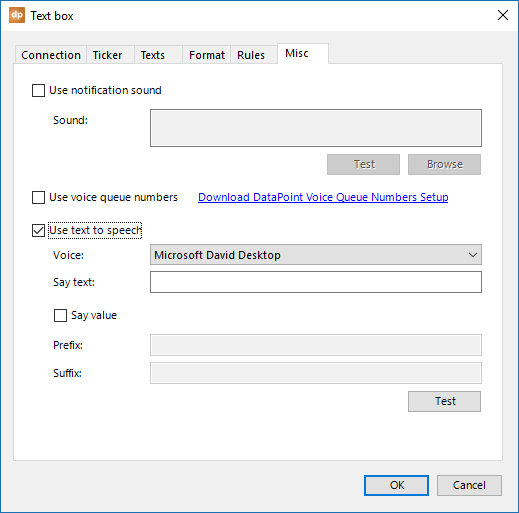
Check the option Use text to speech. Then, choose a voice from the Voice combobox. The voices that you can choose from are dependent on the operating system that you are using, and your language settings. Typically, you will find at least one male and one female voice.
Basically, there are two options for text to speech.
The first option is that you say a given fixed text, like ‘Hey, we have an update for you!’ For this type of speech, just enter your text in the Say text textbox.
The second option is that you announce the database value in a sentence. You have your database value and you can say something before and after it.
When should you use this? Imagine an information display for a train station. You can see a field on the slide for showing last-minute platform changes. In case of such an event, you can display this text in the textbox.
For the text to speech functionality, you can enter this, as an example.
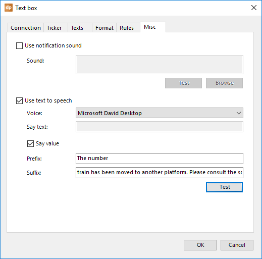
When the textbox is updated with this information, David will say or announce the text: “The number 4 train has been moved to another platform. Please consult the screens.”
Click OK to close.
The tabs Format and Rules will be covered later on in this documentation because they behave the same for tables, too.
5.11.Dynamic video shapes
Pictures are great, but videos are even better. Think about product commercials or a video about your company. Maybe you want to control what video file is playing on your slides, via a data file.
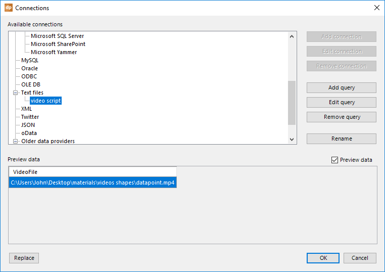
To insert a video on your slide, click to open the Insert menu and click the Video button, choosing Video from My PC…
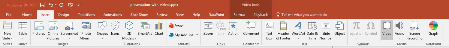
Navigate to your file and click Insert to get this video on your slide.
With the video selected, click the Playback menu option and change the Start option to Automatically.
Then, go to DataPoint and click the Video button.

Make sure to select the correct data connection providing your video information, and set the right column. In the Preview area, you can see the value being returned from the data file.
Choose the appropriate option for the The data of the selected column contains option. If the data file is only returning the filename of the video, and not the full path, then you might have to set the folder and optionally specify the file extension.
The value, as we see it here in the preview, looks like a full path, so we can continue with this information.
Click OK to close.

The source file of the video shape on this slide is now controlled by the content of the file.
5.12.Dynamic Web URL
You can show a web image as a normal linked image on your slide with a normal PowerPoint picture shape. DataPoint can keep this picture up-to-date as the picture might be modified on the website. But some pictures, or better say websites, are more complex. They draw real-time information on pictures. Think about weather, traffic, planes etc. Take this website as a sample.
DataPoint can directly show this website on your slide. Start by inserting a normal picture. Select the picture and click to open the DataPoint menu.
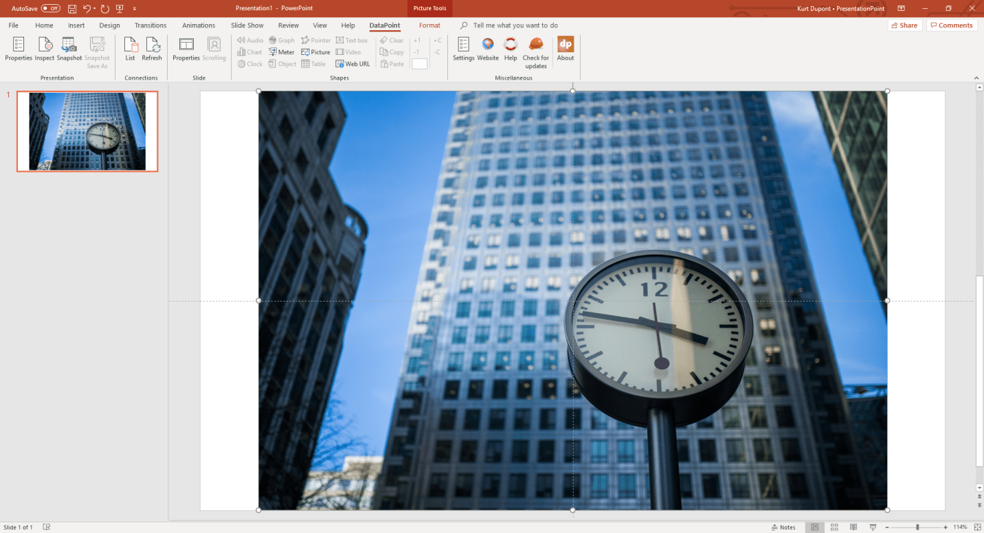
Now click the Web URL button of the Shapes group.
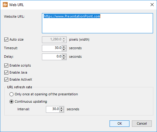
Change the Website URL to the desired URL of your web page. Here this is https://www.bing.com/maps?q=traffic+new+york&form=EDGEAR&qs=PF&cvid=df924f1dd6324f9f99b31e116355c110&cc=US&setlang=en-US&rdr=1&rdrig=979DFF1A9C3746C19FE2AFB81B05D040.
Set the width of the browser or let the website decide automatically. Uncheck the Auto size option to set a manual width in pixels.
The Timeout value is the maximum time in seconds that DataPoint will try to capture the website. Set a specify Delay value if the website somehow needs some more time to draw elements on the website. This wait time will be applied between the time that the web browser says that the website is completely shown and the time that the capture takes places.
You will probably have all switches Enable scripts, Enable Java, Enable ActiveX set to get the full website experience.
To refresh the website picture, you have two options.
You can choose to refresh the website only once at the opening of the presentation. This could be done when you are only using the presentation for reporting or statistics, not really for real-time information screens.
Or, you can choose to activate a timer, e.g. every 60 seconds, to check for new website. This timer starts when you begin the slide show. So, the automatic updating will not happen when you are designing the presentation. For that, you have the Refresh button.
Click OK to close the form and let DataPoint display the website in a picture shape. This can take a few seconds due to the website itself, the delay setting and the complexity of the website and technology itself.
5.13.Formatting
You can format the value of a textbox or table. Select the text box that you want to format and open DataPoint’s textbox properties. Next, click to open the Format tab.
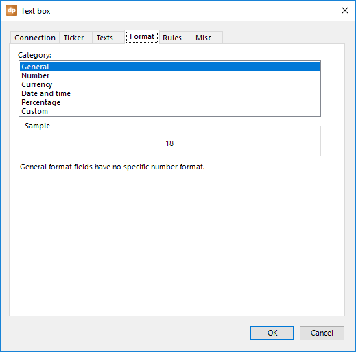
Choose what format category you want to use. You can choose between general, number, currency, date and time, percentage, and a custom format.
If your textbox needs to show a price in a shop, you can set the category to number, and then more formatting options for numbers become available.
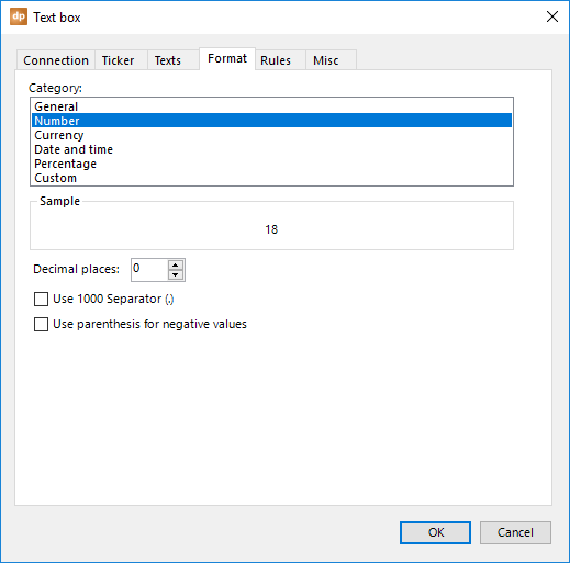
You can set the number of decimal places and decide whether you want to use a thousand-separator character, and so on.
Or maybe for prices, you can set it to currency and then other options appear.
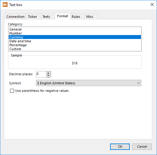
The date and time category also offers other options.
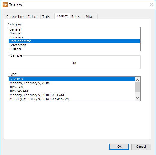
Most of the options are probably familiar. Special formatting can be set by choosing the custom category.
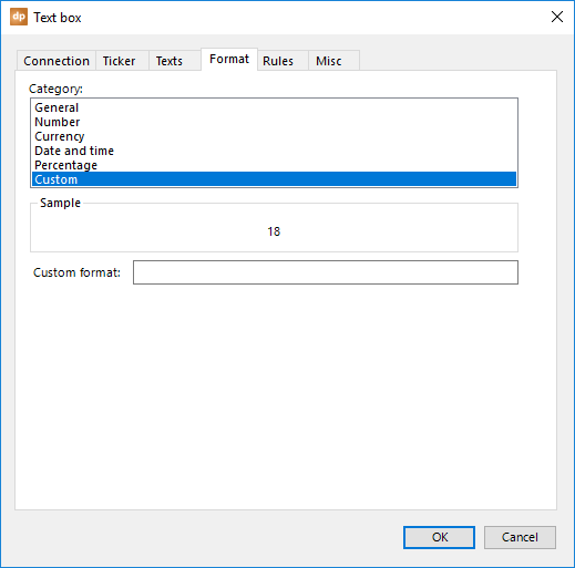
For the custom format, we completely follow the custom formatting options as they are defined by Microsoft in the .Net framework documentation.
Here is the documentation for custom numeric format strings: https://msdn.microsoft.com/en-us/library/0c899ak8(v=vs.90).aspx
And the documentation for custom date and time format strings: https://msdn.microsoft.com/en-us/library/8kb3ddd4(v=vs.90).aspx
Full custom formatting information can be found at: https://msdn.microsoft.com/en-us/library/fbxft59x(v=vs.90).aspx
To indicate that you want to use numeric or date/time custom formatting, prefix your custom format in DataPoint with, respectively, \N\ or \D\.
Use this custom format to display, e.g. June 15: \D\ MMMM d
Table formatting
Textbox formatting is obvious. Select the textbox that you want to format, open DataPoint’s textbox properties, and apply a specific format.
For tables, there are a few things that you should know.
When the complete table is selected as a shape, before you open DataPoint’s table properties, all formatting is applied to all cells of the table.
When you select a complete row, a complete column, or just some cells of the table before you go in, the formatting is applied to the selected cells only.
When the table is used with a data connection that is using the data scrolling feature, you set your custom formatting on the first data row only. Any new rows that you have because of more data depend on the settings of the first data row. Custom formatting on rows other than the first one when scrolling are ignored.
5.14.Rules
Rules are great for emphasizing a given value on your slides. You can display a number in red when the value is in the range of 80 and 100. Other values that are below 80 will be in green.
Select the textbox that you want to add a rule to and open DataPoint’s textbox properties. Next, click to open the Rules tab.
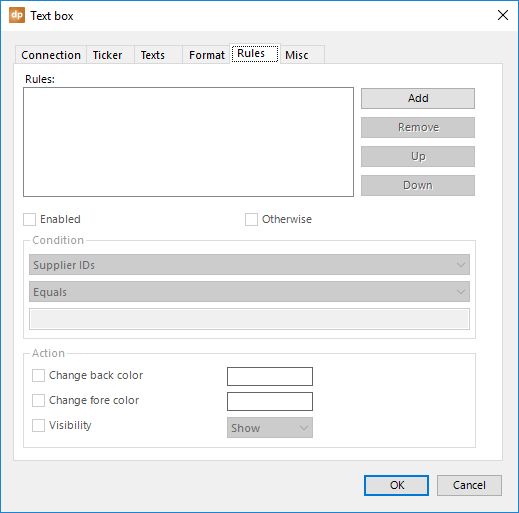
You will find a list of rules on this Rules list. Click the Add button to add your first rule. A new rule will be added to the list.
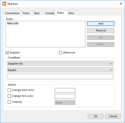
Now, look at the condition group. We can choose a column for the data connection and compare it to a given value. This column can be the column that is assigned to this textbox already, or it could even be another column from the same data connection, if you want to compare it to another value.
The options for comparing values are based on the column type. When you are using a numeric column, you get options like less than, greater than, less than or equal, etc. For columns with string or text values, you get options like starts with, ends with, contains, etc.
After choosing the column and the operator, you then choose a value for comparison. Just enter the value. When you want to compare the data value of the chosen column to the value of another column, you enter the name of that other column here, enclosed by brackets, like [ListPrice].
There are 2 functions that you can use as Value. Use the function =DATE() to represent today’s date or the function =NOW() to represent the current date and current time at your condition. Note that the functions are case sensitive.
The options for the conditions are all set. Now, we can specify what to do when the condition is met. You can check the Change back color checkbox and set the color from the color palette.
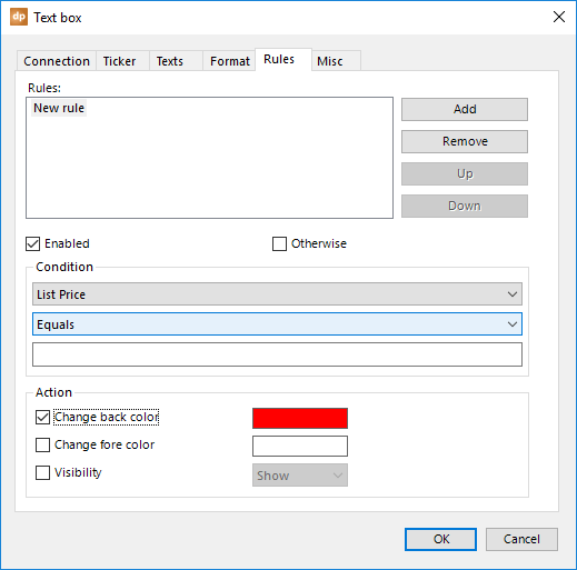
Or, check the Change fore color to specify what color the text should be. Or, control the visibility of the textbox by checking the Visibility checkbox. A good example of controlling visibility it a big red ‘SOLD OUT’ stamp on properties that are sold on a real-estate display screen.
You can always add more rules to the list, remove rules, and change the sequence of the rules. The first rule that satisfies the condition, wins. An important note about this list of rules is that you should always have one rule added to the list with the Otherwise checkbox checked. This rule is the last rule that is used when no previous conditions are met. Basically, this rule brings everything back to normal. For the otherwise rule, no condition parameters can be set.
Table rules
The rules on a textbox are rather obvious. Select the textbox that you want to set conditions for, open DataPoint’s textbox properties, and add a list of rules.
For tables, there are a few things that you should know.
When the complete table is selected as a shape, before you open DataPoint’s table properties, all rules are applied to all of the cells of the table.
When you select a complete row, a complete column, or just some cells of the table before you go in, the rules are only applied to the selected cells.
When the table is used with a data connection that is using the data scrolling feature, you set your rules on the first data row only. All new rows that are there because you have more data depend on the settings of the first data row. Any rules on the rows other than the first one when scrolling are ignored.
5.15.Clear, copy and paste shape information
Within the shapes group of the DataPoint ribbon, there are a few controls that need more information.
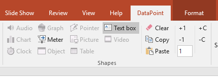
The Clear button removes all DataPoint information from the selected shape. This includes data linking information, rules, formatting, etc. When you don’t want to apply a dynamic value anymore to a textbox, use the clear button and DataPoint will forget this shape completely.
Use the Copy and Paste buttons to duplicate specific DataPoint settings from one shape to another. This can be handy when you want to switch data connections, or copy rules.
First, select the shape that holds the information that you need to copy to another. Then, click the Copy button. This opens the copy dialogue.
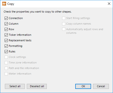
Here, you can check the information or tags that you want to copy to your clipboard. If you only want to set another connection, then click the Deselect all button and check the Connection checkbox. Click OK to close.
Next, select the shape or multiple shapes that you want to copy the selected information to and click the Paste button. All DataPoint tags that were previously copied to the DataPoint clipboard are now applied to the shapes that were selected.
5.16.Shortcuts
And there are more handy buttons in the shapes group.

You can quickly show information from multiple rows on your slide. First, set up the textboxes to host the data from your first row.

These two textboxes are each linked to the columns named ProductName and ListPrice. Both are from row number 1.
We can now select textboxes and create some kind a table with them.
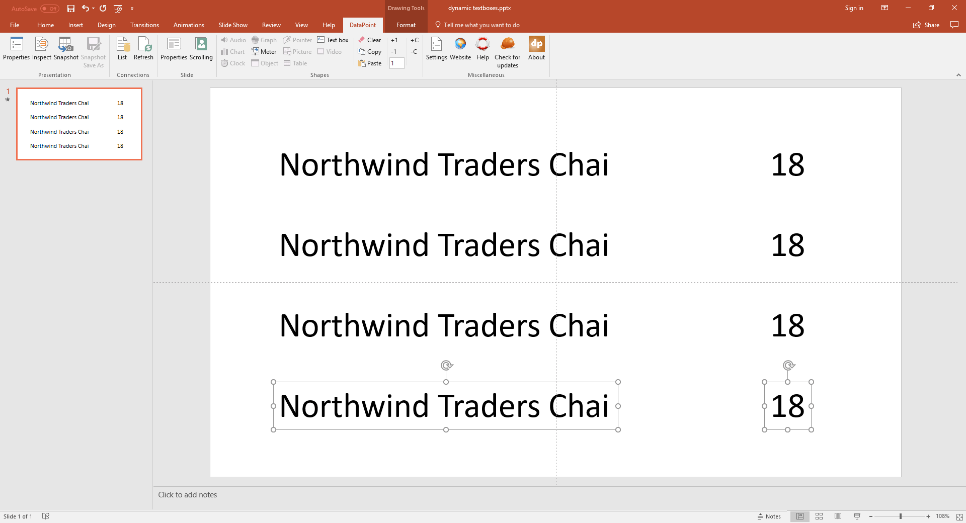
Here, we have eight textboxes showing the information from row number 1 four times. Now select the 3rd and 4th textboxes.
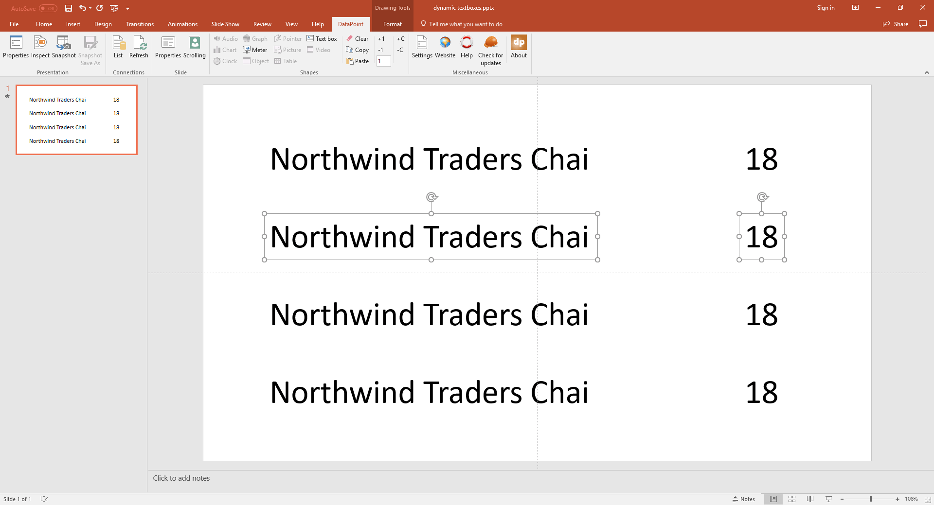
We need to show the information from the second row of our data here. Simply click the +1 button and the row number used in the selected textboxes increases by an increment of 1.

Repeat the same for the 5th and 6th textboxes and click the +1 button twice; and so on.
With the -1 button, you decrement the row number used on the selected shapes.
With the button +C and –C, you can assign the next or the previous column from the column list.
And finally, you can directly enter the row number in the row number textbox.
6.Slides
In the slide group of the DataPoint ribbon, you will find specific properties for the currently selected slide. You can hide a slide based on data or your can activate data scrolling.
6.1.Properties
Click the Properties button of the Slide group.
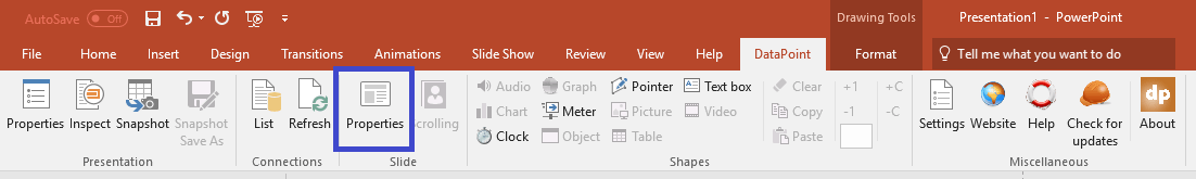
This opens a form where you can control specific properties of slides. DataPoint offers the functionality to hide or show a slide in a running slideshow based on the availability of data.
The controls on this form are only enabled when you have more than one slide and at least one data connection. A presentation or slideshow with only one slide cannot be hidden.
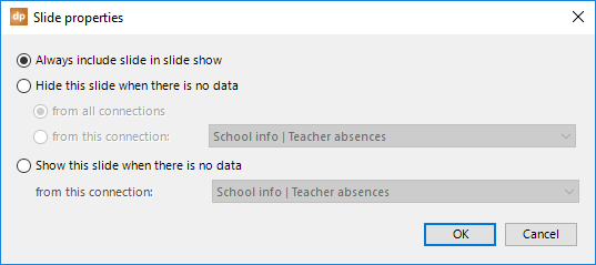
When there are no new employees started in your company, you don’t want to show a slide that lists the names of new employees. Or at a school, you don’t show a list of teachers that are absent when there are no absences for the day.
To hide a slide when there is no data, check the Hide this slide when there is no data checkbox.
After that, you have two options. You can hide the slide when there is no data returned from all the data connections that are being used on this slide. Alternatively, you can choose one specific data connection that is checked for no data. To do so, check the from this connection option and select the data connection from the connection list.
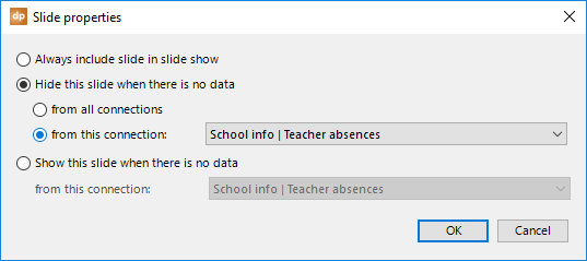
Hit OK to close.
When you are running your slideshow and there is no data (e.g., no teacher absent), DataPoint will show all of the other slides from this presentation, but it will ignore this slide.
If one teacher absence is added to the data file, then when DataPoint sees the data, the slide will become visible automatically in the running slideshow.
The other way around is possible too. You can choose to show a slide when there is no data from a given connection. For example, for a cinema theater, when there are no movies scheduled, then you might want to display a slide with the text ‘Sorry, no movies today!’.
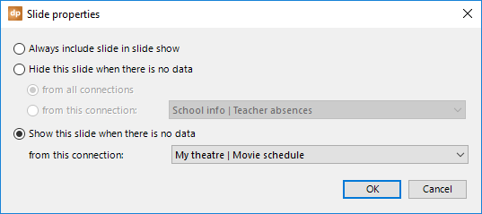
6.2.Scrolling
Next to the dynamic updating capabilities of data on your slide, the DataPoint’s data scrolling is probably the best feature for your information screens and reporting.
Imagine that you are displaying RSS news information on your slide. You have all the news articles from your newspaper, and you can use textboxes to link the first article’s fields to your slide. When you run this slide, you will always see the information from row 1, or the first or top article of the newsfeed. You could add a second and third slide and link them to rows 2 and 3, respectively. But there are probably 25 news articles. Or, when showing sales information for a product, you might be selling hundreds of products by next year.
This is where data scrolling is very handy. Click the Scrolling button in the Slide group. This button is enabled only when you have linked DataPoint shapes on the current slide.
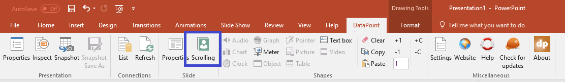
This opens the slide scrolling, or data scrolling, form.
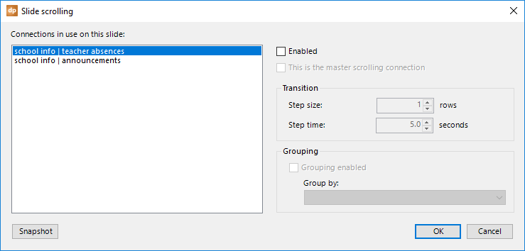
To the left, you can see a list of all the connections that are in use on this slide. Select the connection that you want to use for data scrolling and check the Enabled checkbox.
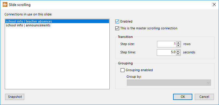
First, let’s have a look at the transition options.
The step size specifies the row increment of each transition. The step time determines how long a data block is shown.
Imagine that we are displaying one news article on the slide. We will set this step size to 1 and maybe a step time of 10 seconds. This would result in showing each news article individually for 10 seconds on the slide. So, 10 seconds for article 1, then 10 seconds for article 2, and so on, until all of the news articles are shown.
Another example is a table where you can show product information. You show 5 data rows on this slide. Here, you would probably set the step size to 5. This would show rows 1-5 in the first round, and rows 6-10 in the second round, rows 11-15 on the third row, and so on.
You can set scrolling information for all of the data connections that are used on this slide. Just select the data connection on the left, and then set its data scrolling options. But, you have to identify one data connection as the master scrolling connection. Check the option This is the master scrolling connection for that connection. When all of the data rows from the master scrolling connection are shown on the slide, DataPoint automatically moves on to the next slide of your presentation.
Grouping can be enabled, where you group data together and do not show the data from another group at the same time. To enable grouping, check the Grouping enabled checkbox and set the Group by combobox to the column that is used to identify the group.
Let’s illustrate this grouping with an example. At a conference center, they have multiple rooms and they want to show which course is held in which room. They design a slide like this:
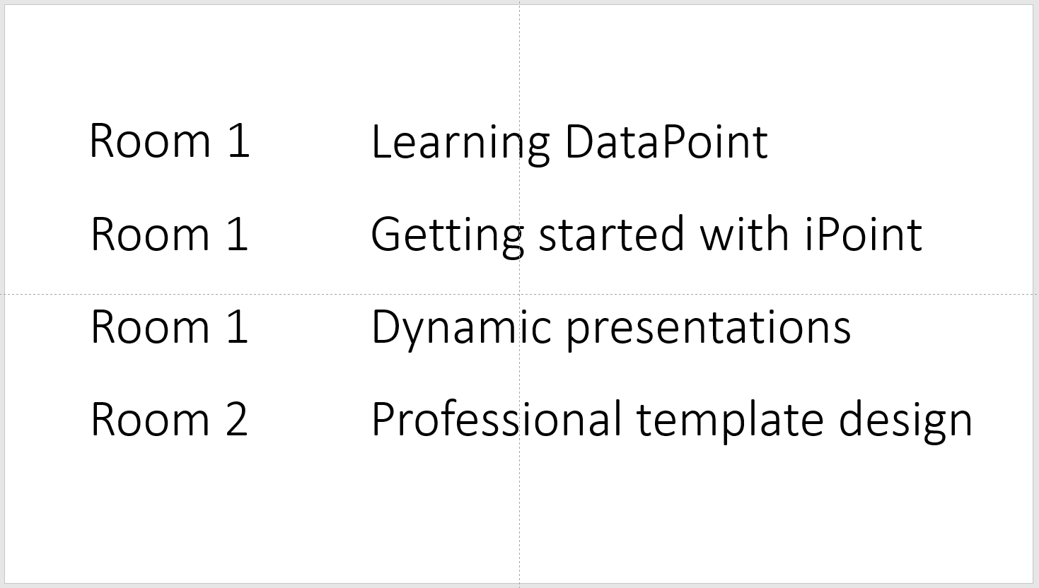
Here, you will probably use a step size of 4 rows. But, maybe you want to break down the data in the room field so that you keep the courses in room 1 together on one slide, and then you start showing the data for the next room (room 2 in this case) in the second round.
Then, activate the grouping option and set the group by column to the room column. After that, the slideshow would look like this for the first round.

And this for the second round.

Finally, there is a button for snapshot options when you generate snapshots. Click the Snapshot button.
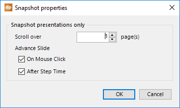
A snapshot presentation is a presentation that is generated by DataPoint by clicking the Snapshot button on the DataPoint ribbon. This action generates a new presentation with the latest information, but then disconnects the shapes from the data sources. So, a snapshot presentation is ideal for reporting and sending presentations to others that do not have DataPoint, or who do not have access to your data files and databases.
If you have multiple slides for one data record, then you can set this here. Imagine that your product or sales report is spread out over four slides per product. Set the Scroll over to 4 slides. At generation time, it will generate slides 1 through 4 with the data from row 1, then slides 5 through 8 with the data from row 2, and so on.
As an option, you can also set the Advance Slide option to specify how the generated snapshot slides should advance to the next slide. Either by mouse click or after a given number of seconds.
7.Presentation
Now, we will describe the features of the Presentation group from the DataPoint menu.
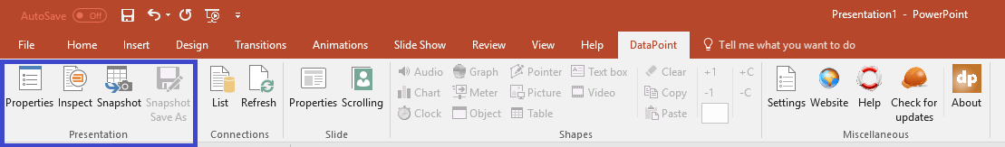
Let’s explore each button.
7.1.Properties
The majority of the presentation’s default properties are probably fine for most users.
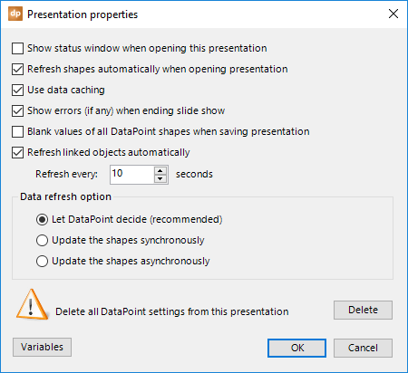
The first option, Show status window when opening this presentation, shows the connections refresh form when you open the presentation. This is the connections refresh form.
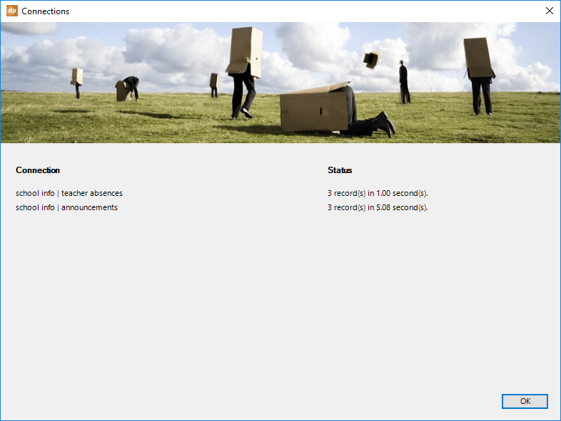
The second option, Refresh shapes automatically when opening presentation, is refreshing the dynamic shapes at opening time, when checked. By default, DataPoint is reading the data and updating the dynamic linked shapes.
For slow or long-running queries, data caching might be a good option. Check the Use data caching option and all data will be sent to the data caches with an expiration time. Whenever the data refresh comes in before the expiration time, it will not execute that query on the data server, but read in the values from the local cache.
Note that you can clear the data cache manually when you go to DataPoint and then click the Settings form under the Miscellaneous tab. In the data cache section, click the Clear button.
The next option is called Show errors (if any) when ending slideshow. During the slideshow, potential errors are not shown by message boxes. Errors like network problems or timeouts are collected and optionally presented when the slideshow ends. You can turn that off by unchecking this checkbox.
By default, the current values of the data connections are visible and stored within the presentation. When dealing with highly confidential data, or when you want to prevent people from seeing old data for a second, check the option Blank values of all DataPoint shapes when saving presentation to avoid those saved values.
You can insert and link, for instance, an internet image or network image. When you enable the option Refresh linked object automatically, you can specify the interval. Note that this does not count for data or paths to images from a DataPoint data connection. This is really about linked objects without a data connection.
There are two basic data refresh options possible in DataPoint. Updating the shapes synchronously and asynchronously. Synchronous updating will build a queue of all DataPoint shapes and it will process all of the shapes, one after another. It will wait for completion before processing the next shape. Asynchronous updating will build that same list of DataPoint shapes, but then start a separate thread to update them. It will launch all updates via a separate thread and will not wait for completion. The default value is to let DataPoint decide what to do, based on the number of data connections and the number of shapes.
In the unlikely event that you want to remove DataPoint connections and information from the presentation, click the Delete button under the option to Delete all DataPoint settings from this presentation.
The Variables button is there to set the value of variables that can be used in custom SQL statements. This will be covered in a dedicated chapter.
7.2.Inspect
The inspect button under the Presentation group will check your presentation and list all DataPoint options in a treeview. All information on this form is purely informational and read-only.
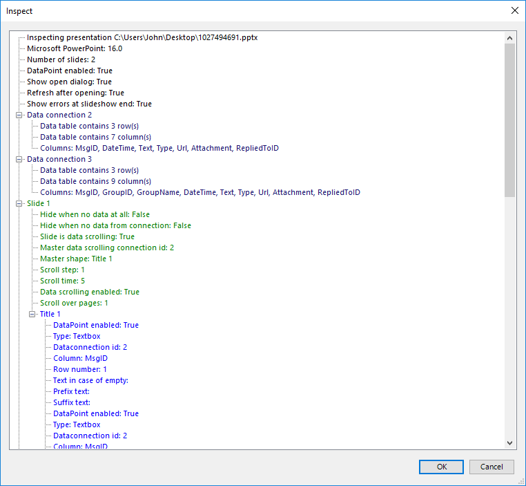
7.3.Snapshot presentations
NOTE: Using a folder that is under the control of a synchronization tool like OneDrive, Google Drive, Dropbox, and others has a serious negative impact when generating snapshot presentations. It is best is to use a local disconnected folder or temporary folder.
A snapshot presentation is a presentation that is generated on the fly with the latest information, but then disconnected from the data sources. You can then forward this snapshot presentation to others, like colleagues or customers, that do not have DataPoint installed, or do not have access to your databases. Snapshot presentations are easy to regenerate at regular intervals and are typically used for reporting.
A DataPoint snapshot presentation will have the latest information embedded in the presentation. Using data scrolling will also create physical slides for the scrolling data.
Let’s showcase this presentation that is linked to a RSS newsfeed. First, the slide is linked to the first article from the newsfeed.
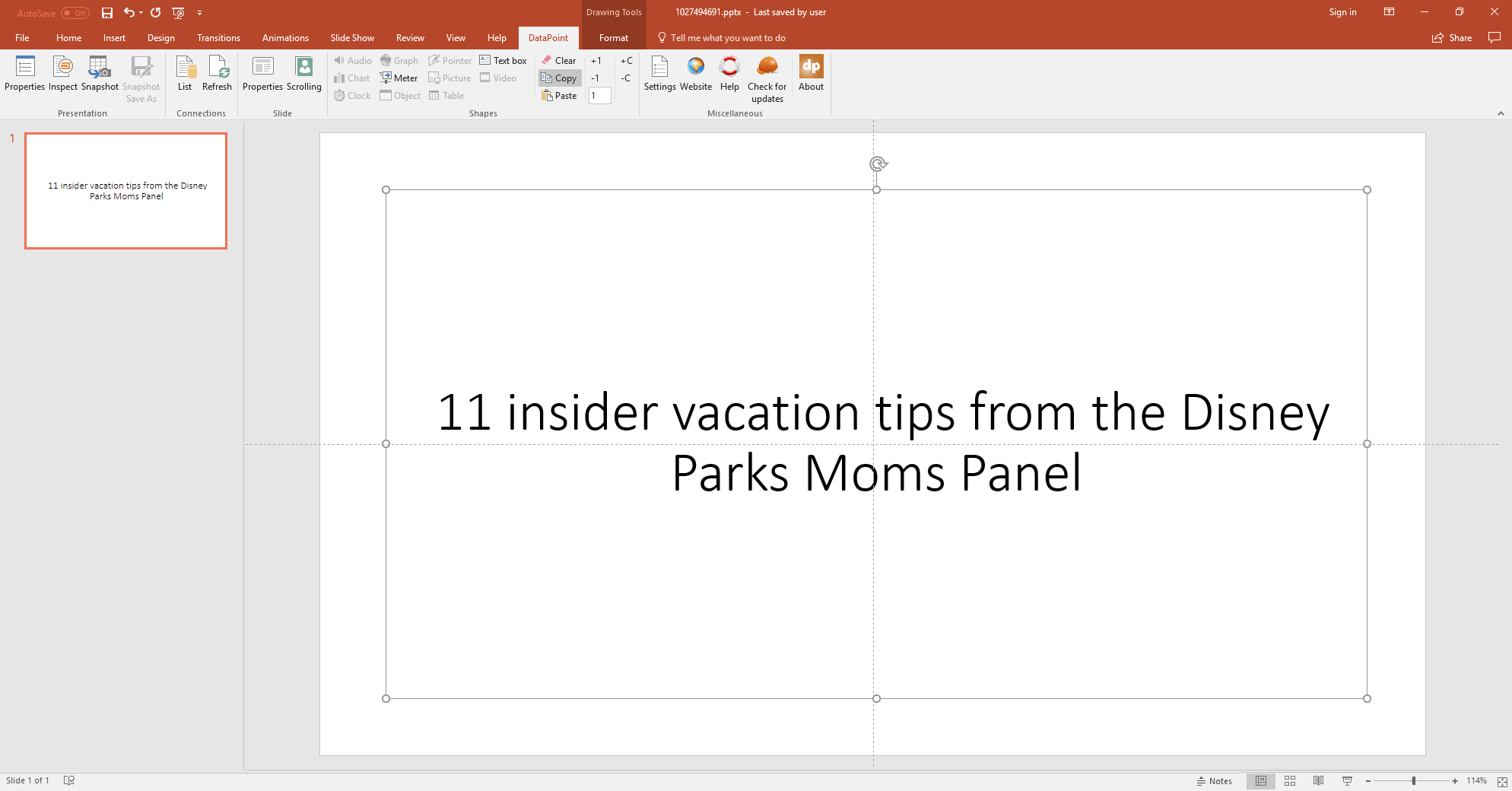
Then, we activate data scrolling.
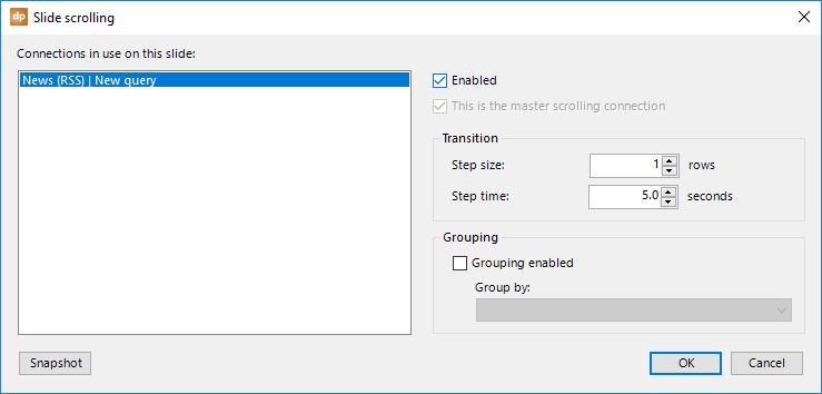
Click the Snapshot button and you will see a form that is showing the progress of the snapshot generation.
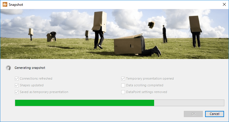
At the end of the snapshot generation process, a new temporary presentation is opened. You can save the file and send it out to your presentation audience.
The generated snapshot presentation looks like this presentation.

7.4.Snapshot Save As
FOR DATAPOINT ENTERPRISE EDITION ONLY!
NOTE: Using a folder that is under the control of a synchronization tool like OneDrive, Google Drive, Dropbox, and others has a serious negative impact when generating snapshot presentations. It is best is to use a local disconnected folder or temporary folder.
There is a button in the Presentation group that is only enabled in the DataPoint Enterprise edition. It is called Snapshot Save As. Remember that a snapshot presentation is a regenerated presentation with the latest information that is then saved as a new temporary file, ready for distribution.
This feature goes a bit further as it will generate multiple documents, and not only presentations. Imagine that you are generating reports on products, or reporting per country, or reporting per person. Then, you might want to run a generate batch that creates multiple documents; one per product, or one per country, or one per person. This is exactly what the Snapshot Save As is doing.
With the DataPoint Enterprise edition loaded in your PowerPoint, open your presentation, link to a data source, and start linking shapes. Don’t forget to activate data scrolling. See this simple sample presentation below.
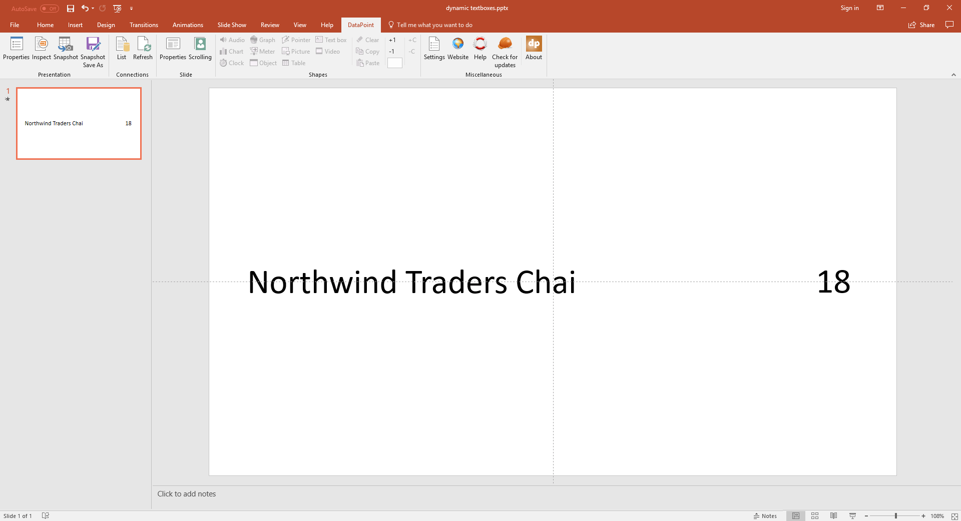
Then, click the Snapshot Save As button.
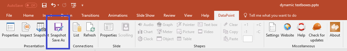
This will open an options form.
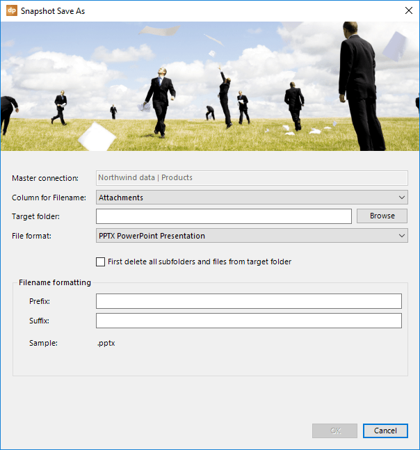
At the top, it will show and confirm the master data scrolling connection being used. It is our intention to generate a new snapshot presentation per product. So, click to open the Column for Filename combobox and select the field that holds the name of the generated file. We choose to use the Product name for this.
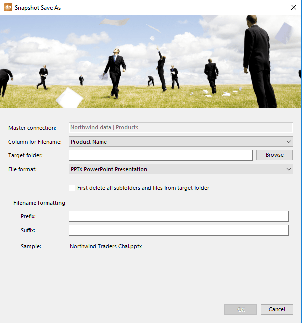
Then, set the Target folder where you want the snapshot presentations to be saved.
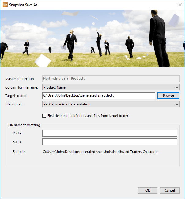
Next, click to open the File format combobox. You can choose to generate:
- PowerPoint presentations
- PowerPoint slideshows
- PDF documents
- JPG images
- PNG images
- MP4 videos
- WMV videos
Make your selection.
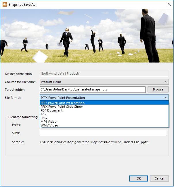
As an option, check First delete all subfolders and files from target folder. This can be useful when you have run a Snapshot Save As before. When checked, it will remove all files and folders before starting.
Look at the preview of the filename. You will recognize the target folder or path, then the value from the first row of the column for filenames that were chosen, and the chosen file extension. You have the option to further customize the name of the files, but specify some text before and after the column value.
Before setting these values, our first filename would be saved as C:\Users\John\Desktop\generated snapshots\Northwind Traders Chai.pptx.
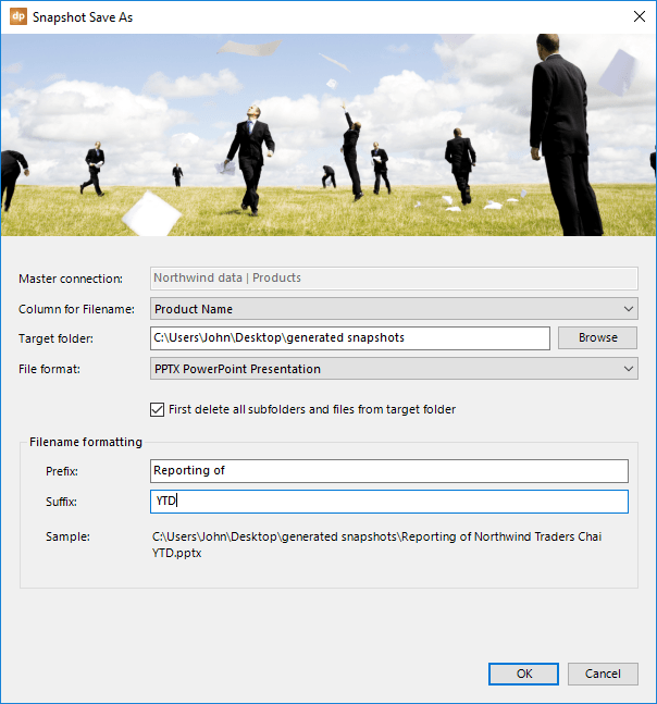
With the prefix and suffix of this screenshot, our first file is now saved as: C:\Users\John\Desktop\generated snapshots\Reporting of Northwind Traders Chai YTD.pptx.
Click OK to start the Snapshot Save As process. When the First delete all subfolders and files from target folder is set, you will get this option.
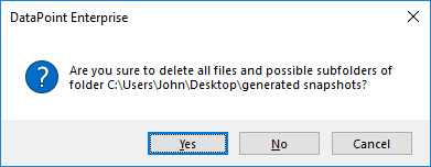
Click Yes to continue. And, finally, the generation process starts.
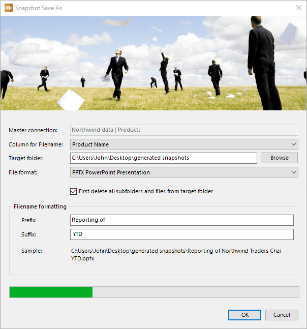
At the end, click the Close button. You can open the target folder and it will contain a file per column value as it was seen at the data source.
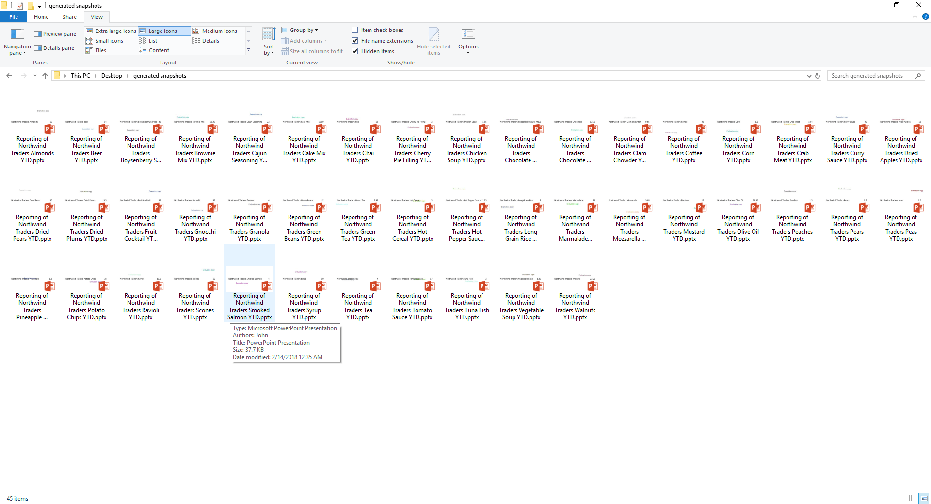
Note that you can easily select another format other than PowerPoint. It is very handy to generate PDF documents based on your PowerPoint designs. Or even generate customized video files with PowerPoint animations, where you can personalize the name of a person or product on the slides.
7.5.Command Line Tool
FOR DATAPOINT ENTERPRISE EDITION ONLY!
With the DataPoint Enterprise edition, a command line tool is included. A command line tool is a process that allows you to generate a snapshot presentation via instructions or batch file. This is a great feature when you want to use the command line tool or the presentation generation at scheduled times, or maybe integrate into another package. The DataPoint command line tool, or DataPoint Generator as this is called, will generate snapshot presentations without the need to open the PowerPoint user interface.
Click the Windows Start button and type Command. Select the Command Prompt option from the list.
This opens a command prompt, which is a kind of notepad for instructions.
First, we need to change the folder or directory to the one containing the DataPoint Generator tool. Type in: CD \Program files (x86)\PresentationPoint\DataPoint Enterprise edition and hit Enter.
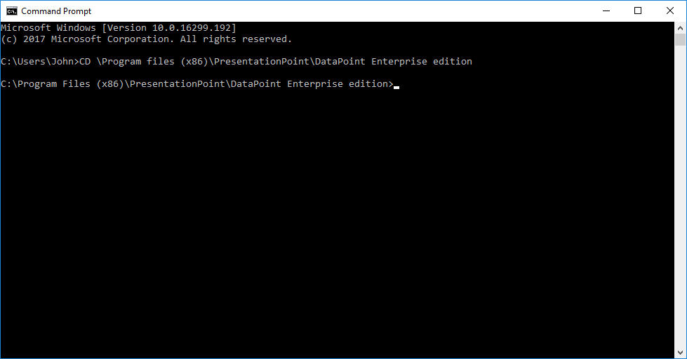
From the new line that was added after hitting enter, you can see the current path that we have changed to.
Now type in: DP16GEN and hit Enter.
Note that DP16GEN stands for the DataPoint Generator tool for PowerPoint 2016. Use DP14GEN for PowerPoint 2010, and DP15GEN for PowerPoint 2013.
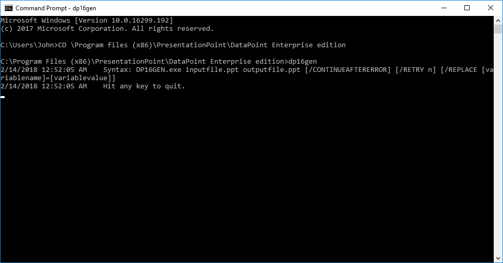
This will display the syntax on how we can use the command line tool. It looks like this:
DP16GEN.EXE inputfile.ppt outputfile.ppt [/CONTINUEAFTERERROR] [/RETRY n] [/REPLACE [variablename]=[variablevalue]]
The inputfile.ppt is the PowerPoint presentation that we use as the source presentation for the snapshot generation process. The outputfile.ppt is the name of the file used for the generated snapshot presentation.
Further value options are:
- /CONTINUEAFTERERROR: Don’t stop the generation after an error, but instead try to make the best of it. Without this, it will stop processing and just display the error message.
- Sometimes you can retry the generation. Use the /RETRY option and set n to 3; for instance, try it 3 times.
- When using presentation variables in your queries, you can set the values here by scripting.
Set the inputfile and outputfile variables, and the optional parameters; then hit Enter after the command.
It is never a bad idea to put the variables between double quotes. This is a must whenever your filename or path contains spaces.
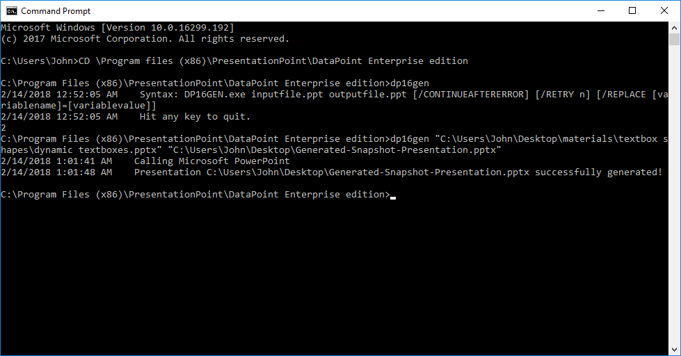
The output above shows that the snapshot has run successfully and that our source presentation is updated with the latest information. It is saved as C:\Users\John\Desktop\Generated-Snapshot-Presentation.pptx.
8.Miscellaneous
There is a Miscellaneous tab in every application. Let’s discuss the buttons found there.
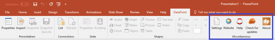
8.1.Settings
First, there is the Settings button.
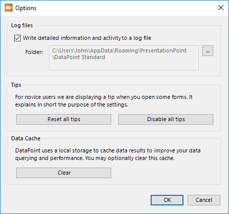
Log files is the first group of options. By default, DataPoint writes activity information to a log file. There is one log file per day that is stored in a given folder, and 15 days of history are kept.
Here in the log files group, you can disable the logging feature by just unchecking the Write detailed information and activity to a log file option. The folder where the maximum 15 days of logfiles are kept is listed here, too. Click the button with the three dots to open the folder directly.
The second group is about tips. Tips are those small blue forms that you see when you go into an option for the first time. A tip gives you more information and instructions on what the option is intended for.
A tip looks like this.

You can check the option Do not show this tip here anymore. The next time that you use PowerPoint and click that same button, it will not show that tip again.
You can click the Reset all tips button to reset the Do not show anymore for all shapes. Or, click the Disable all tips to set all tips as seen and understood.
Finally, there is the third group called Data cache. The cache folder is there to quickly retrieve data, like the caching of images from your internet browser. Cached data is stored on your hard disc as a temporary file. You can delete all cached files immediately by clicking this option.
8.2.Website
The Website button is very simple to use. It opens a browser on your computer and navigates to the PresentationPoint website.
8.3.Help
Click the Help button and it will bring you to the support section of the PresentationPoint website.
8.4.Check for updates
We do our best to bring out new features and bug fixes. You can click the Check for updates button to find out if there is a new version or setup available. If you click on the button, a browser like this should open.
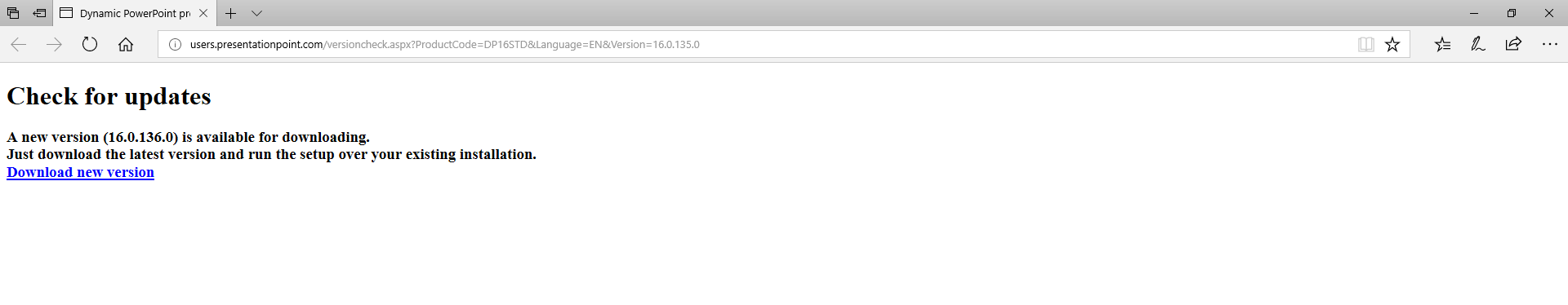
This page signals that there is a new version of DataPoint available. You can click the URL to download and then run the setup. You can always install a newer version of DataPoint over the existing installation. By doing that, you will never lose the status of your license.
Whenever your version is brought to the latest version, then you can check for updates again, but it will show a page like this to confirm that you are using the latest version already.
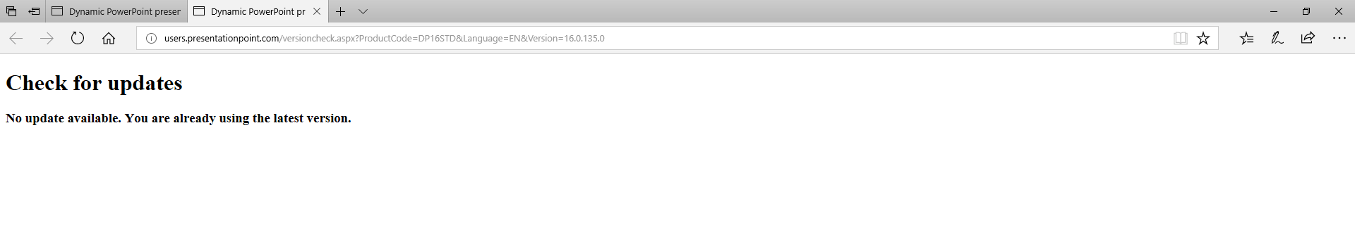
8.5.About
The last button is the About button.
It will tell you what product you are using, the edition that is installed, and the current version number.
Also important, in the middle of this form, it will show you the status of the trial or the physical license. You will find buttons there to order a license at our shop, and two buttons to activate or deactivate a license. Activation is done when you want to enable a license on this computer. Deactivation is used when you have a license active and you want to deactivate it so that it can be activated again on another computer.
9.More
In our final chapter, we will cover some features that were not covered before.
9.1.Using hyperlinks
A hyperlink in PowerPoint is a clickable object that brings you to another document, or maybe a webpage. You can use hyperlinks in DataPoint, too. Basically, you need to format the content of a cell to a given syntax that contains all of the information for a hyperlink.
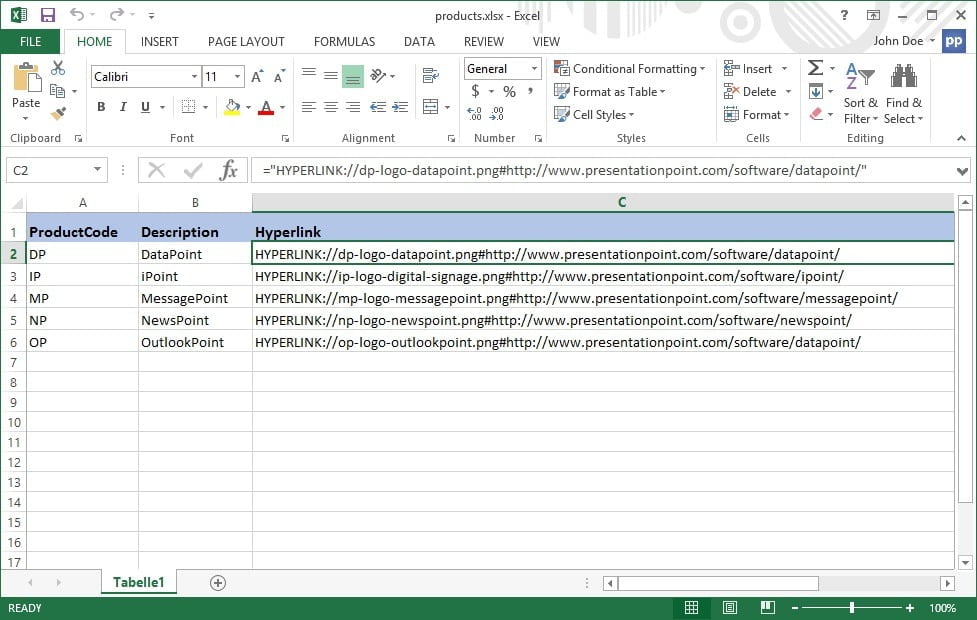
Format the value in your database like this: HYPERLINK://value#link#caption
HYPERLINK:// is the mandatory prefix text to indicate that you want to use this as a hyperlink. After that, you have three possible values separated by a pound sign (#): value, link, and caption.
The text that you use for the value part is the text that is displayed in a textbox, or the file path of the image that you want to use. The link part is the URL that is opened when the text or hyperlink is clicked. The optional caption value is shown as a popup text when you hover over the object, like a tip.
The database value, like HYPERLINK://dp-logo-datapoint.png#https://presentationpoint.com/software/datapoint/#More info on this… on an image will use ‘dp-logo-datapoint.png’ as a dynamic filename for that picture. When it is clicked, it will open the command ‘https://presentationpoint.com/software/datapoint/’ and the picture caption is set to the text ‘More info on this….’
9.2.Using variables
DataPoint can work with variables in custom SQL statements. A variable has a name and has a value. Imagine that you have multiple data queries in your presentation, getting information from everywhere. Often, we see that some values are used in the various where clauses. When you are doing reporting on products that your company is producing or selling, you may need to use the name of the product or its part number in your queries. For instance, imagine that you have 12 queries where you get the information from various tables about the same product. In your custom SQL statements, you will see that product name of part number. When you want to reuse this presentation to do reporting on another product, you will need to change that product name or part number in all 12 of your queries. And that is time consuming.
This is exactly where variables are handy. Instead of typing your part number each time, you just use the name of the variable, like %ProductPartNumber%, in your SQL. And then, you only have to set the current value of this variable one time.
First of all, set up the variables. Open DataPoint and click the Properties button in the presentation group.
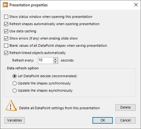
Click the Variables button here.
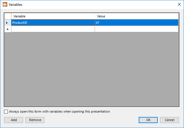
Click the Add button and set the name of the variable and its current value. You can add multiple variables to this list. To remove a variable, select the variable from the list and click the Remove button.
On this screenshot, we created a variable named ProductID, with its value set to 47.
Click OK to close.
Now, when we set up data queries, for example, for a Microsoft SQL Server connection, we use a custom SQL statement, like this:
Select * From TblProducts Where productid = REPLACE://ProductID
The REPLACE:// prefix reveals that we are using the name of a variable. So, when DataPoint executes these queries, it will replace the variables with their current value. This is how the SQL statement is executed at this time.
Select * From TblProducts Where productid = 47
The text ‘REPLACE://ProductID’ is replaced with 47 from our variable list.
Note that the productid is a number value. When you want to use a string value, like product name, use a syntax with quotes, like:
Select * From TblProducts Where productname = ‘REPLACE://ProductName’
You can also use a reference to a specific shape of a given slide to get its dynamic current value. Here at the variable’s value use a value like ‘Slide12.Textbox 38’. This will get the current text from the shape named Textbox 38 of slide number 12.
Check the option Always open this form with variables when opening this presentation to always ask to verify and change the variable values when you open this presentation.
System variables
There are a few system variables in DataPoint that you can use in your queries.
REPLACE://COMPUTERNAME will use your computer’s name in your queries. You could set up a database or datasheet with announcements for certain displays or computers. You will have a list of announcements with two columns: computer name and the announcement text. With this system variable, you could set up a query that filters out the announcements for the current computer only. The computer name will be replaced at runtime.
REPLACE://USERNAME fills the variable with the username of the user logged on to the system.
REPLACE://PRESENTATIONNAME will be replaced by the name of the active presentation. This is the name of the file without a path or extension.
REPLACE://PRESENTATIONFULLNAME replaces this variable text with the full filename of the active presentation. So, it is the filename including the path and extension.
REPLACE://PRESENTATIONPATH will do the opposite. It will only return the path of the filename of the active presentation. The filename and extension are dropped from the value.
Command line generation tool
Our users of the DataPoint Enterprise edition can now use the command line tool, or the DataPoint Generator tool, to create snapshot presentations with variables that are used in a command or instruction at the command prompt.
Just add the name of the variable and its associated value to the command line, like this:
“C:\Program Files (x86)\PresentationPoint\DataPoint Enterprise edition\DP16GEN.exe” “name-of-our-presentation.pptx” “snapshot.pptx” /REPLACE ProductID=47 /REPLACE CountryID=1
9.3.Using Viewer edition
Dynamic presentations that are created with the DataPoint Enterprise edition can be opened by the DataPoint Viewer edition. The DataPoint Viewer edition is a free add-on for PowerPoint, without any license limitations. Hundreds of your colleagues can use this free DataPoint edition when you, as a designer, create a presentation with the Enterprise edition.
The only limitation on the free Viewer edition is that the dynamic DataPoint data connections and linked objects are refreshed only once, when it is opened. So, with this limitation in place, the Viewer edition is ideal for distributing up-to-date statistical presentations or reporting presentations to your company.
Whenever you need continuous, self-updating content on your slides, then you have to use the DataPoint Standard edition.
9.4.Using Runtime edition with iPoint
Our digital signage product, iPoint, is great for distributing and scheduling presentations. These presentations can be static (typical for advertising) or dynamic (typical for information screens).
As a designer, you can create dynamic presentations with our DataPoint Standard edition. When you need to run dynamic DataPoint presentations on an iPoint player, then you need to install the DataPoint Runtime edition on the computer where the iPoint player component is installed.
The DataPoint Runtime edition license is free, as it is already included in your iPoint player license.
When you set up data connections for your iPoint players, make sure that you are using file paths to your data files (e.g. Microsoft Excel worksheets) that are accessible for you as the designer, as well as for all the players. Typically, you will first place the data files on a network share that is available to everyone.
10.Change log
Version 15.0.189, 16.0.189, 3.0.37 • 17 Apr 2024 • released
- New option for style codes: dynamic font sizes
- Bug fix for Google Sheets connections with many files in the storage
Version 15.0.188, 16.0.188, 3.0.36 • 29 Feb 2024 • released
- Bug fix for tables when combining data scrolling and special column selection
Version 15.0.188, 16.0.188, 3.0.35 • 24 Feb 2024 • released
- New option for textbox, limit text length: shorten at the end of nearest word
Version 15.0.188, 16.0.188, 3.0.34 • 18 Jan 2024 • released
- New option for text file connections: skip first n lines
- Bug fix for rotating meters when using a range starting with a negative value
Version 15.0.187, 16.0.187, 3.0.33 • 31 Jul 2023 • released
- Bug fix for special column selection with SharePoint connections
- HEX values (next to RGB color value) for DataPoint pointer shapes
- Feature to visually mark DataPoint shapes with a red border so that you can see which textboxes and shapes are linked via DataPoint
- Use of variables in the prefix and suffix texts of linked textboxes. Now you can refer to other columns of the same data row and form a complex sentence.
Version 15.0.186, 16.0.186, 3.0.32 • 27 Mar 2023 • released
- Bug fix for data scrolling over multiple slides when generating a snapshot save as
- Weather data service now with geographical coordinates (latitude, longitude), in addition to names of cities or locations
- New style code option was added to set the font dynamically for text boxes and tables
Version 15.0.185, 16.0.185, 3.0.31 • 7 Feb 2023 • released
- Release for 2023 with graphical updates
Version 15.0.184, 16.0.184, 3.0.30 • 26 Dec 2022 • released
- Microsoft is not allowing online Microsoft Exchange connections with username and password anymore
- Style codes can be applied on tables too (next to text boxes previously)
- Snapshot generation: bug fix for Shrink text on overflow setting on text boxes
- Snapshot Save As generation: bug fix for group by functionality
- New option for Excel connections: ‘use advanced driver’ to avoid the traditional Excel connectivity problems with more complex spreadsheets or too many columns
- Bug fix when connecting to Excel spreadsheets with named ranges
- New feature for linked images: define and set up a fallback image when the linked image does not exist
Version 15.0.183, 16.0.183, 3.0.29 • 1 Sep 2022 • released
- Bug fix for a more complex JSON file with post data
Version 15.0.182, 16.0.182, 3.0.28 • 9 Aug 2022 • released
- Bug fix for popping up a message about your subscription
Version 15.0.181, 16.0.181, 3.0.27 • 16 June 2022 • released
- Support for Microsoft Office 2010 or 14.0 and its DataPoint version 14.0 of that has ended
- Bug fix for picture of hyperlink notation when generating snapshot presentation
- New option added to data scrolling where you can now choose to stay on a data scrolling slide (manual advancing)
- Bug fix for the JSON data provider for tables starting with numeric characters and underscores included
Version 14.0.180, 15.0.180, 16.0.180, 3.0.26 • 28 Apr 2022 • released
- New feature: integrated counters, countdowns and timers at a DataPoint clock shape
- Weather data provider: abbreviated day names in chosen language
- New data provider: Excel Online for Excel files stored on OneDrive, SharePoint and Google Drive
- New data provider: File system to get a list of all files and its attributes of a folder
Version 14.0.179, 15.0.179, 16.0.179, 3.0.25 • 28 Mar 2022 • released
- New feature: automatically add QR codes to your slides
- Addition to the JSON data provider: set header values with a GET command
- Ticker functionality bug fix for dynamic sizing problem
Version 14.0.178, 15.0.178, 16.0.178, 3.0.24 • 19 Jan 2022 • released
- Bug fix for consecutive chart updates
Version 14.0.177, 15.0.177, 16.0.177, 3.0.23 • 21 Dec 2021 • released
- New option for XML data sources to read out the properties at root level
- Enhanced performance and stability for presentations with multiple charts
- Bug fix for waterfall charts not updating
Version 14.0.176, 15.0.176, 16.0.176, 3.0.22 • 29 Oct 2021 • released
- Automatic resize method after updating a linked picture
- Bug fix for MySQL data provider
Version 14.0.175, 15.0.175, 16.0.175, 3.0.21 • 29 Sep 2021 • released
- Bug fix for charts
Version 14.0.174, 15.0.174, 16.0.174, 3.0.20 • 30 Aug 2021 • released
- Compilation with the latest (internal) drivers
- Automatic mailing feature for the ‘snapshot save as’ (Enterprise edition)
- Enhancements on XML data provider: now it can use presentation variables in the XML connection URL
- Bug fix for weburl images
Version 14.0.173, 15.0.173, 16.0.173, 3.0.19 • 22 Jul 2021 • released
- Bug fix for hidden slides after generating a snapshot presentation
- Updated processing code for both native PowerPoint charts, as well as for embedded Excel charts
Version 14.0.172, 15.0.172, 16.0.172, 3.0.18 • 22 May 2021 • released
- New DataPoint shape to show a picture slideshow of all images of a folder
- New option at slide properties to hide a slide on given computers
- New data provider for PostgreSQL data connections
- Bug fix for numeric data columns of JSON connections
- Dynamic style codes for linked text boxes
- Bug fix when cropping web url images
Version 14.0.171, 15.0.171, 16.0.171, 3.0.17 • 1 Jan 2021 • released
- New data provider to connect to Numberish data in real-time
- Process BLOB columns as local images so that you can show database images on your slides
- Bug fix for Z-order on linked video shapes
Version 14.0.170, 15.0.170, 16.0.170, 3.0.16 • 30 Nov 2020 • released
- Fix for rule on empty rows of a table when data is scrolling
- New weather API with more accurate info and forecasts
- Real-time and dynamic slide show tickers running over all slides, showing information from any DataPoint data source
Version 14.0.169, 15.0.169, 16.0.169, 3.0.15 • 20 Oct 2020 • released
- Fix for password protected Microsoft Access databases
- Fix for snapshot generation
- Fix for weburl images
Version 14.0.168, 15.0.168, 16.0.168, 3.0.14 • 12 Oct 2020 • released
- Bug fix solved for snapshot generation
Version 14.0.167, 15.0.167, 16.0.167, 3.0.13 • 1 Oct 2020 • released
- Bug fix solved for snapshot generation
Version 14.0.166, 15.0.166, 16.0.166, 3.0.12 • 11 Sep 2020 • released
- Fix for multiple-choice values from a SharePoint list
- Fix for text file connections where a number or date is not interpret correctly
- New technology used to get an image from any URL
Version 14.0.165, 15.0.165, 16.0.165, 3.0.11 • 9 Jul 2020 • released
- New data provider for Microsoft Dynamics data
Version 14.0.164, 15.0.164, 16.0.164, 3.0.10 • 4 May 2020 • released
- New rule action for text boxes and tables to display another text when the rule is met
Version 14.0.163, 15.0.163, 16.0.163, 3.0.9 • 9 Apr 2020 • released
- New data provider for SalesForce data
Version 14.0.162, 15.0.162, 16.0.162, 3.0.8 • 1 Apr 2020 • released
- Bug fix for the Facebook Posts data provider for pages with a space in the name
Version 14.0.161, 15.0.161, 16.0.161, 3.0.7 • 27 Mar 2020 • released
- Enhanced logic for Facebook Pages
- New data provider for Facebook Posts
- New data provider for Google Analytics
- Bug fix for incorrect order of numeric columns for text file connections
- Hyperlinks formatting now possible for tables
Version 14.0.160, 15.0.160, 16.0.160, 3.0.6 • 03 Mar 2020 • released
- Bug fix for error ‘DataTable already belongs to another DataSet’ during snapshot generation
Version 14.0.159, 15.0.159, 16.0.159, 3.0.5 • 19 Feb 2020 • released
- New server-side website image grabbing for complex websites
- Bug fix custom SQL statements over multiple lines
Version 14.0.158, 15.0.158, 16.0.158, 3.0.4 • 7 Feb 2020 • released
- Bug fix for authentication of the oData data provider
Version 14.0.157, 15.0.157, 16.0.157, 3.0.3 • 30 Jan 2020 • released
- Bug fix for when a data scrolling table gets slower in advancing
Version 14.0.156, 15.0.156, 16.0.156, 3.0.2 • 24 Jan 2020 • released
- Switch to .NET Framework 4.7
Version 14.0.155, 15.0.155, 16.0.155, 3.0.1 • 17 Jan 2020 • released
- New presentation property to not refresh the shapes when the slide show is running
- Fix for the font scaling problem on some form.
Version 14.0.154, 15.0.154, 16.0.154, 3.0.0 • 20 Dec 2019 • released
- Bug fix for rules
- JSON data provider: POST method added
Version 14.0.153, 15.0.153, 16.0.153 • 4 Dec 2019 • released
- Fix for custom SQL statements with line feed codes
- Plot by fix for charts
- RSS Feed CNN: correction for featured image
- Improved rendering of web URL images
- Reviewed Facebook communication
- Reviewed Google Calendar and Google Sheets communication
- Recurring events of Google Calendar are included now
- New engine for snapshot generation
- Fix for font scaling problem when scale > 100%
Version 14.0.152, 15.0.152, 16.0.152 • 29 May 2019 • released
- Microsoft Yammer data provider: fix for client-side filter
Version 14.0.151, 15.0.151, 16.0.151 • 7 May 2019 • released
- Bug fix for Microsoft Exchange recurring appointments in combination with selection filter
Version 14.0.150, 15.0.150, 16.0.150 • 29 Apr 2019 • released
- Fix for blocking situation on updating multiple charts in a slideshow
- Duplicated entries for Microsoft Exchange appointments
Version 14.0.149, 15.0.149, 16.0.149 • 2 Apr 2019 • released
- Microsoft Exchange data provider: support for recurring events and appointments
- Weather provider: better distinction between current condition and today’s forecast
- New option for charts: set the data selection ranges on the worksheet manually
- New DataPoint shape: web URL to display websites in real-time
- Randomize data rows feature
- Use of Voice Queue Numbers as notification sound after data update
Version 14.0.148, 15.0.148, 16.0.148 • 21 Feb 2019 • released
- Period selection was not kept for Microsoft Outlook connections
- Microsoft Exchange data provider: passwords are not mandatory on the form validation
- Support for HD weather icons expansion pack (optional purchase)
- Automatic dropping of the retired Yahoo Weather provider when refreshing data
Version 14.0.147, 15.0.147, 16.0.147 • 6 Feb 2019 • released
- Use the current value of a textbox on any given slide as a variable in a custom SQL statement
Version 14.0.146, 15.0.146, 16.0.146 • 30 Jan 2019 • released
- Option to open the datasheet when updating the chart’s data
- Yahoo Weather API is retired and we start using a new weather API with better availability and uptime, plus 4 new icons sets and 10-day forecasts
- Shortened filenames for downloaded images of RSS feeds
Version 14.0.145, 15.0.145, 16.0.145 • 20 Dec 2018 • released
- Use of variables at client-side filtering for e.g. Microsoft Excel connections
- Updated 3rd party libraries
Version 14.0.144, 15.0.144, 16.0.144 • 4 Dec 2018 • released
- Bugfix for Google Calendar entries with time part specified
- New presentation property to turn off the intelligent refreshing of the shapes of the current and next slide of a slideshow
- Bugfix for connecting to Facebook
- Added authentication scheme for Microsoft Exchange connections
Version 14.0.143, 15.0.143, 16.0.143 • 25 Oct 2018 • released
- Faster Twitter retrieval (default featured images are off)
- Better group processing (shapes) when using Snapshot Save As
Version 14.0.142, 15.0.142, 16.0.142 • 16 Oct 2018 • released
- Bug fix with rules on all cells of a table
- Changed behavior while working with Google Sheets
- Now removing the HTML tags (when enabled) from the body texts (Microsoft Exchange data provider)
Version 14.0.141, 15.0.141, 16.0.141 • 19 Sep 2018 • released
- Option to show a slide when there are no rows returned from a data connection
- Better performance when generating snapshot presentations for presentations with many text boxes
- New logic for Twitter data provider after policy changes by Twitter
- Bugfix for snapshot generation with pointer shapes
Version 14.0.140, 15.0.140, 16.0.140 • 13 Jul 2018 • released
- Automatic font scaling for text boxes based on the length of the content
- Dynamic image updates on the slide master
- Current position locator for Yahoo Weather
- RSS Feed: bug fix for retrieving featured images from https sources
- Switch to .Net Framework 4.6
- New Google Calendar data provider code
- Improved JSON data provider
Version 14.0.139, 15.0.139, 16.0.139 • 6 Jun 2018 • released
- Bug fix for switching rows and columns at graphs
- Enhancement for getting the featured image of Tweets
Version 14.0.138, 15.0.138, 16.0.138 • 19 May 2018 • released
- Faster processing of tables with data scrolling
- Automatic font size adjusting on text boxes
- New Facebook restrictions and API modifications applied
- Bug fix for hiding open Excel sheets when using dynamic charts
Version 14.0.137, 15.0.137, 16.0.137 • 30 Mar 2018 • released
- SharePoint data provider: fix for special column selection
- New data provider for Microsoft Outlook
- Bug fix for filtering JSON data queries
- Improved data provider for Twitter, now with featured images
Version 14.0.135, 15.0.135, 16.0.135 • 5 Feb 2018 • released
- Bug fix for some tables that are not properly using data scrolling
Version 14.0.134, 15.0.134, 16.0.134 • 25 Jan 2018 • released
- Updated data provider for Google Sheets
- Updating shapes on slide master
Version 14.0.133, 15.0.133, 16.0.133 • 20 Dec 2017 • released
- Fix on graph problem with various number of columns
- Better synchronization when using many images on one slide and using data scrolling
- RSS feed data provider: getting featured image when the image is embedded (HTML) in the description field
- RSS feed data provider: new featured image column name ThumbnailURL detected at abcnews, now adapted for local downloading