
 The truth is that there are quite a lot of different tools that you can take advantage of in order to visually represent your idea in front of investors, business partners, managers, and whatnot. This is because of the vast improvement of the internet technologies and the increased customer demand for applications of the kind. Even though it’s safe to say that the market is rather saturated right now, there is always that one name which is going to stand out on top of the others, especially when it comes to presentation creation. That, of course, is Microsoft’s PowerPoint.
There are quite a lot of merits to using this particular piece of software, but there is, even more, merit to using dynamic gauges in PowerPoint. The reasons for this are various, and we are going to focus on the most important ones of them. However, you should also know that the PowerPoint tool as it is might not provide you with enough built-in features to make your presentation appropriate or to polish your idea to be perfectly visually represented. That’s where our software comes into the picture.
Comprehensiveness and Utility
Right off the bat, we’d like to provide you with software which is going to enable you to completely revamp the PowerPoint framework. You know how no matter what you do, your PowerPoint presentation always appear to be just a bit more static than it should? That’s what we want to change, and that’s what our software does. It’s comprehensive enough, and it provides you with the chance to display dynamic bits of information on the slides of your presentation.
For instance, if you’ve been on a long-distance air flight, you might have noticed on the screen on the backseat in front of you the way that it maps out where the plane is flying through. This is nothing but a PowerPoint presentation which takes advantage of dynamic information.
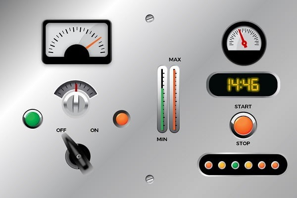
Introducing Dynamic Gauges for PowerPoint is Aesthetically Appropriate
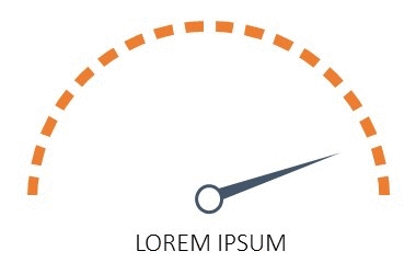
The truth is that PowerPoint presentations can, indeed, look rather stiff and static. That’s something that may not serve you any good. With the help of our comprehensive software, you can change all that. The introduction of dynamic gauges can also help you provide the information in a more understandable manner. We can also make sure that the needle of the gauge rotates between 0 and 360 which is quite feasible.
If you want to add a bit of twist and interesting appeal to your presentation, our software is without a doubt something that you should check out. This is going to help you deliver the information in a way which everyone can comprehend which is the ultimate goal of your presentation. Furthermore, it’s going to show to your managers, if they are the target of the presentation, that you are willing to go the extra mile in order to edge things out and make them flawless.
Using DataPoint for Dynamic Gauges
With our PowerPoint add-on DataPoint, you can link any gauge to a data source. Most of the times, you already have a data source with the information that you want to visualize. This could be a database that is already connected to your business processes. Or, in the simplest form, you should maintain that value manually in a simple Excel spreadsheet.
 Basically, there are 3 ways to control gauges dynamically:
- Rotate a needle on a plate
- Change the height of a meter, think about a thermometer
- And finally, control the width of a meter
We will go into detail in three different articles.


Where are the other two articles…
Indeed, they were announced but not yet written.
You can find more info about changing the height and width at the section of the manual here: https://presentationpoint.com/docs/manuals/dp20/#using-meters