
Guest blog article by Slide Cow
But does it work in the presentation space? I mean, if we were to pick the right RGB values, hues, intensities, casts, and tints, would we be able to influence our presentation audience’s mood?
Abso-friggin-lutely.
Depending on the message, choosing the right colors will get your audience to see what you want them to see and feel what you want them to feel. There is no better tactic than this in visual communication because you’re tapping into your audience’s emotional cues.
So let’s get into this with a little more detail. I’m going to list five colors and how they can have an impact on your audience’s mood(s). Depending on your message, you can use these colors to sway the room’s collective opinion to your favor.
Orange

People use orange to associate their content with enthusiasm, creativity, and encouragement. It’s the go-to color to use when you want people to try something or accept something new. I’ve used the color orange in various presentations that instilled change, for example. Above everything else, the color orange is strongly associated with happiness and energy. It’s a “good-mood” color that can turn a frown upside down.
Red

Red is a power color. If red was a person, and he walked up to you, the first thing he’d say is “bow down to me, simpleton!”
Alright, I’m exaggerating.
Still, red is a color that calls for attention. It is a color that binds itself to energy because it is emotionally intense. When we interpret the color red, we could feel things like an elevated heart rate, or an increase in appetite. Think about it: don’t you think there’s some sort of explanation why Coca-Cola or McDonalds are branded the way they are?
Whenever you’re designing your slides, use red whenever you want to grab as much attention as possible.
Green
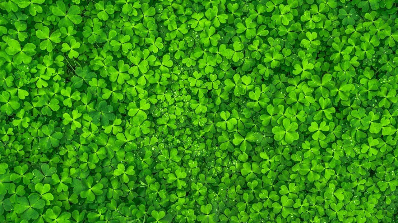
Green is a little confusing. On one end of the spectrum, green is perceived as a “soft color.” It isn’t merely as intense as the other colors listed here. Instead, green is associated with things like nature or healing. Green exudes comforting vibes like relaxation, freshness, growth or harmony. I’ve used green in my PowerPoint slides whenever I want to make my audience feel as calm and collected as possible. On the other end of the conundrum, the color can be linked to ‘negative’ moods like envy or jealousy. This is because green is traditionally associated with corporate-focused items like money or financing or profit. I guess it comes down to how you want to use it.
Yellow

Yellow is all about happiness and optimism. Think back to when you got that star-sticker in the third grade, or when you got a laughing emoji in your last text message. There’s a reason why those things are yellow. Yellow also helps whenever you want to categorize valuable points in your slide, and that’s only because it’s a color that stands from the crowd. I’ve used yellow several times in my presentations just to help me make each point stand out from the other.
Blue

Blue is the ‘silent assassin’ of the color wheel. It’s not an in-your-face color like red or yellow. Its impact on one’s mood is really subtle; things like confidence, wisdom, and intelligence are highlighted very discretely. Blue also tends to represent calmness and tranquility. The color of the skies and seas in our beautiful world are blue, and whenever we look epic at them, we always give ourselves a moment to take it all in.
Influencing One’s Mood With Color
Visual communicators of today don’t tend to stick to the dull black-and-white, Arial font and bullet point routine. The best presenters use colors because they can significantly help get a crafted message across. If you’re excited to try choosing colors for yourself, then my best piece of advice would be to not stick to just one color. Experiment, explore, and above all, have fun. The real value is only gained when you know how to use colors in different combinations, all depending on your message.

Really interesting. Will definitely keep this in mind for my presentation!