People often put the slug on various presentations. To say the truth, in many cases, this criticism is completely justified. Most of us know how it feels to listen to a voluble, but a stodgy presentation that brings out one single thought: I want this nightmare to end up as soon as possible.
Actually, what is this distinguishing thing that creates a contrast between an impressive presentation and awful one? Without a doubt, it’s the way the information is presented. So, in this very case, we deal with such things as design and content. You may speak extempore, you may speak glibly, you may speak absolutely decisively and masterfully, but slides streaking off behind your back can completely ruin the whole image of your presentation. They can distract listeners from the main message of your speech and take their minds off.
In order to prevent you from making unforgivable mistakes, we’ve decided to collect a bunch of tips that will help you to create an impressive presentation. Just keep them in mind during its preparing and your success will be sure as a gun.
1. Push out of your head ordinary templates
An out-of-the-ordinary design has nothing to do with standard templates that come alongside with a software. Some people can say that they look pretty simple and minimal and such an approach to design is widely-recognized nowadays. The main point is unchangeable, anyway. Default templates look extremely tiresome and even dreadful. When you start to create your presentation, throw away this typical kind of design and try to focus on something off-the-beaten-track. Push your imagination beyond the limits, check out various combinations and, in such a way, you will certainly get something trustworthy and nice-looking.
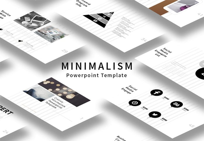
If you have a desire to push your presentation beyond the limits of everyone’s imagination, take a glance at Powerpoint templates presented
2. Play around with colors but don’t overdo
Sometimes there cannot be something better than a balanced color scheme that spices the whole look of the presentation up. You can create various color mixes, but, anyway, there is no need to be zealous with complex gradients and combinations. Your presentation can gain a wonderful look even if you use a simple, but a right mixture of colors. In addition to this, you should pay attention to the contrast between text and background in order to make people enjoy your slides, not pull a face taking a glance at acid hues. By the way, bold and italic fonts are not the only way to highlight the most important information. Select one color and use it to bring to focus a crucial point and, thus, people won’t miss it.
3. Call attention to fonts and their relevance
To start with, you should always think about people while choosing a font and its size. Don’t forget about those who sit far away from the screen – they’ve also come to listen to your presentation, not jack around on the cheap sets. Such fonts are Times New Roman or Comic Sans are too simple, while Helvetica is a traditional one that looks extremely great. In addition to this, try to use sans serif fonts, because serif ones have a tendency to combine into a one single unity, thus, making text twice harder to read.
4. There is no need to place a lot of text on the slide
Slides that come together with a multiplicity of paragraphs are awful. People won’t even listen to your speech, their attention will be absolutely compelled to the screen. As you know, sometimes it could be very hard to listen and read at the same time. When you present a lot of text on the slide, you just shift everyone’s attention to the presentation and, in such a way, people start to read the information written on the slide and ignore your speech. Moreover, try to not use more than 5 lines of the text. People need to process information both audible and written, so don’t overload their minds with unnecessary letters. In general, don’t turn your visuals into a manuscript and don’t forget to divide main points, writing them on different slides.
5. Place your stake on images
Visualization is an incredibly powerful thing. It has an ability to encourage attention to the presentation and make it more enthralling.
6. Place your stake on various charts and infographics
People perceive the information better if it’s presented in the form of charts and infographics. In order to do it in a professional way, take a look at following tips:
- use pie charts to show a particular percentage and, moreover, use colors to highlight the most important slice of it;
- use vertical bar charts to show changes that happened during a particular period of time;
- use horizontal bar charts to compare some points;
- use line charts to show various trends.
7. Use a limited number of animations and transitions
There is no need to put animation on every slide. The animation is good when they’re used in small doses. Make sure that you’ve chosen it aforethought and keep in mind that it shouldn’t look extremely slow or quick. Such a simple variant as a subtle swipe right-to-left would look twice better than a slow fly or move. The same tips can be used regarding transitions. People will definitely be tired of eternal transitions used between all slides. For this reason, try to not overload your presentation with unnecessary effects that are, actually, considered to be not so important and essential.
8. Use video and audio elaborately
In general, you can use video and audio in your presentation, but, anyway, make certain that it will be relevant. It’s possible to use various video clips in order to show particular examples that need a confirmation. In such a way, the main point will be illustrated in an amusing way. If we were to talk about audio, try to avoid these sound effects that come together with the animation. Your audience will divert its attention away if they hear some inappropriate noise in the background.
Without a doubt, you need to follow these eight steps in order to make an impressive presentation that will make everyone agape with wonder. Yet there is one more thing that you need to pay attention to and it’s your speech. A lot of people are afraid of speaking out. How is it possible to escape this nasty fear and gain confidence in order to sound convincing? Julian Treasure shares some useful tips that will help you to capture the attention and forget what does it mean – to speak when nobody’s listening to you. Thanks to the video below, we’ve made out two more helpful pieces of advice that will allow you to come into notice.
9. Avoid these seven deadly sins of speaking
There are a plenty of things that we need to throw away while speaking. These seven habits are considered to be something that everyone can fall into. Try to avoid them completely and, thus, your speech will turn into something more pleasant, spectacular and thought-out.
- Gossip
- Judging
- Negativity
- Complaining
- Excuses
- Lying
- Dogmatism
10. Keep in mind this HAIL thing in order to sound impressively
One of the definitions of the word hail sounds like to greet or acclaim enthusiastically. If we
- H – honesty (try to be clear and straight)
- A – authenticity (try to be yourself without any pretending)
- I – integrity (try to do what you’ve said without talking idly and, in such a way, you will become somebody whom people can trust)
- L – love (try to show real respect for your audience and be honest with them.
For those who search for an impactful and imaginative way of presenting their business solutions, we present this free eBook that can be downloaded by clicking on the image below. If you have a desire to find out how to make your storytelling absolutely exciting and attention-grabbing, make the audience become interested in your company, its history, and relationships with customers, just take a look at this step-by-step guide. It will help you to find out the difference between storytelling and content marketing, make it easier for you to tell stories and provide with the knowledge what is the best way to present your one.
- In a perfect world, you should know your topic irreproachably.
- Forget about a big amount of the text on your slides.
- Choose a layout of your presentation elaborately.
- Create a contrast between text and background.
- Avoid using intricate fonts.
- Choose a relevant design theme.
- Don’t overload your presentation with various effects and animations.
We hope that these tips will help you to make a splash and score a hit during your presentation. We wish you good luck and thanks for reading!
Lana Miro falls in love with beautiful web design. She likes to share her experience and explore something interesting.
She also cooperates with TemplateMonster.com for helping everyone to find their best solutions for their own online projects.
Follow her FB for more awesome content and fresh ideas.


